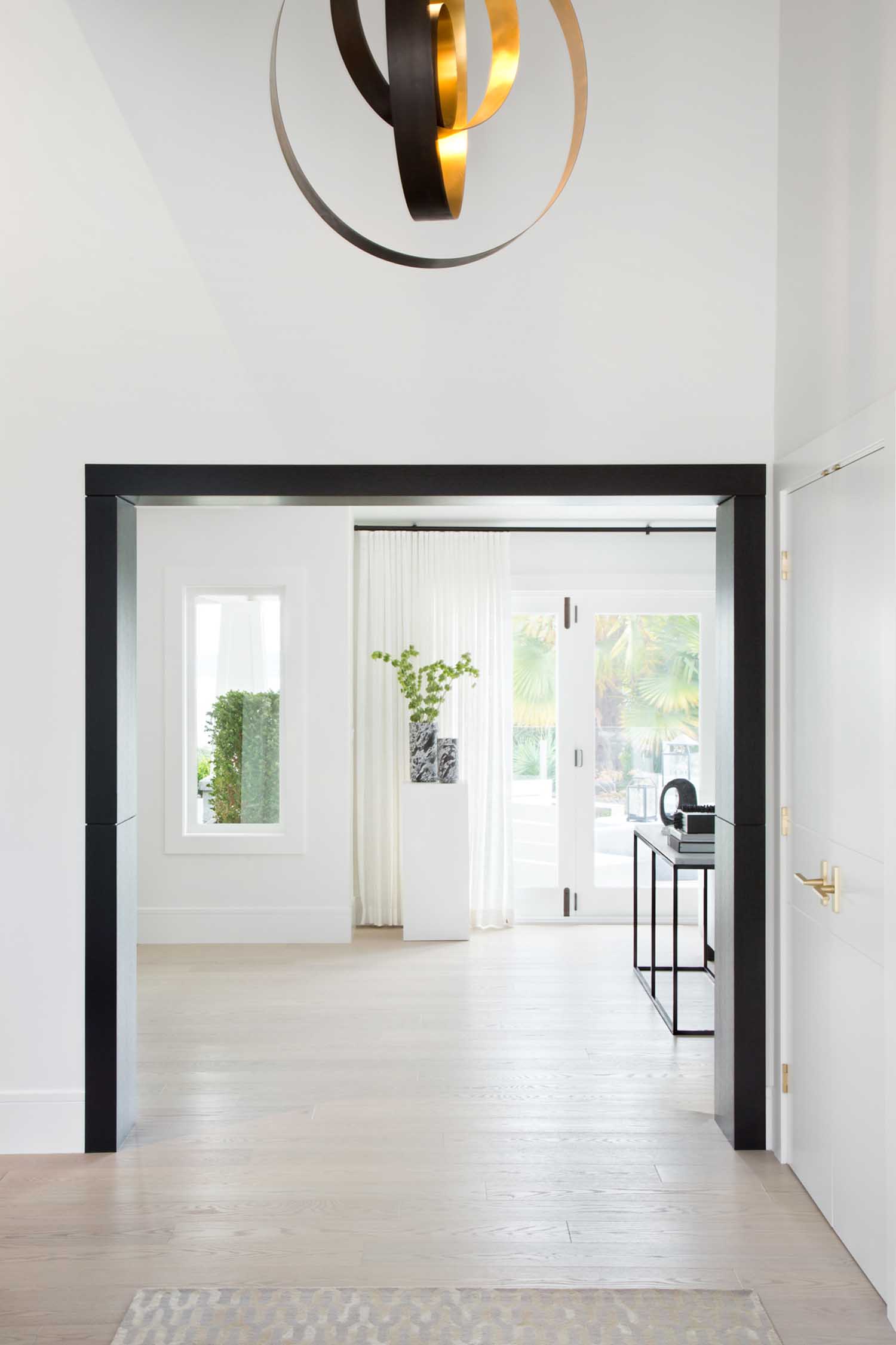
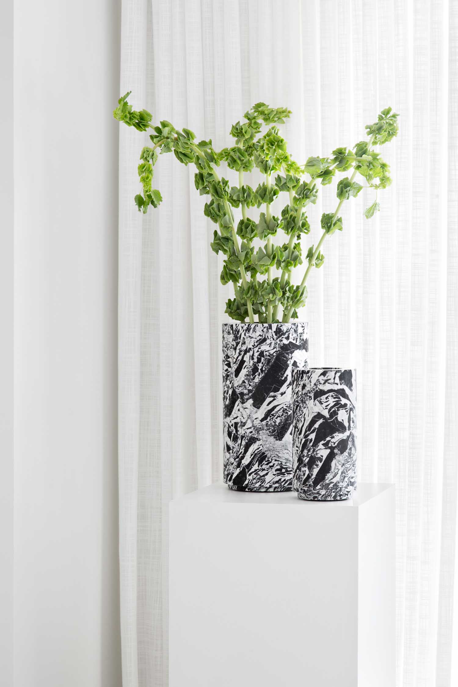
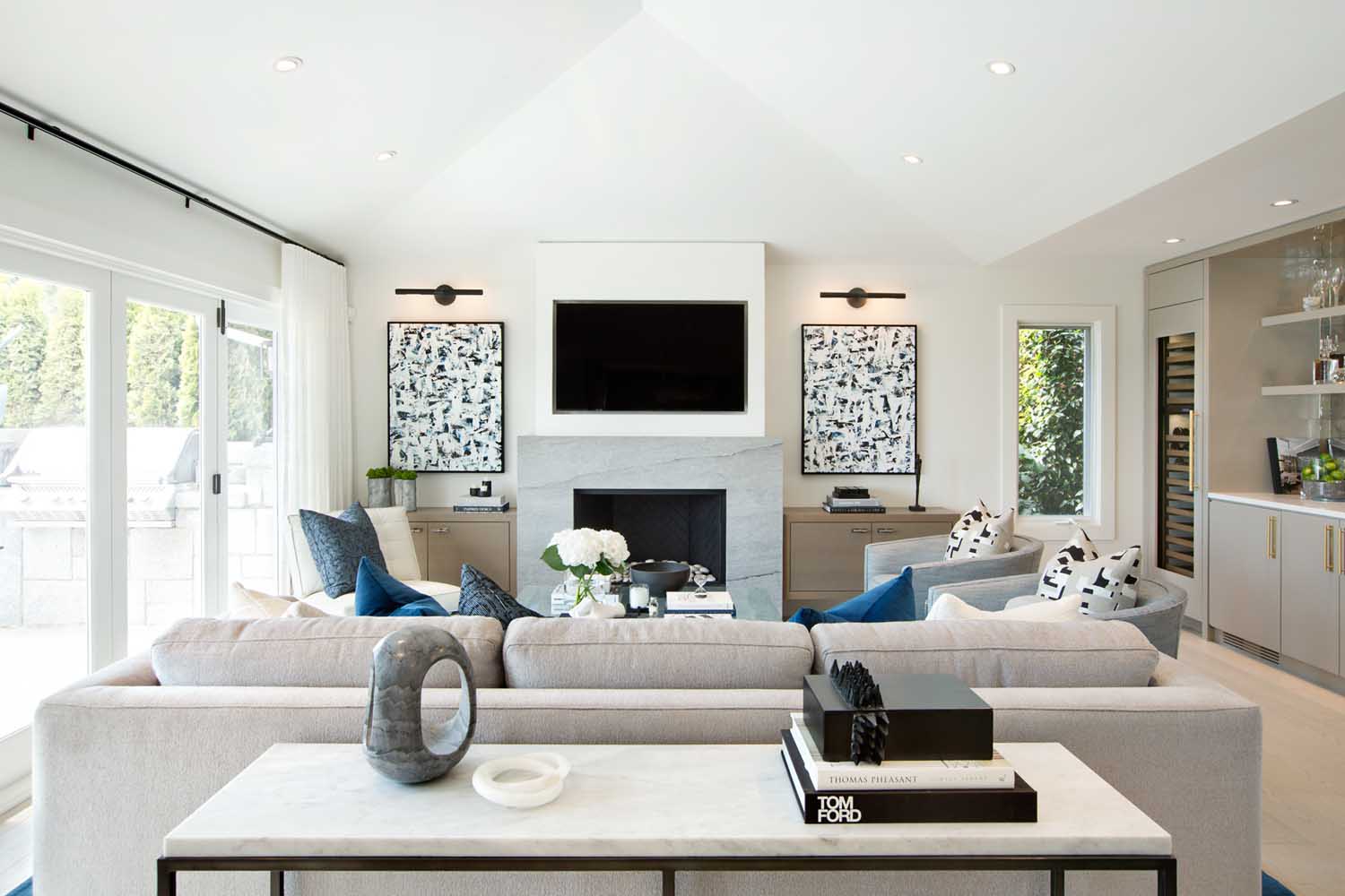
Designer Amanda Evans was faced with a tight timeline when her clients told her they were relocating to Canada from the U.S. Their 6,000 square-foot home in West Vancouver needed a full renovation—it’d be renovated multiple times prior and didn’t have the flow and cohesion they wanted. Amanda and her team quickly got to work, keeping comfort and luxury in mind and ensuring it’d be a great gathering place. It took about 10 months, just in time for the new school year to start. She tells us more.
Tell us about the clients. Who lives here?
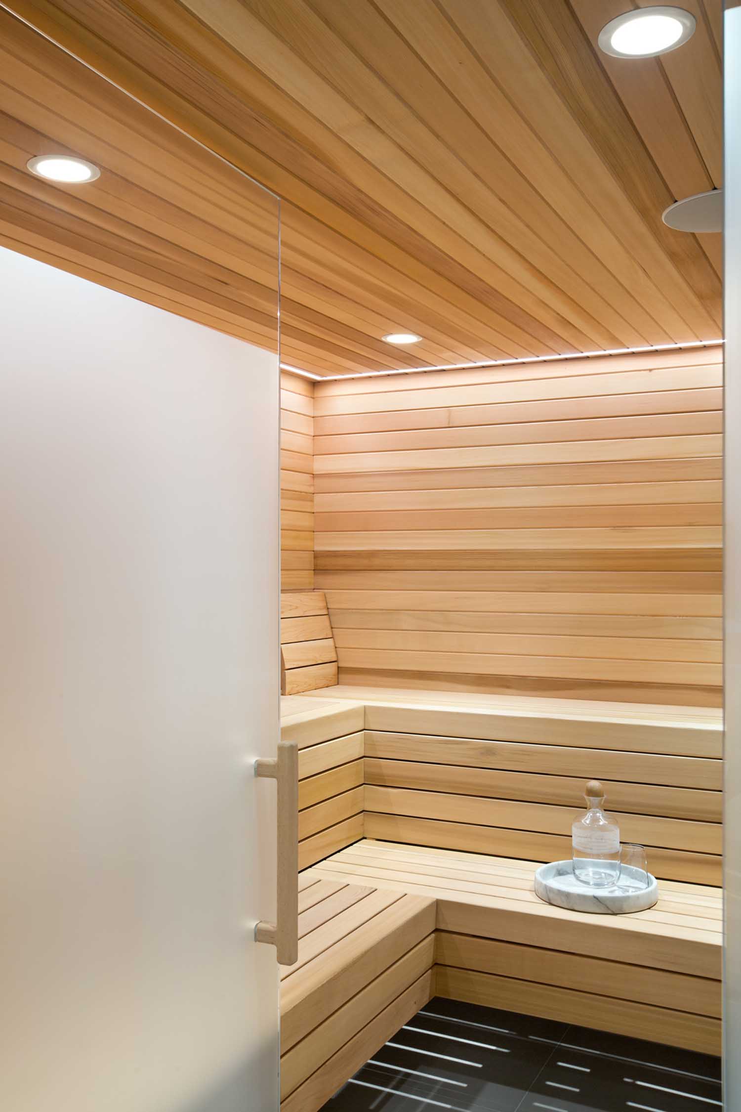
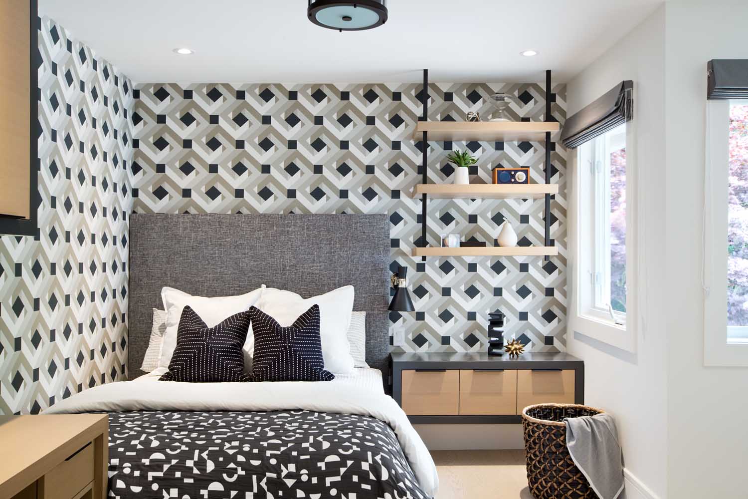
The clients were relocating to Vancouver so the majority of the construction of the home was done prior to them arriving here. The design intent was to create a home that they could live their everyday lives in but also a place to entertain friends and family. A balance of comfort and luxury was always top of mind when we were selecting finishes and materials. They have a remarkably busy and active lifestyle, so ensuring that we captured things like a steam shower and sauna were important items to include. Each kid’s room had its own personality, and we got to have a bit of fun mixing patterns and colors.
Design wise, what was the “jumping off point” for the project? In a few words, how do you describe the style?
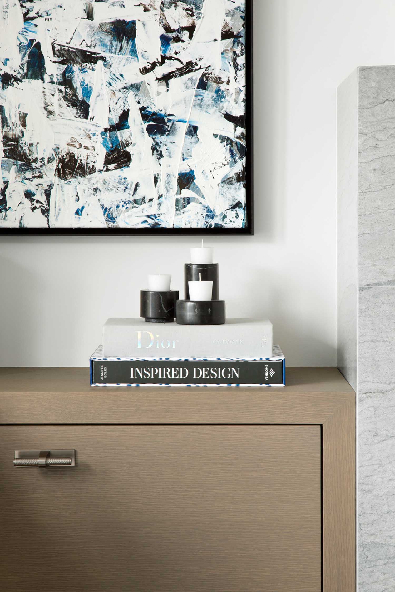
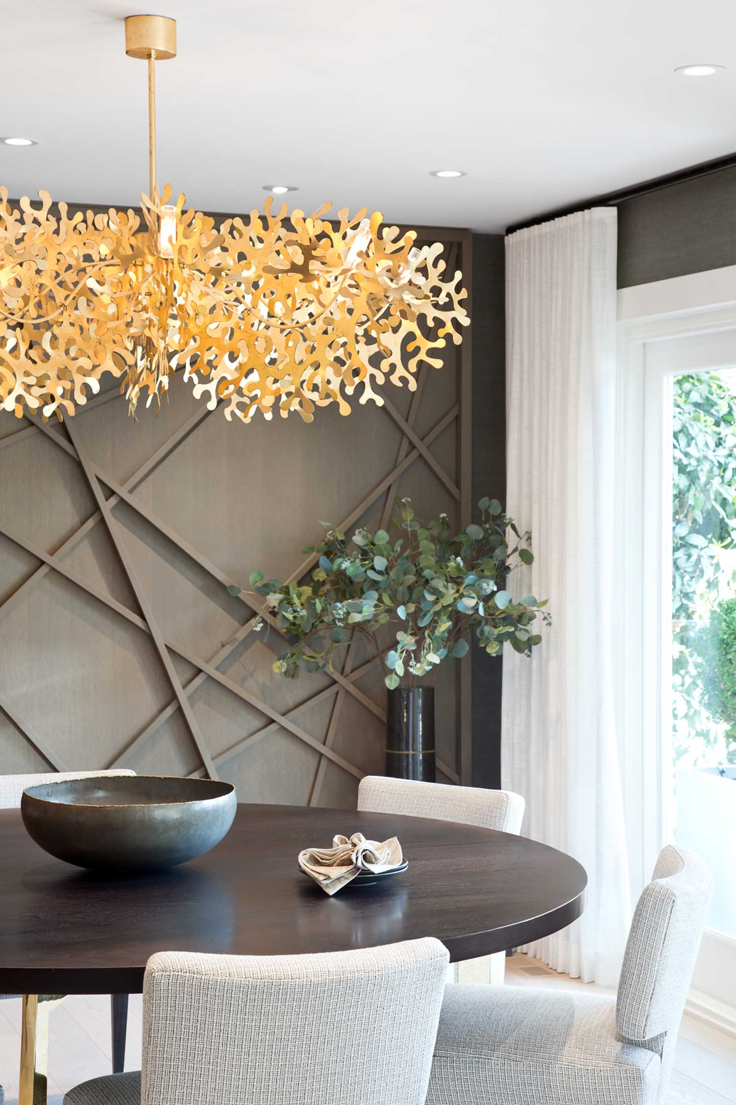
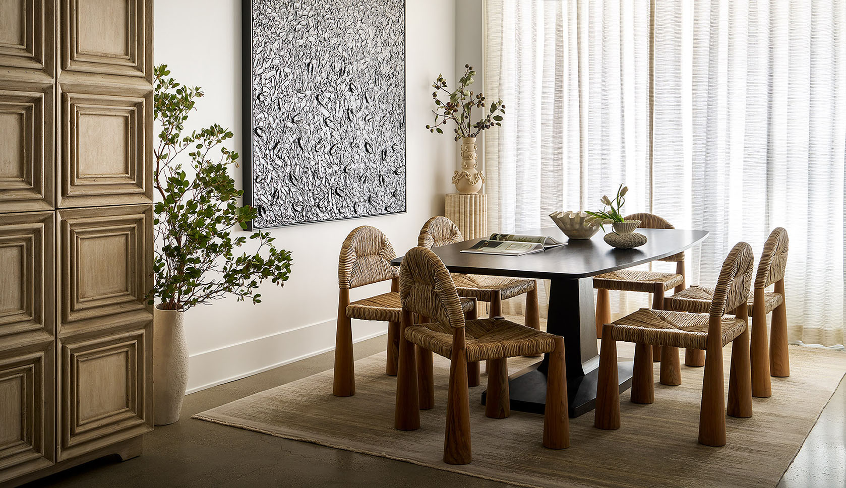
We always collaborate with our clients in the beginning of the project to get a good understanding of what they want to see in their new home. We pulled a lot of inspiration from the clients themselves and their art collection. We wanted to bring a bit of the east coast to the west and we did so with the use of strong pattern and color. A mix of textures was also key to our design so we incorporated rift cut white oak cabinetry paired with finishes like Statuario marble, brushed gold fixtures and grasscloth wallpaper used throughout the home to create a cohesive feel.
The kitchen is great. Can you tell us more about the design of this space?
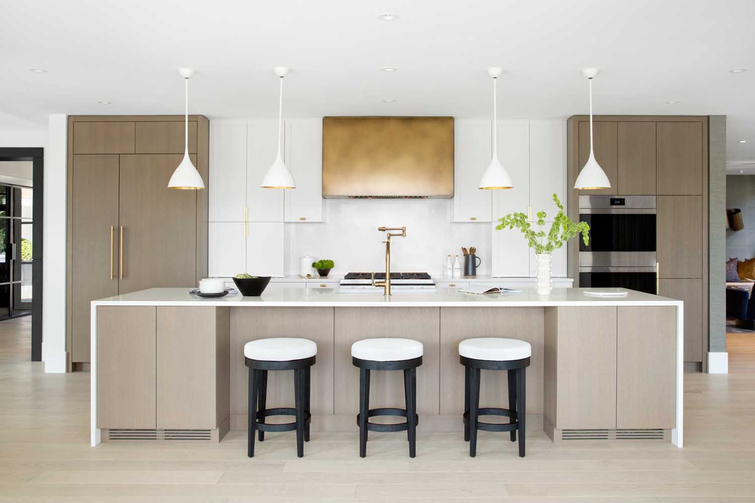
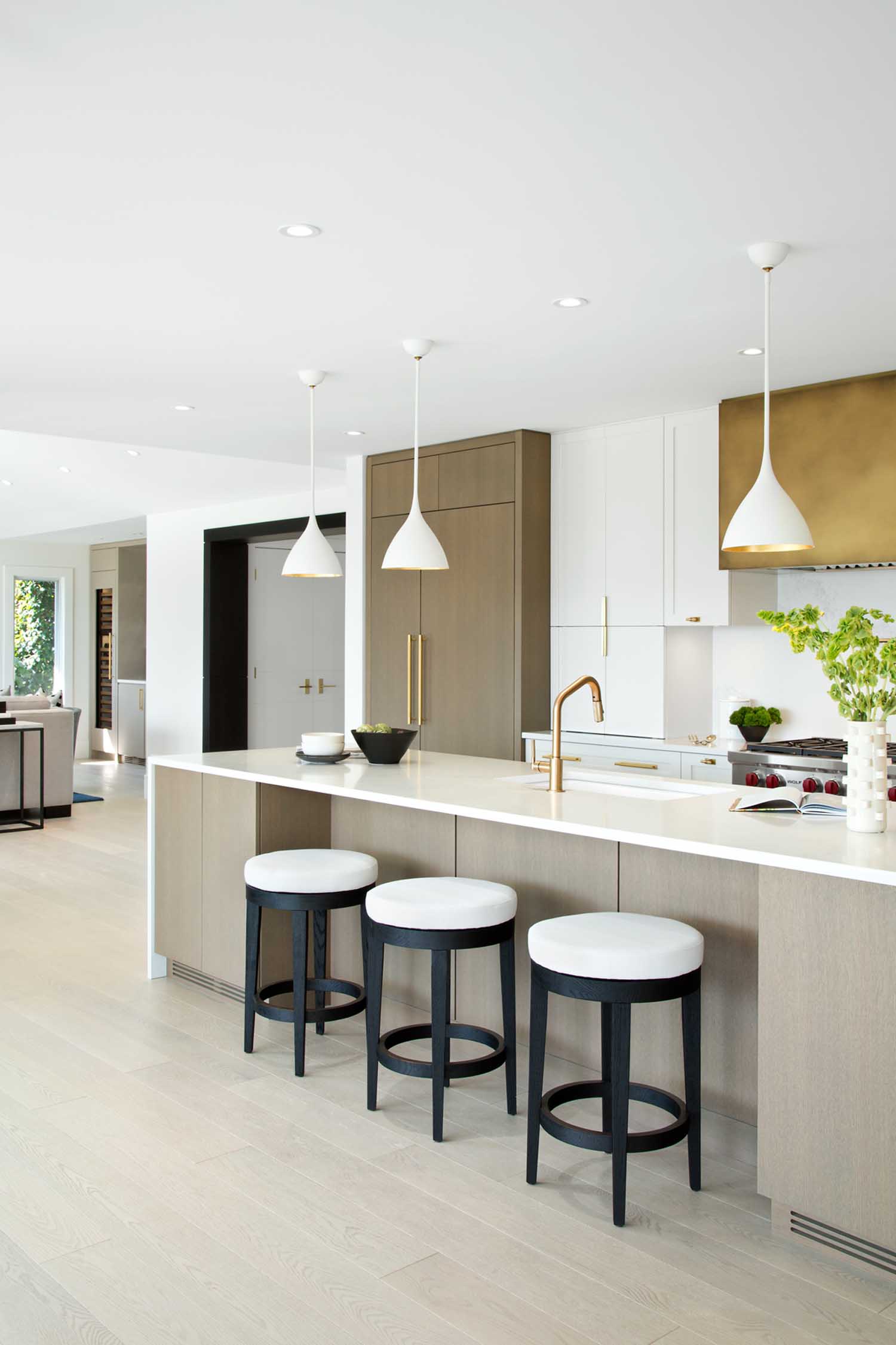
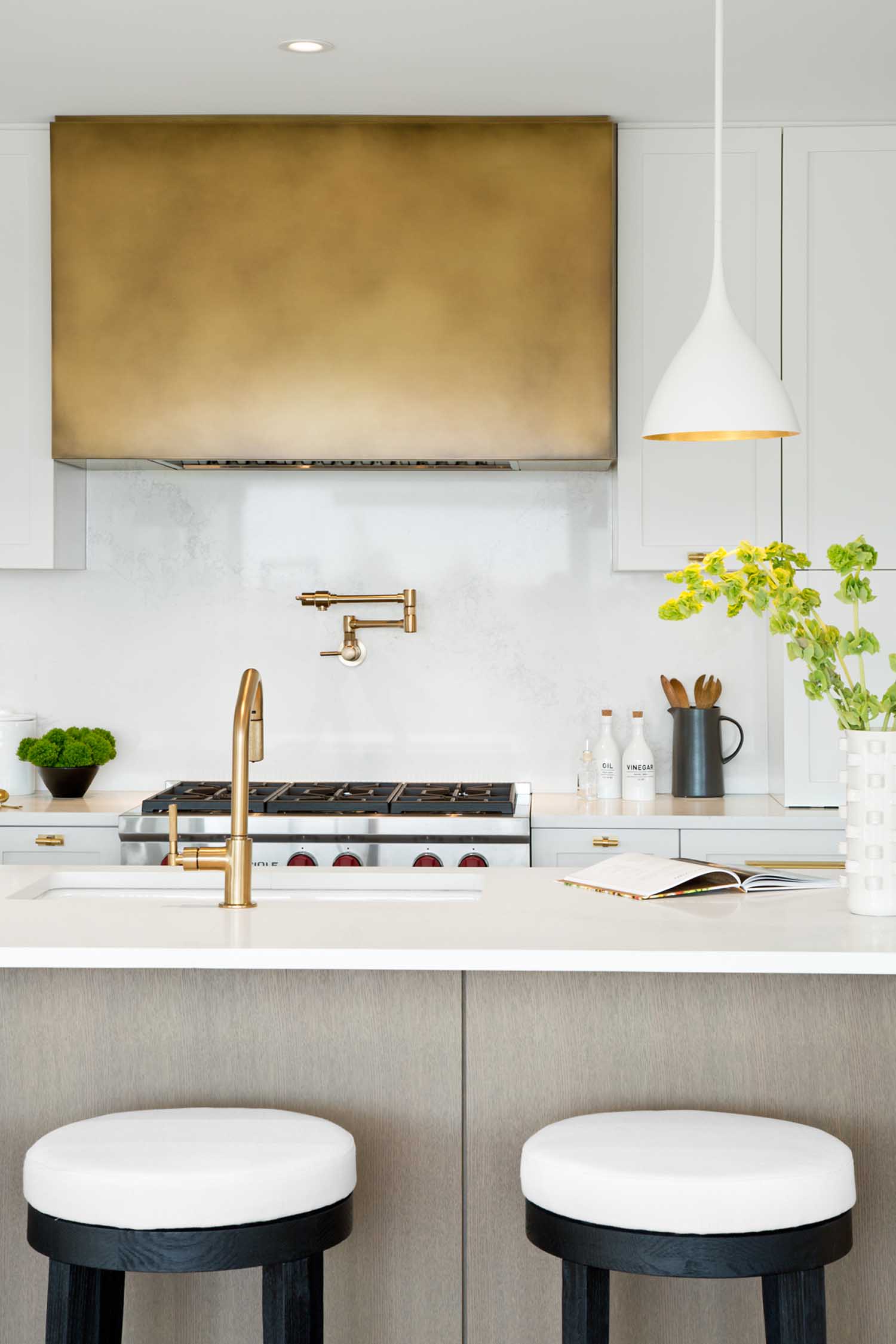
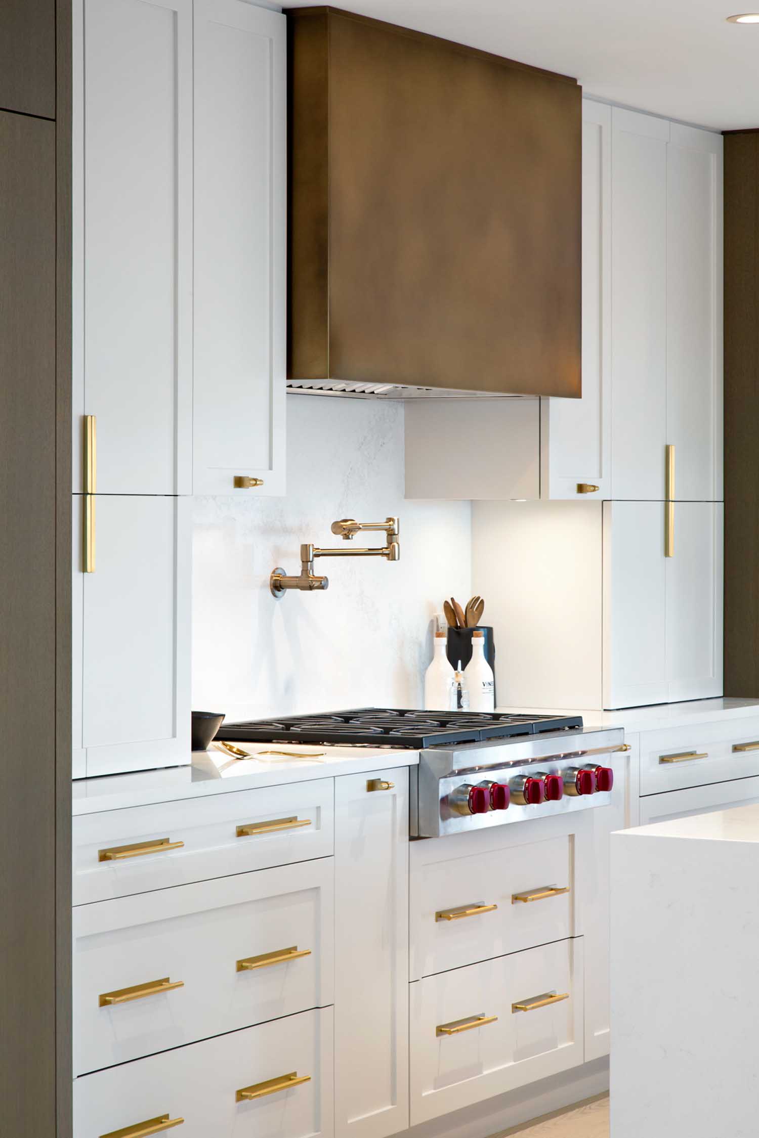
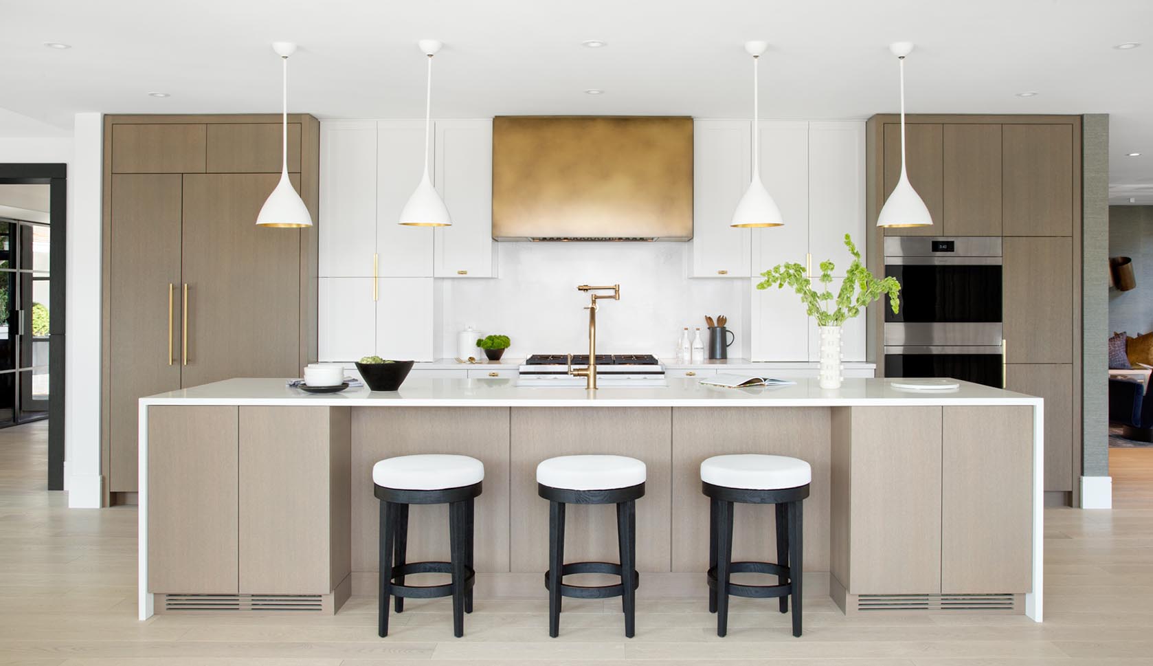
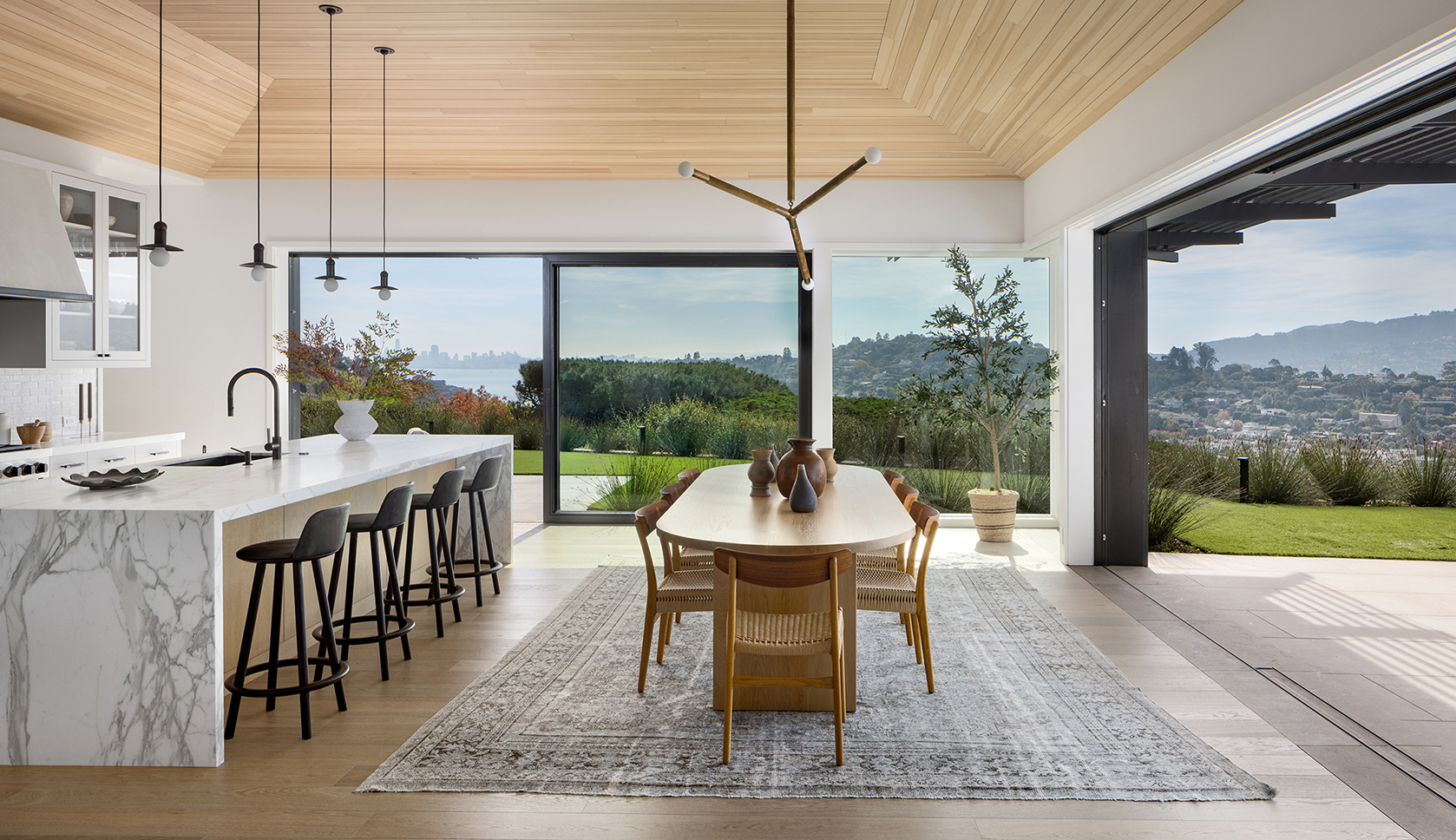
The original kitchen layout posed many issues for our clients and their lifestyle, so the wall was removed in between the kitchen and dining room to maximize flow for the frequent entertaining they do. This meant we were short on kitchen space for the family of six, so we proposed an almost 13’ island and custom designed cabinets that sit on the countertops to conceal everyday kitchen appliances. The bronze hood fan was a statement detail that serves as the main focal point in the center of the kitchen. The kitchen and principal bathroom were top scorers at the NKBA BC awards last October, naming us Designer of the Year 2020.
Congratulations! We love how the bronze continues through the home.
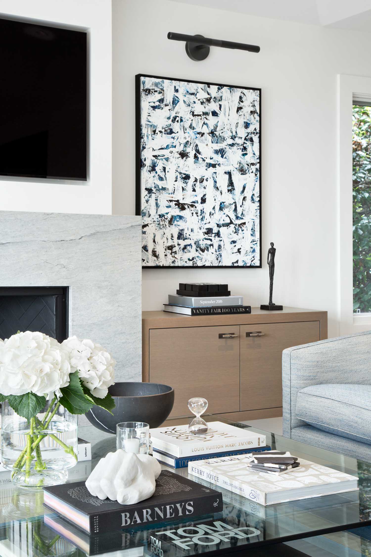
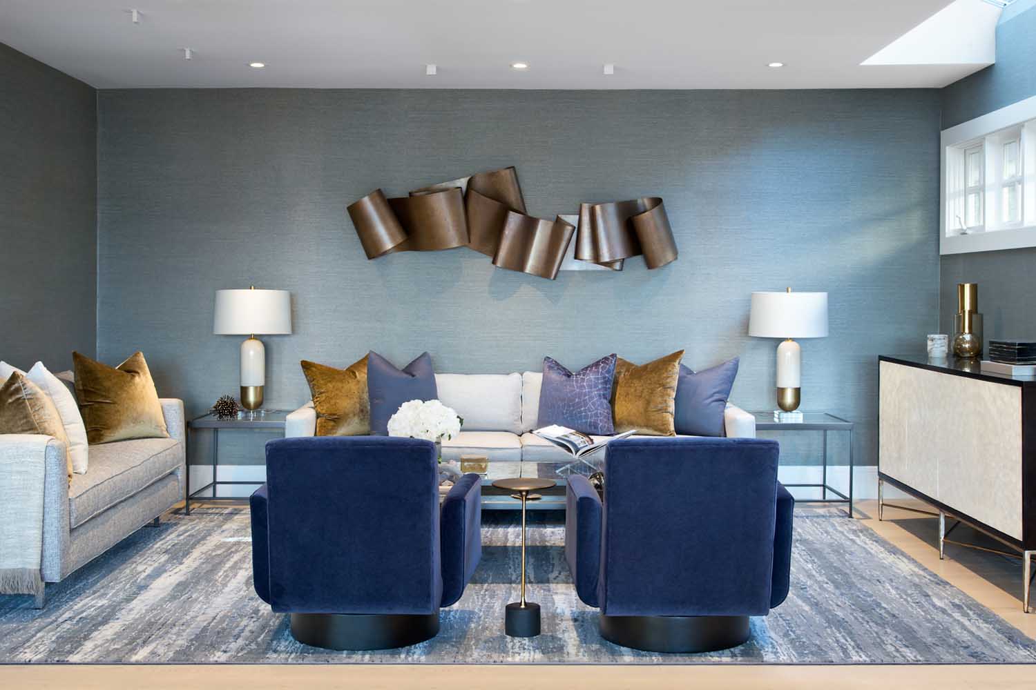
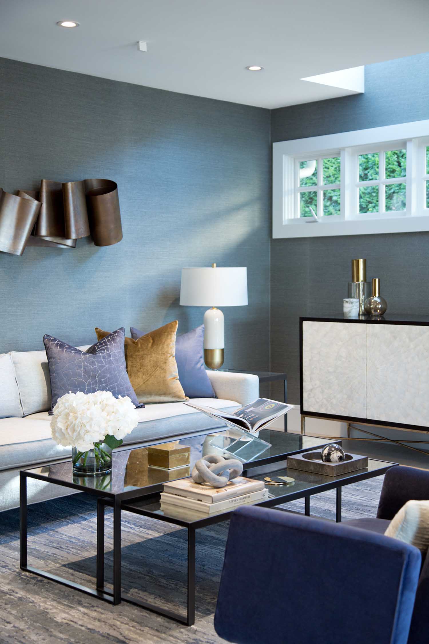
The bronze was repeated in a commissioned piece from local artist Martha Sturdy that hangs in the living room around the corner. We incorporated some of their existing furniture and added in new items like the armchairs, day bed and area rug.
We’d love to know more about the stunning powder bathroom, too!
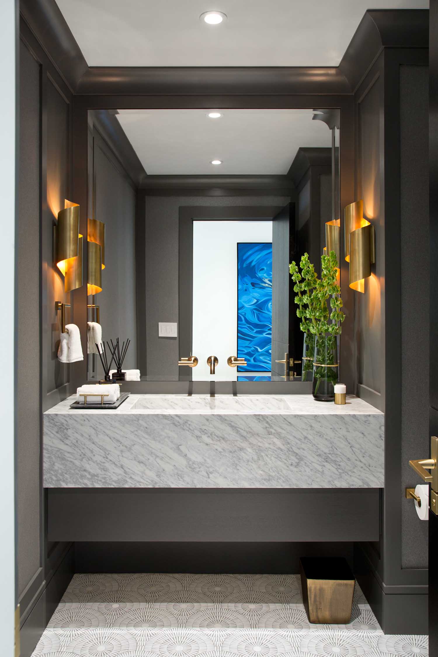
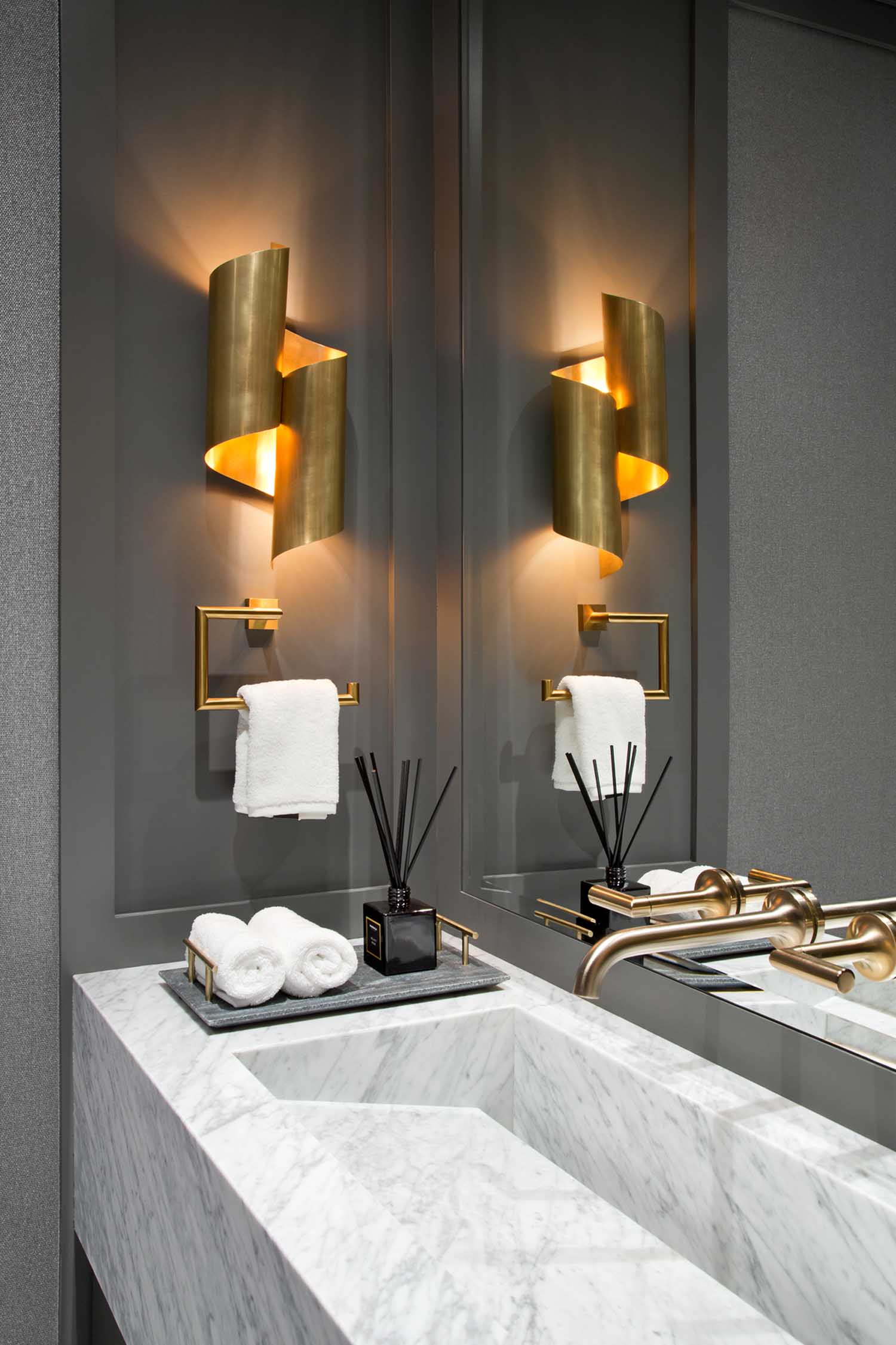
The powder bathroom is a favorite of mine. We designed the vanity to house a Statuario marble sink that popped on a charcoal grey paneled and wallpapered walls. It is accented with brushed gold plumbing fixtures and sculptural lighting, a nod to the art in the living room.
The public spaces are beautiful, but the primary suite is really something special.
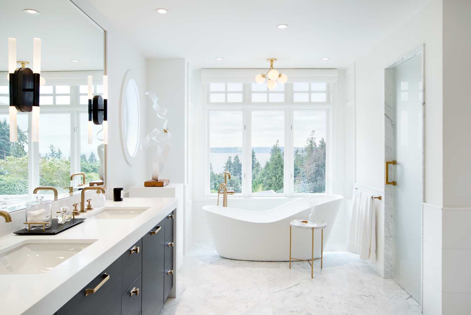
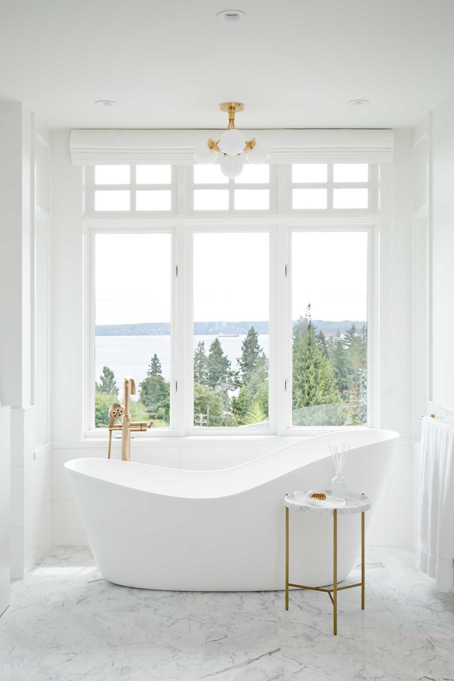
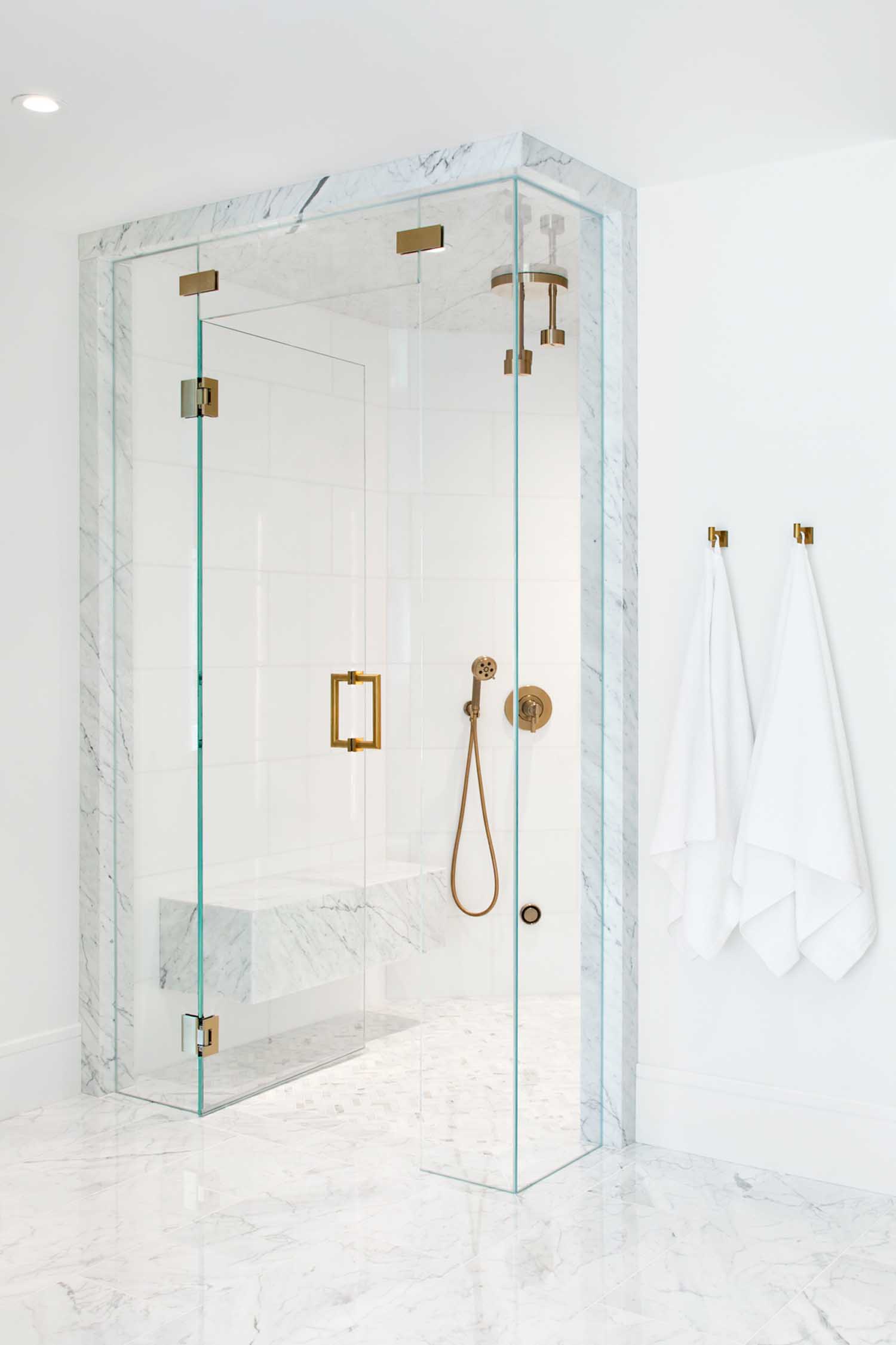
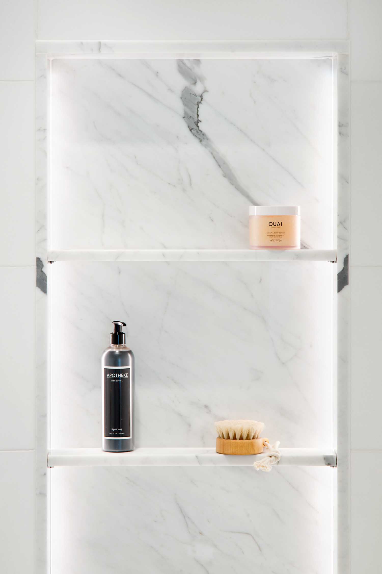
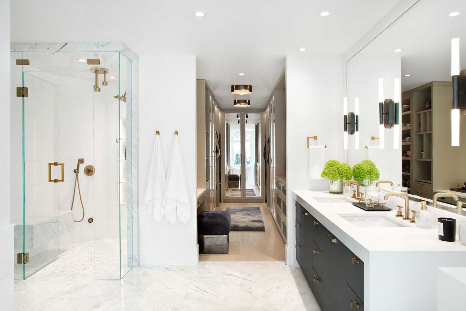
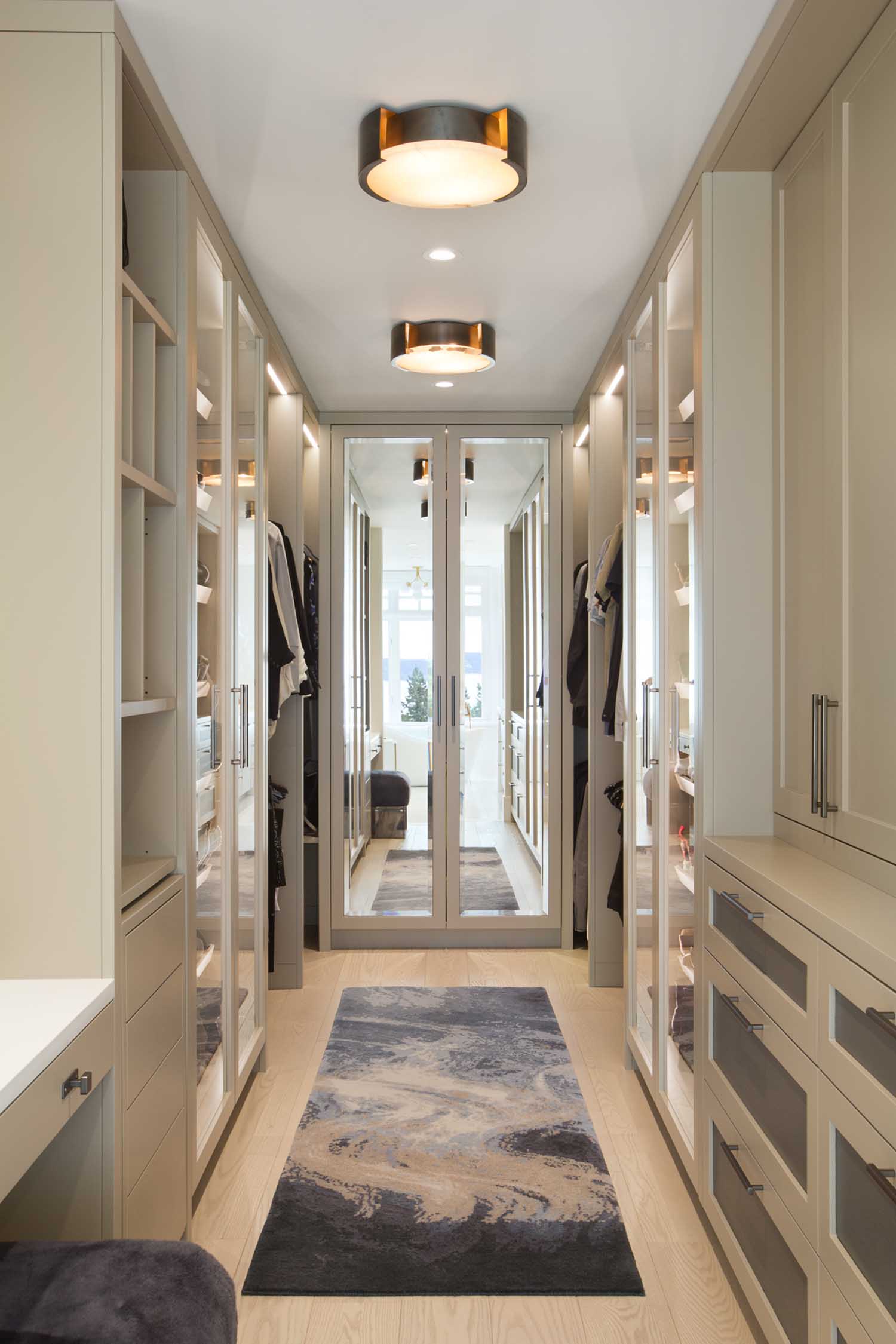
The principal suite was another highlight of the home. We designed custom millwork for the closet and lined it with LED strip lighting to highlight our client’s wardrobe. The principal bathroom was too large, so we stole a bit of square footage and added it to the closet. The vanity is a rift cut oak stained almost black to act as a strong contrast to the bright white counters and Statuario marble tile while at the same pulling out the dark colors of the veining in the marble. The same dark oak is inset in the custom closet millwork to tie both rooms together. The rest of the closet cabinetry is painted a greige color to bring some warmth to the space. A custom abstract area rug finishes the closet and adds a bit of pattern and color.
Color and pattern reigns supreme here. What are some of your favorite choices?
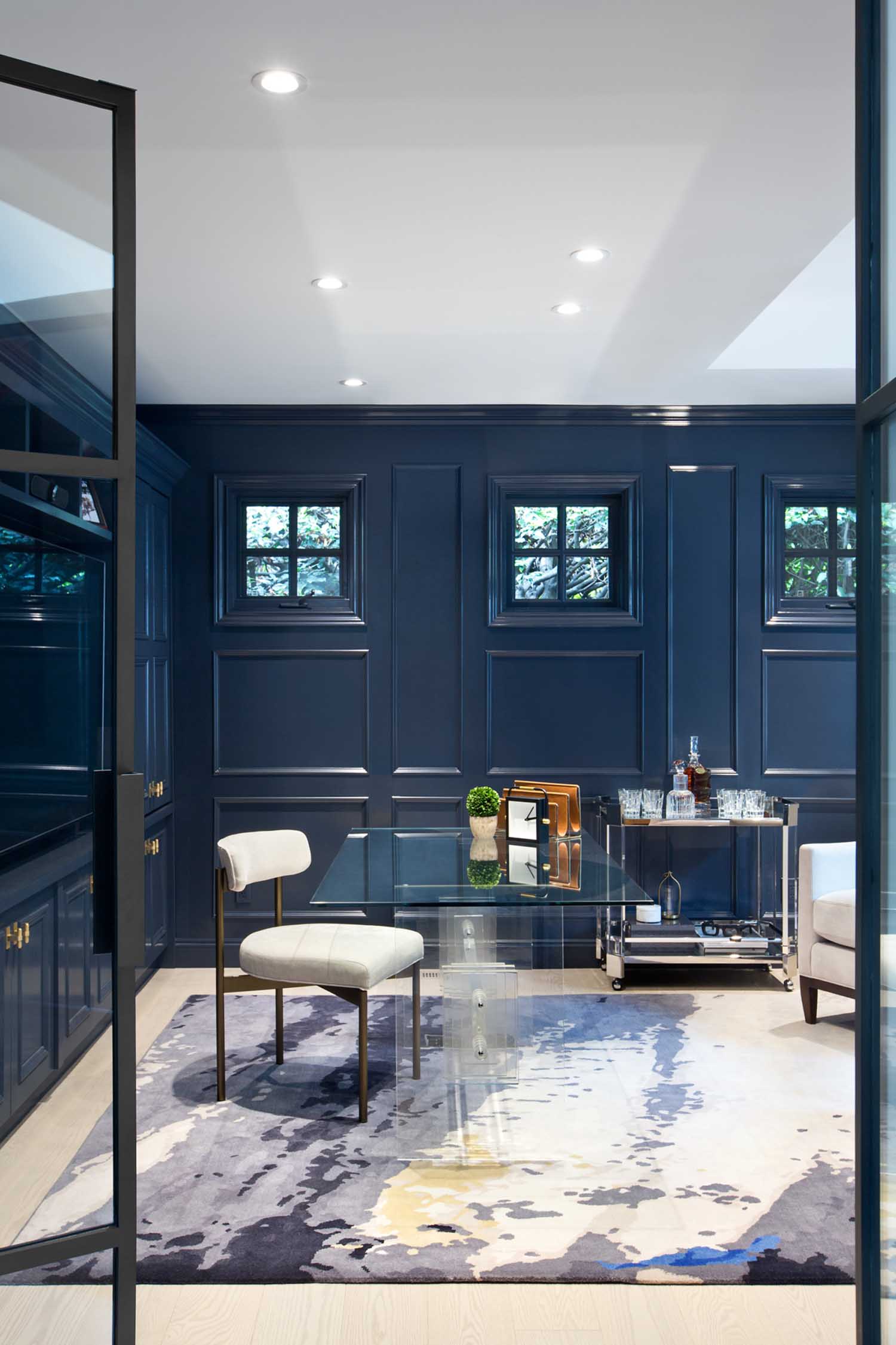
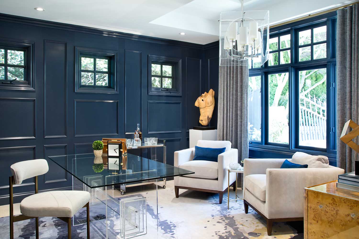
I love that the client embraced the use of strong pattern and color in this home. It’s rare that we get to work with this level of pattern, so it was a welcome change. Some of my favorites include the Kelly Wearstler “Channels” wallpaper on the ceiling in the media room, the graphic black, white and tan wallpaper in one of the kids’ bedrooms and the abstract area rug in the office.
