The conversation around color and interiors always seems to swing between extremes. You have barely-there neutrals or bold, saturated hues, with much of the design world following suit. But according to Little Greene Paint & Paper’s Creative Director Ruth Mottershead, the next chapter is neither too warm nor too cool. Instead, it lands somewhere in the middle, making way for more nuanced, layered palettes.
With the launch of the brand’s updated Colours of England and Colour Scales collections, Little Greene is encouraging designers and homeowners to embrace shades that feel soft, balanced, and full of personality. That approach reflects the new collections particularly well: Little Greene describes the current shift as one toward balanced neutrals and gentler, less saturated shades.
We caught up with Ruth to talk about what’s driving this shift, how to build a palette that lasts, and the storied new blue she can’t stop thinking about.
In your research, you noticed a move from warm, saturated tones to more balanced hues. Why do you think this is?
It’s an evolution rather than a revolution; color trends never really jump, we notice shifts. We’ve watched saturation quietly turn down across the palette. The red oxide and heat that once sat behind our caramels and burnt oranges has softened into gentler, more balanced hues.
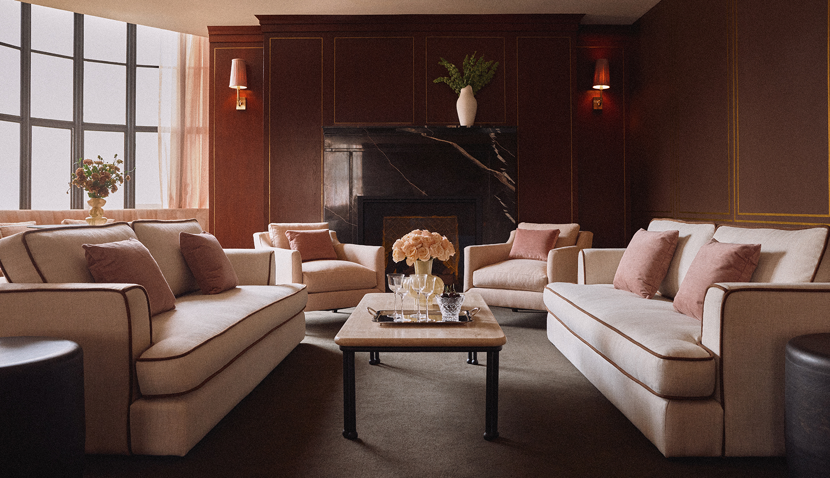
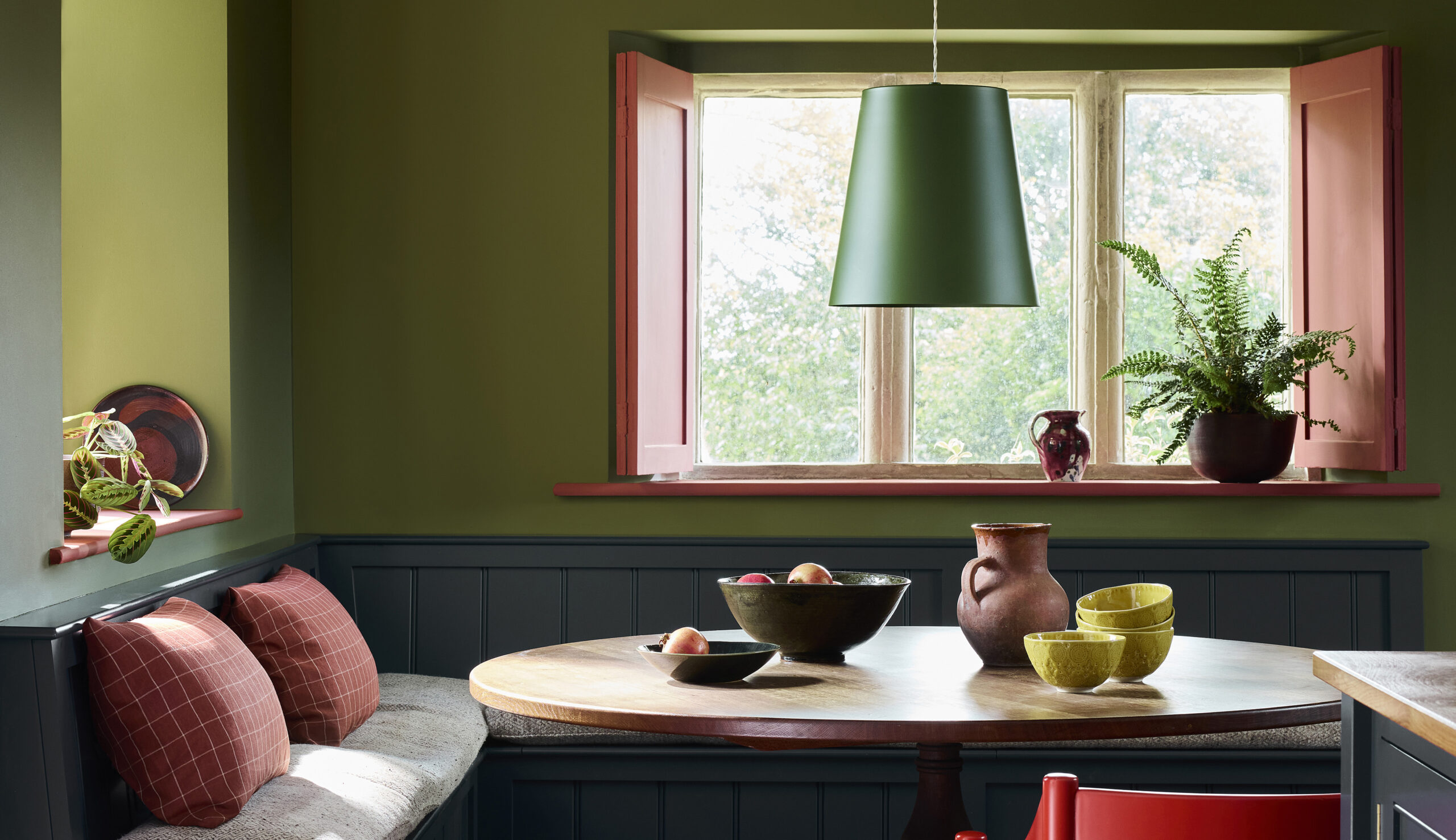
We’ve seen comfortable mid shades that are neither too warm nor too cool really grow in popularity. If you think of it like the pH scale, these much-loved shades are sitting at around 5 or 6 on the scale. There’s a real appetite for shades with personality that don’t shout, such as the gelato-inspired colors we’re seeing used in schemes more frequently, I think that comes from wanting our homes to feel calm and considered rather than following trends.
For someone who is just starting the decorating process, either for a single room or their whole home, do you have any advice or words of wisdom on setting the initial color palette?
My first piece of advice is to opt for colors that you love rather than following trends. Think about how you would like the space to make you feel. Trends will always come and go, but a palette chosen around how you actually use a room, and how the light treats it, will create a space you really enjoy spending time in.
Always slow down and look at how light moves through the room across the day. A north-facing space will pull the coolness out of a color, while a south-facing room will warm it up beautifully, so let that guide your palette rather than fighting against it. Choose a hero color first, then build outwards with one or two shades that share the same undertone, so the whole scheme feels connected rather than assembled. Always make sure you sample your chosen shades too. Paint out large swatches and live with a color on your wall for a few days, watching it in morning and evening light, before committing.
Are there any shades in the new collections that you’re especially excited about?
I’m particularly drawn to ‘Perpetual Blue’ at the moment. There’s a lovely story behind it: it’s taken from a surviving paint palette belonging to Winston Churchill, from his studio at Chartwell, and it carries that same sense of quiet contemplation. It’s a mid to deep blue3 with a touch of green running through it, so responds beautifully to changing light throughout the day. I can see it working beautifully color-drenched in a study or used more sparingly as a grounding note against softer neutrals.