

Joanna Jones and Liz Slutzky of Torus Interiors say this Boston apartment was a white box when they took over. “That’s a great opportunity for a designer, but it can be hard to achieve that cozy, lived-in feel,” they share. Though it’s a new construction, their client wanted the space to feel like it had some history. In addition to a bringing in warmth, they also had to add vintage pieces that would offer patina and depth. One added challenge? The client was commuting back and forth from his home base in New York and living in Boston hotels. Sensitive to this fact, the pair brought it all together (from construction to reveal) in about 5 months. Our chat below explains a bit about the process, and don’t miss the slideshow for added details:
What amazing views! We’d love to know more about the property. Did the location influence the design at all?
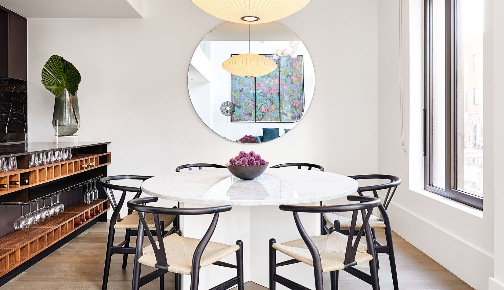
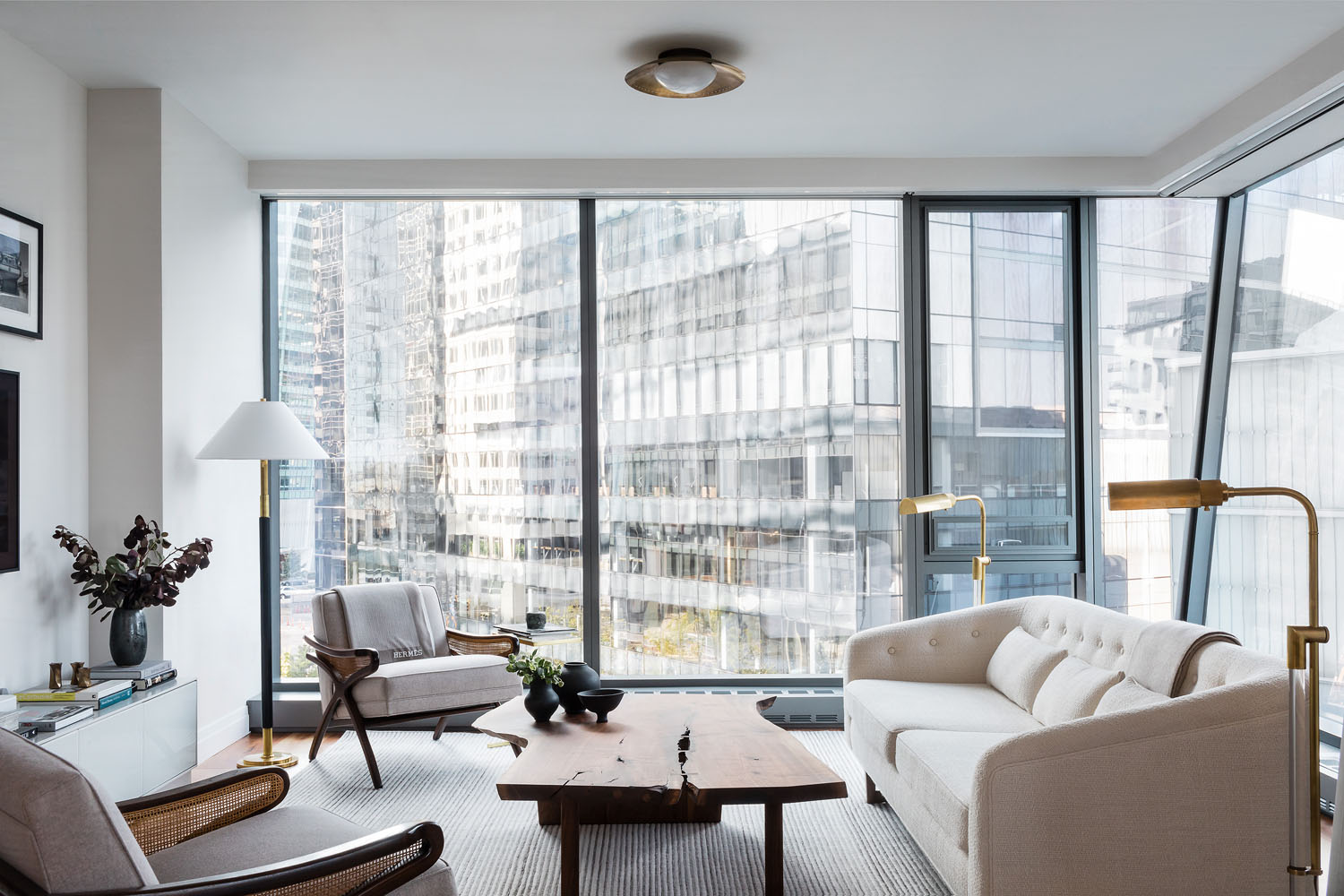
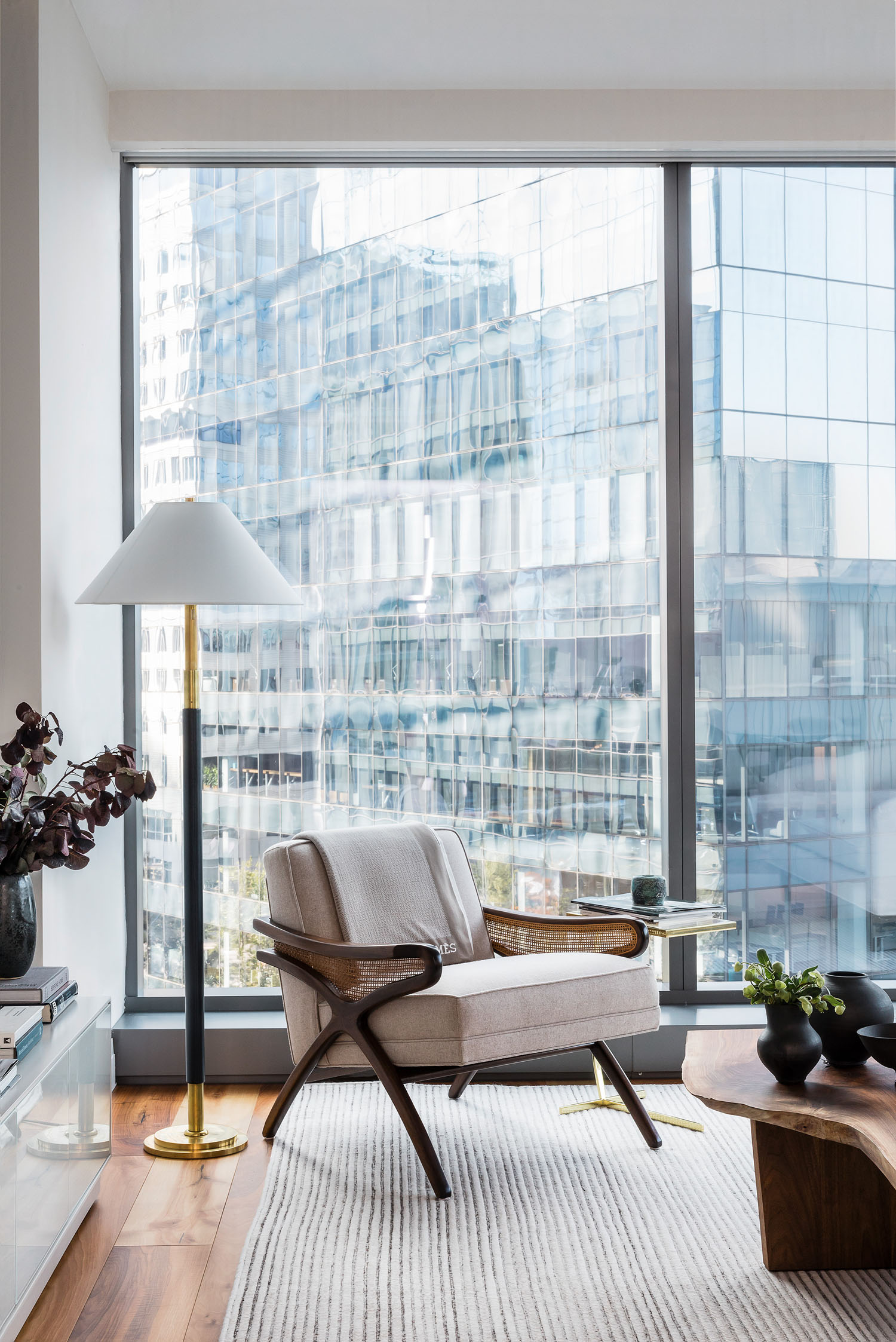
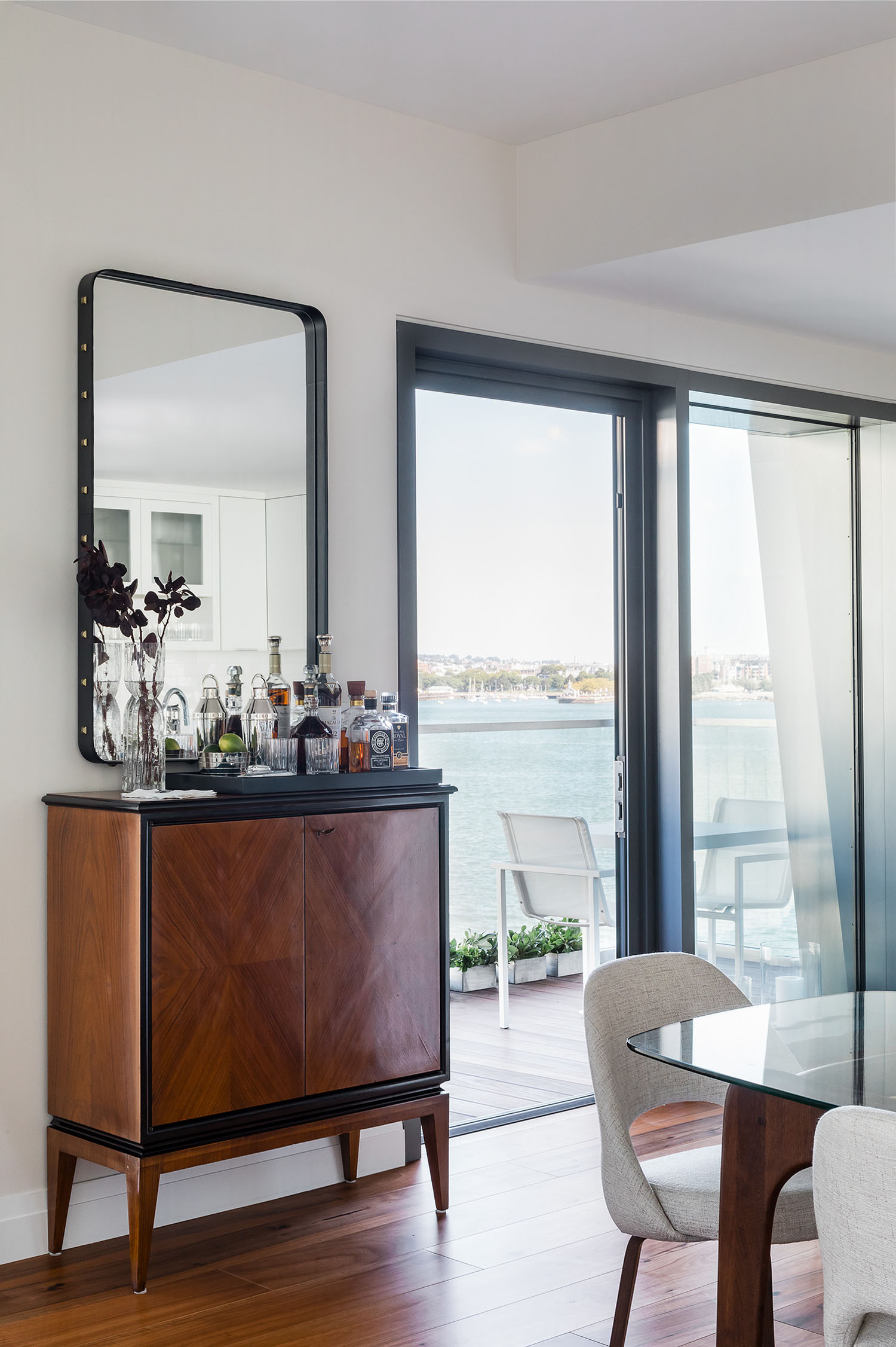
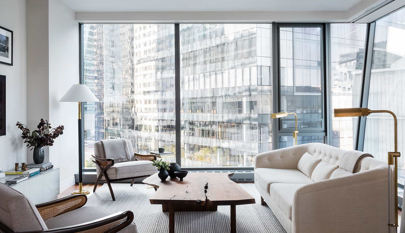
The property is fairly new: it was in full-blown construction when our client purchased. It’s a special spot, out on a pier in the heart of the Boston seaport. You’ve got an upscale, lively neighborhood with great shops + restaurants on one side, and these peaceful water views on the other. All of the rooms are marked by these incredible floor to ceiling windows, so we played off the idea of light + dark, and how the sunlight moves across the apartment. On the practical side, we installed motorized solar shades; the apartment gets SO much sun, it was important to guard against fading.
This is an upscale condo but certainly feels lived in. What are some of the key elements that you feel transformed it from ‘new’ to special?
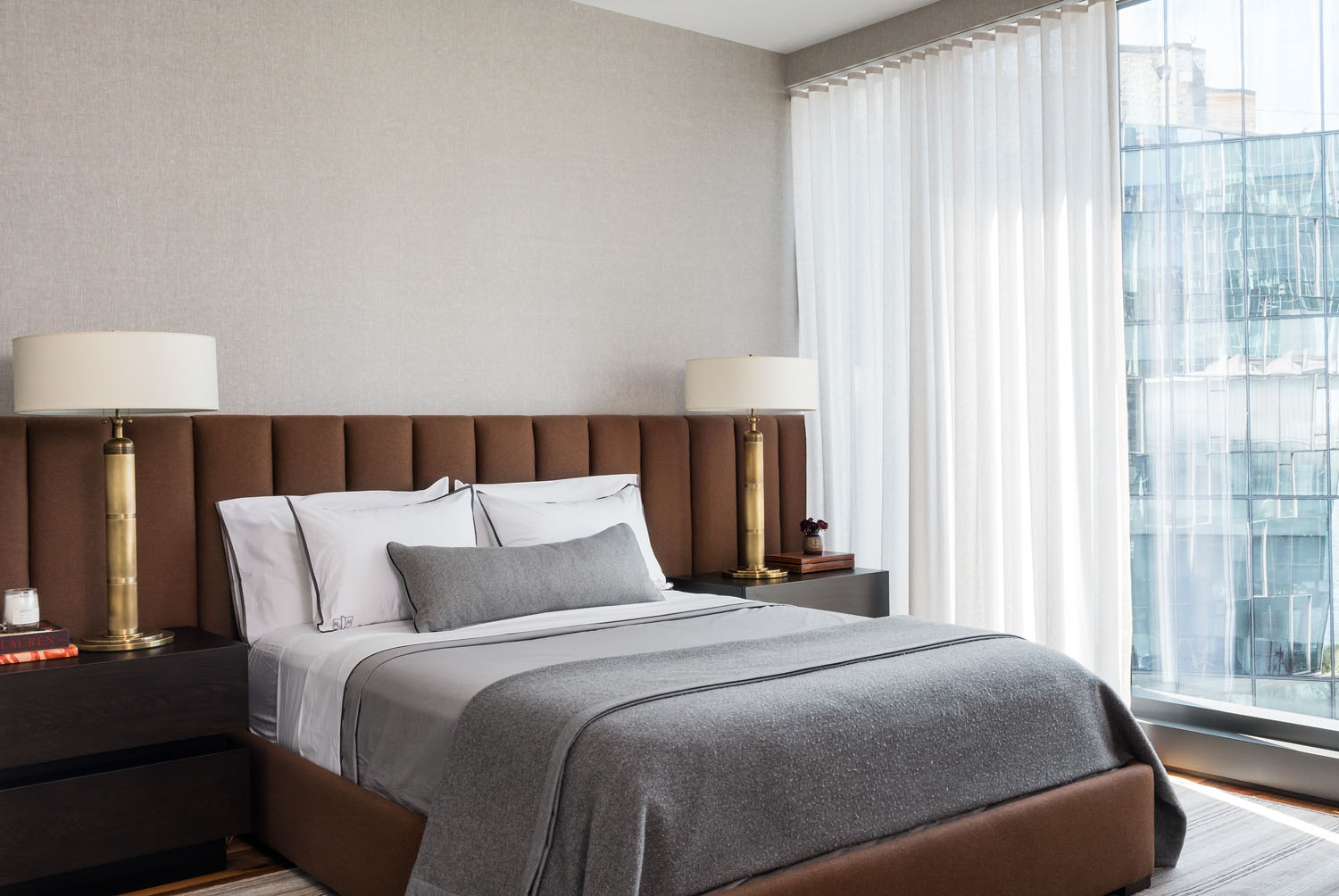
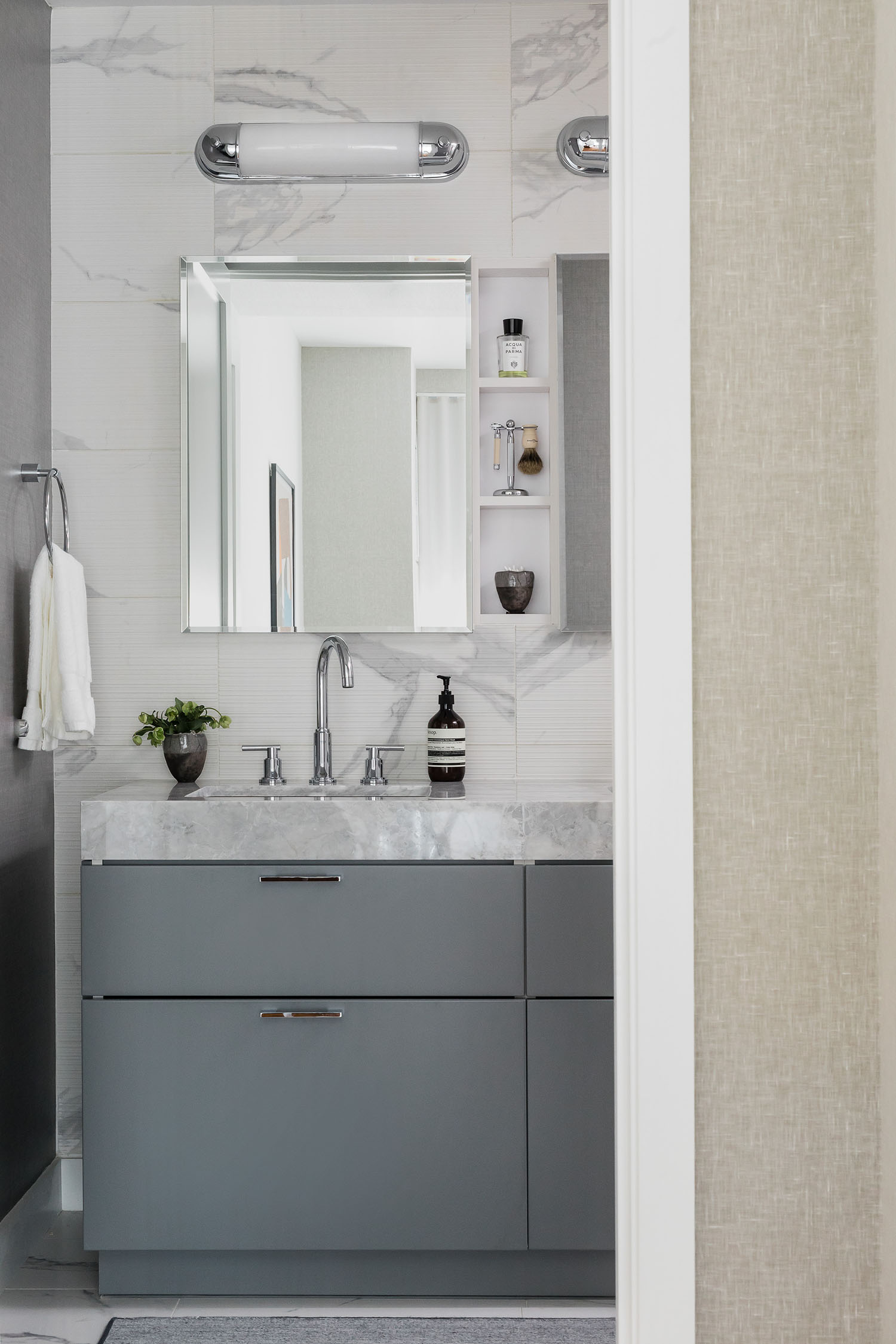
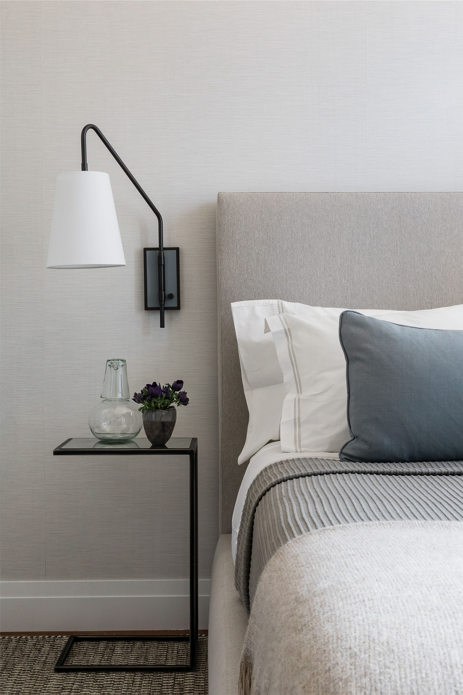
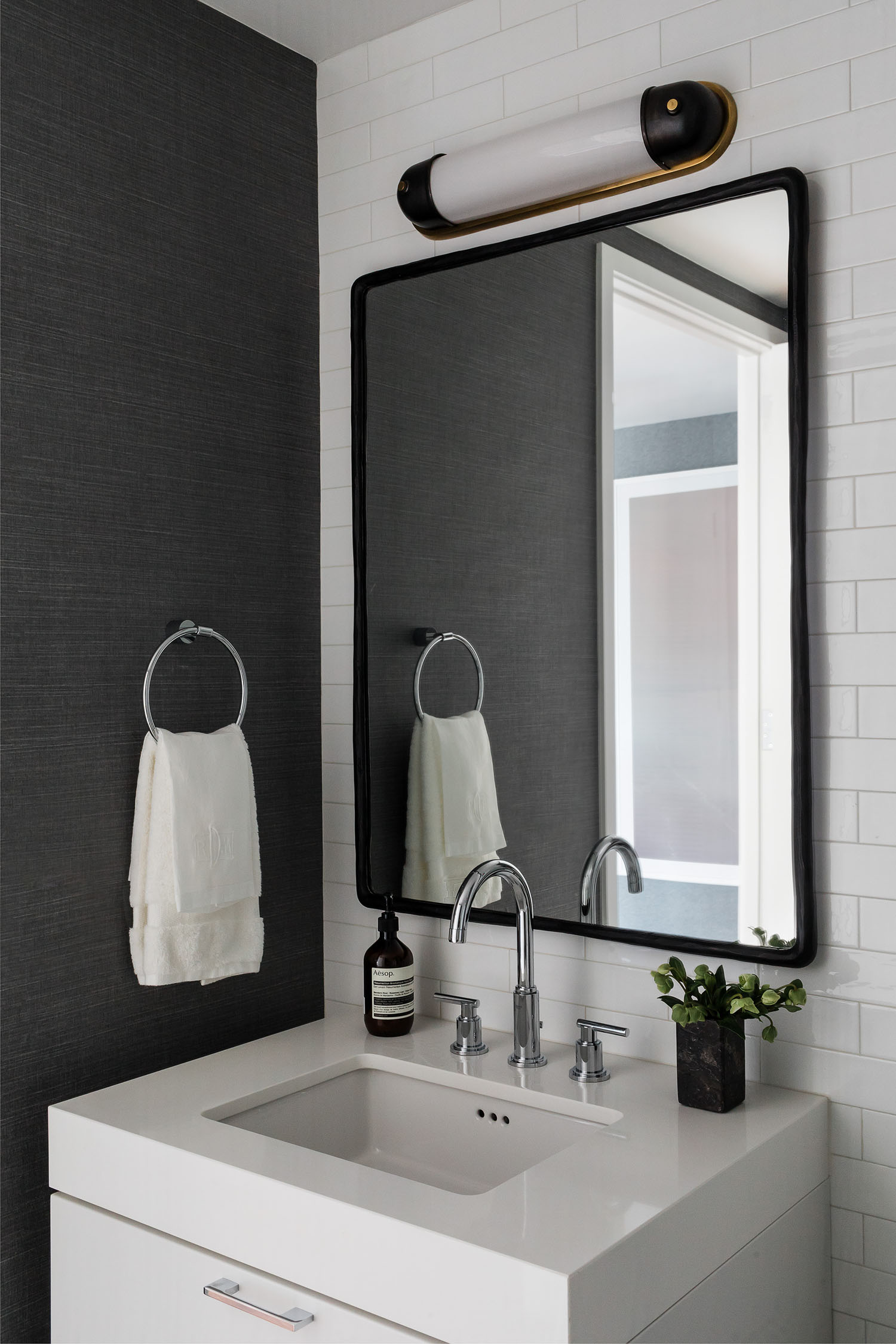
The apartment was a white box when we took over. We use a lot of wallcoverings in our practice, particularly textures like linen and grasscloth. For this project, we installed wallpaper in virtually every space (including the closet interiors!), except the main room. In the main space, we used a Portola Paints Lime Wash finish to add a more industrial look to the existing column.
Are there any elements that you feel especially made the space?
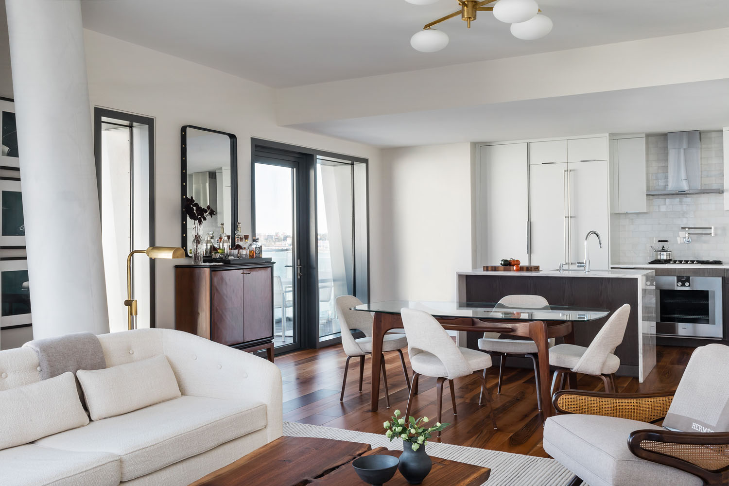
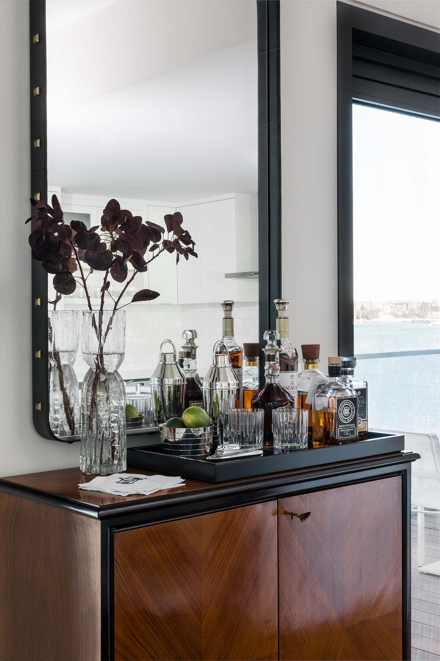
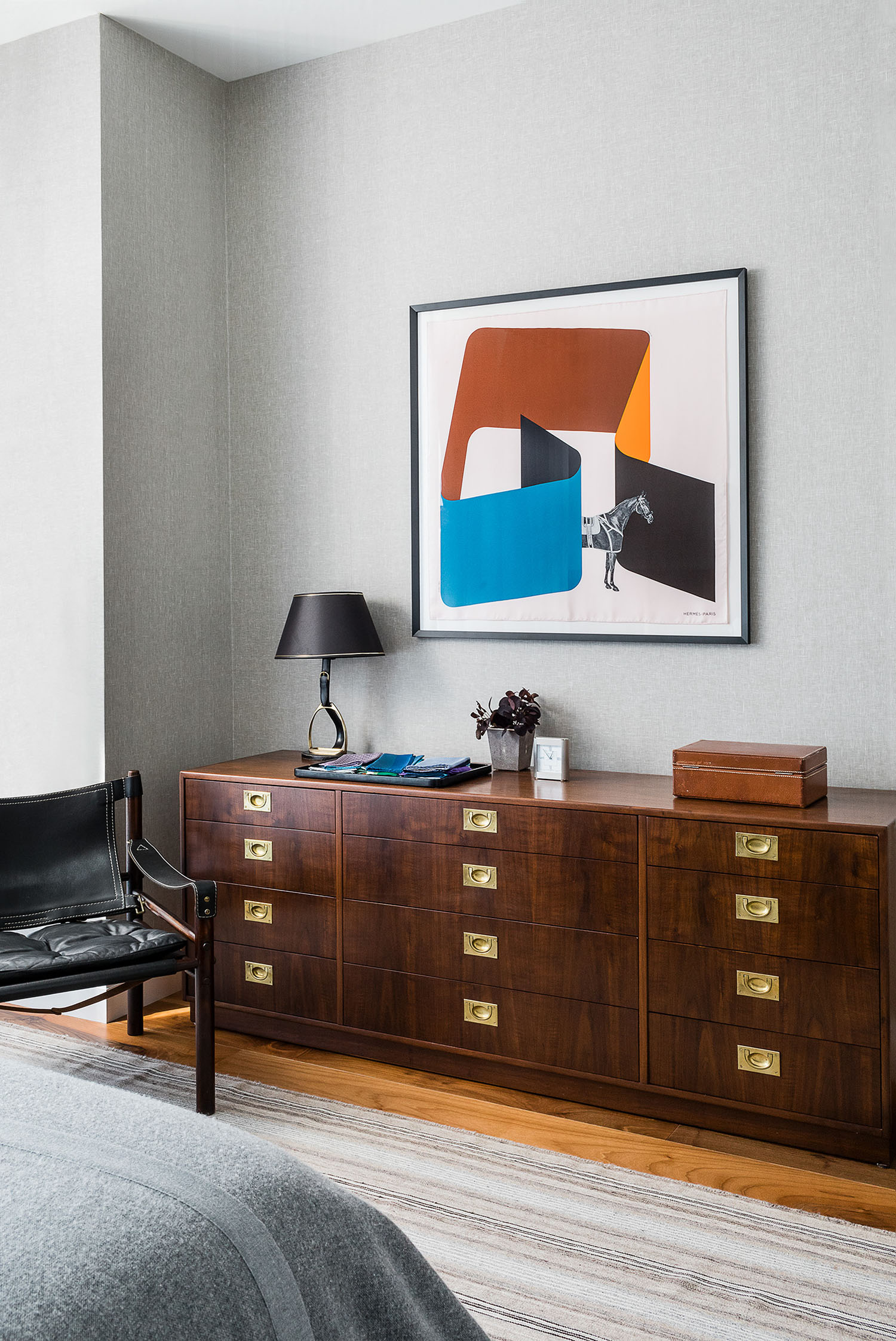
One of our best finds was the vintage Italian bar cabinet near the dining area. We had an awkward sliver of wall, sandwiched between two windows… It’s one of the first things you see, when you walk into the room, so it had to be just the right size and feel. The fact that the client has an amazing collection of barware, with top-shelf liquor, doesn’t hurt.
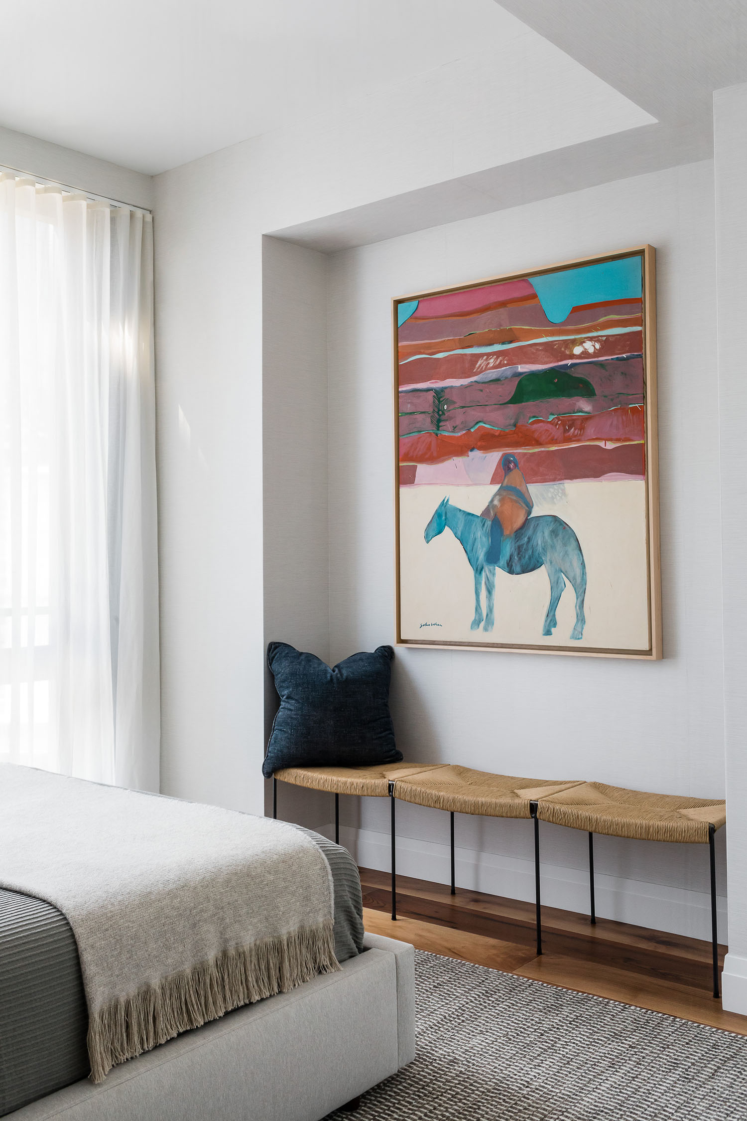
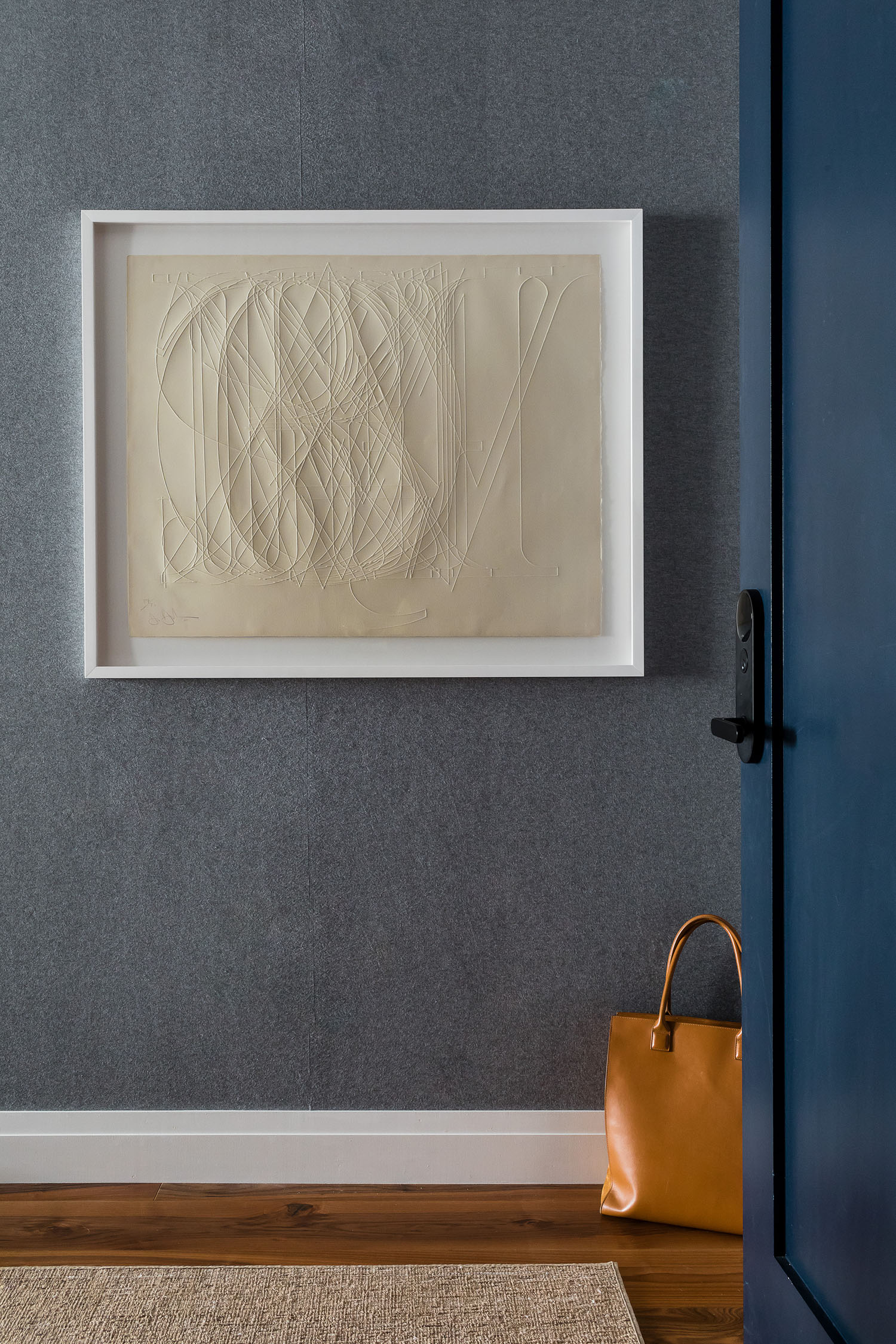
In addition to great barware, the client has an amazing art collection as well! How did you design with these pieces in mind?
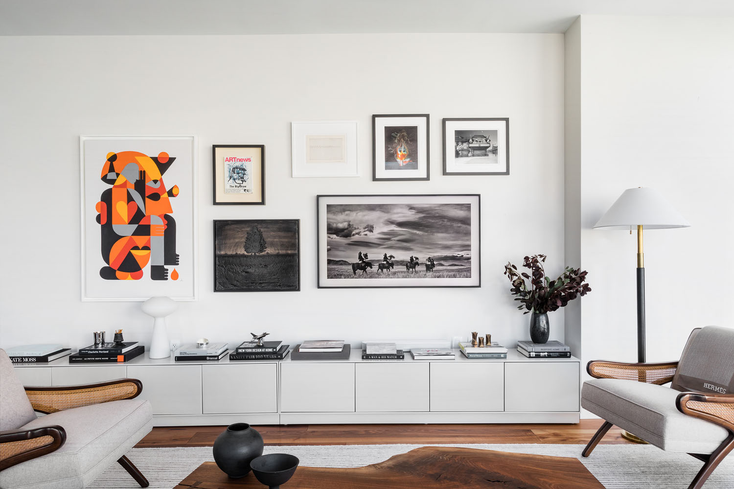
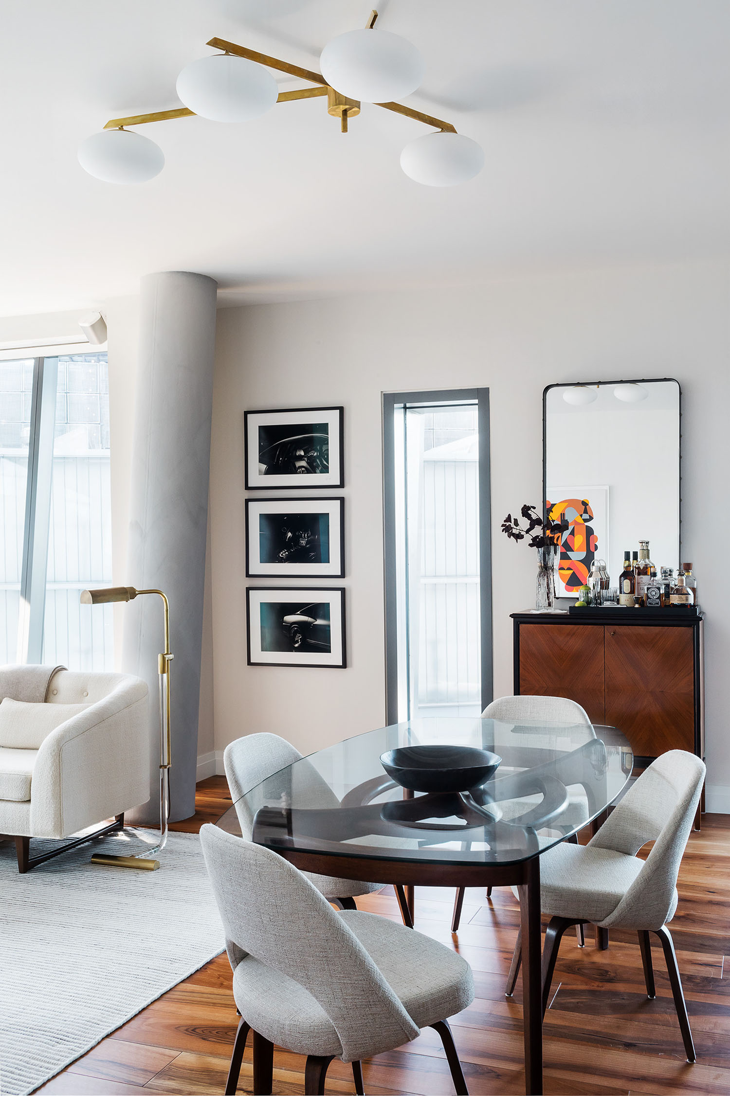
Almost all of the pieces have a story or some meaning for the client…we love the range of styles and mediums. In the living room, we had an expansive wall to play with; it’s one of the reasons we kept the furnishings and fabrics so neutral, so the art collection could really shine. One of our favorite scores is the delicate Agnes Martin ink on paper; the Guggenheim had just finished a retrospective of her work, so that felt like a special addition. The colorful Fritz Scholder piece in the guest room was previously owned by Frank Sinatra. As a surprise for the client: We worked with a photographer to print and frame a series of signed black + white photographs of the client’s own sports car. It’s a nice personal touch, and gives life to a narrow wall in the living room
What did the client say when he saw it all come together?
We always keep the final vision in our heads; for us, it’s satisfying, but not necessarily surprising, to see it all come together. It’s a luxury to have that “reveal” moment…sometimes in our work, that’s just not realistic. It was fun for us that this client didn’t see the space until it was completely finished, installed + styled. I think we continued to get texts and emails of happiness for a few weeks after he moved in.