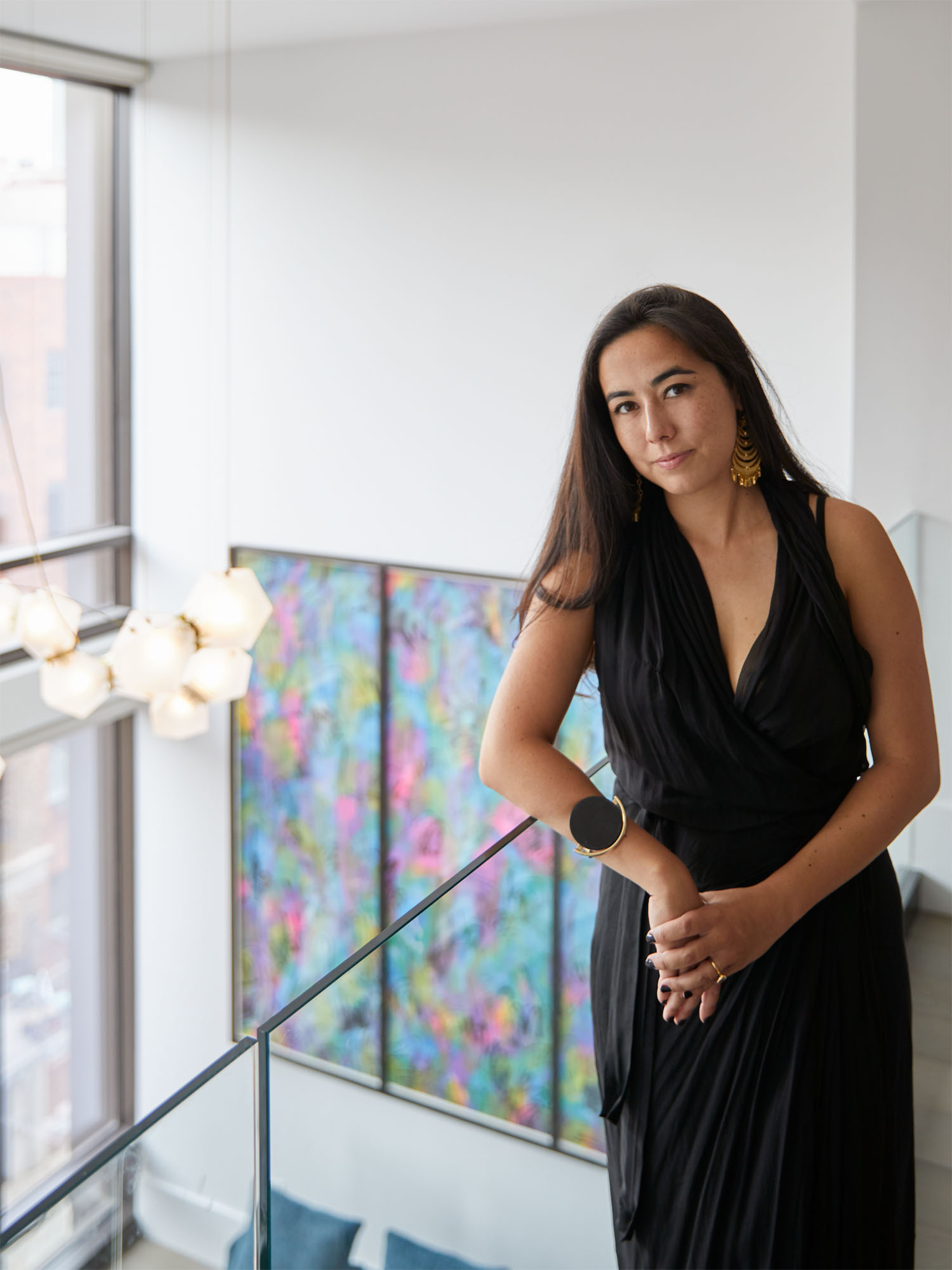

Designer Megan Grehl is no stranger to working under pressure. “I feel I actually thrive in those conditions,” she shares. For this project at The Oosten in South Williamsburg, a tight timeline (a new baby on the way for her newlywed clients!) and a strict budget meant she had to ensure every detail went off without a hitch. “Williamsburg is of course known for its edgy design, so we wanted to keep that spirit in the apartment while reflecting my client’s Asian background,” she explains. Through thoughtful custom elements, every square inch is maximized while the couple’s unique style is at the forefront. In a recent chat, Megan shared a bit of background on the project:
We’d love to know a bit about your clients. What were their goals in hiring a designer?
My clients were a newly married couple, Valerie and Leo, moving from Manhattan to Brooklyn for the first time. She has a more minimal yet feminine style, and his was more bachelor pad. Val was stressed about how to merge their two styles without too much compromise on either side. Valerie’s family also have an art gallery in Taiwan, so taking Valerie’s art collection into account was a big part of the process.
What was your initial vision for the space?
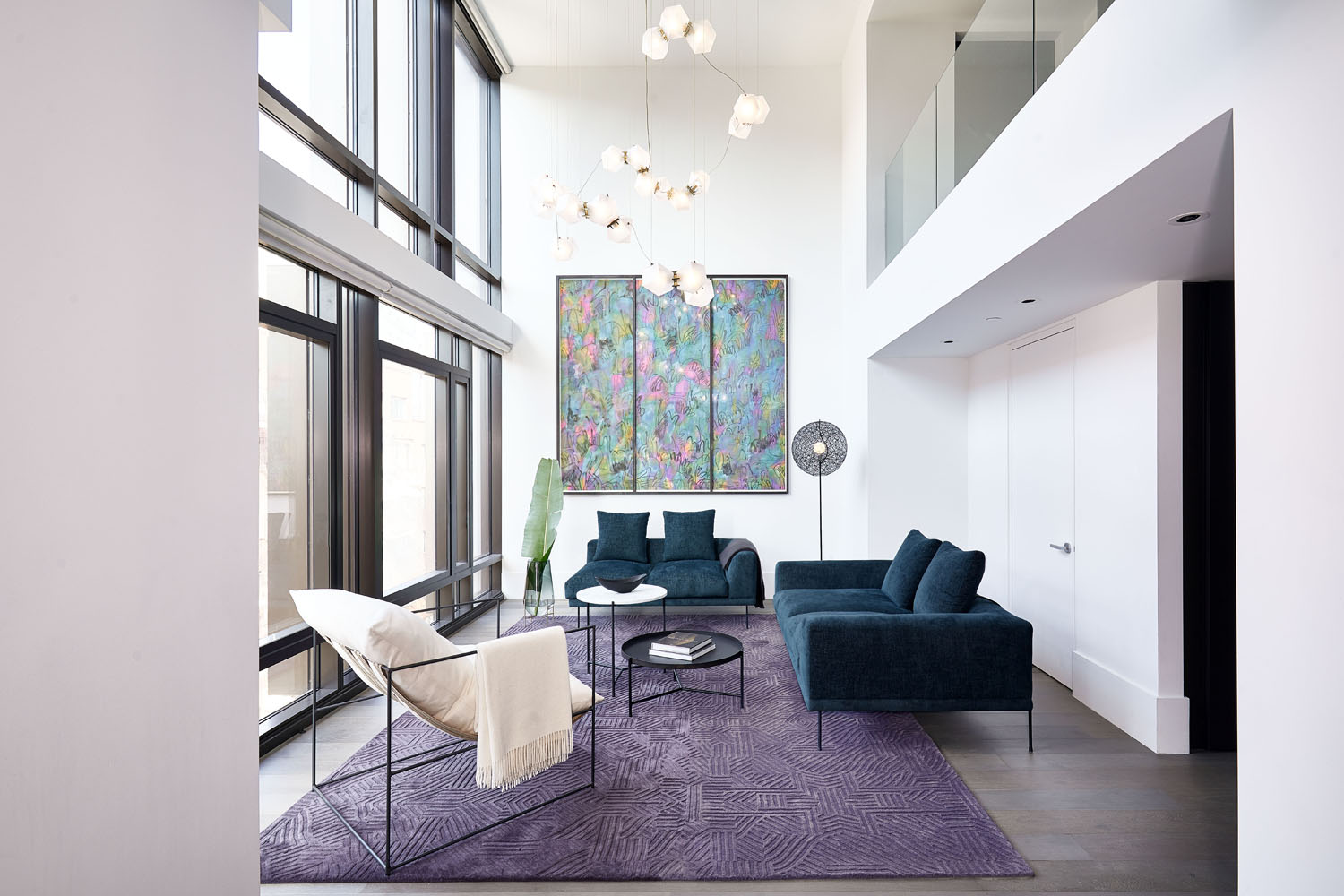
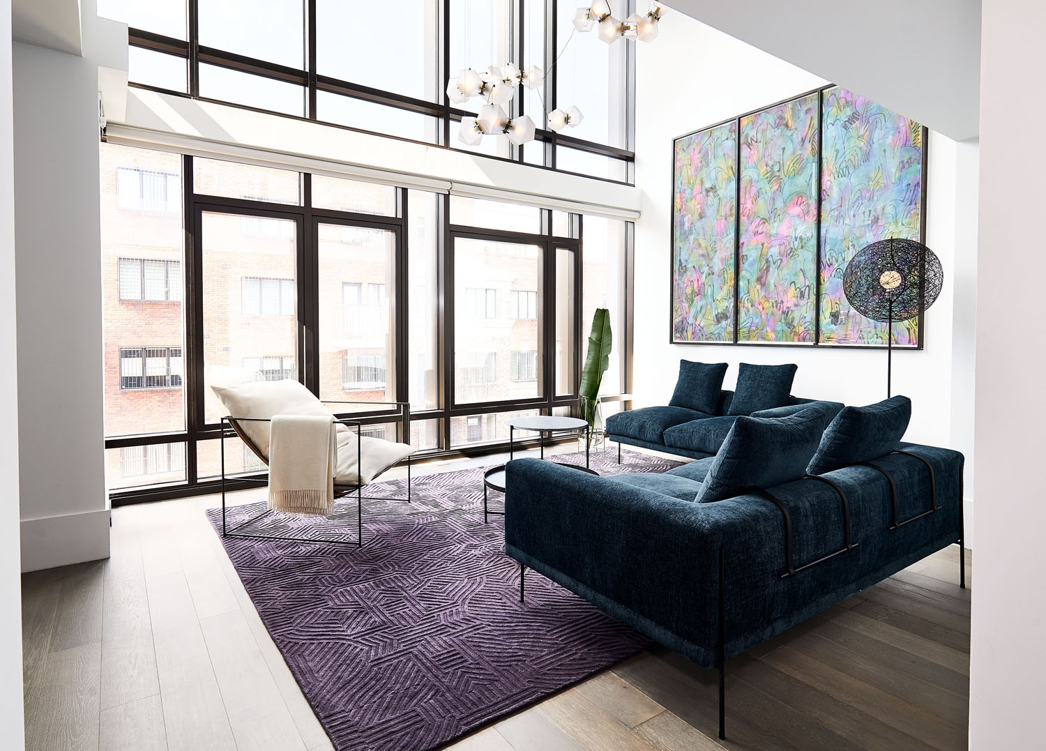
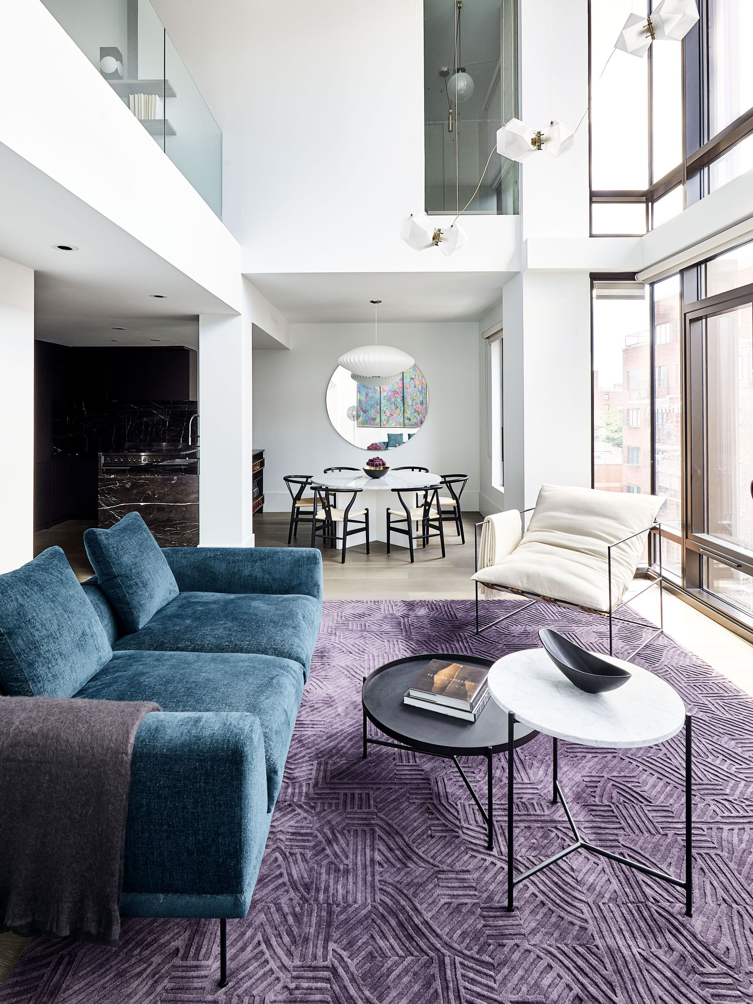
The space originally felt quite cold, so we decided that adding color and warm woods would be a great way to liven up the space. The duplex apartment was laid out in a way that it created a lot of unused space, so we sought to maximize all of these unused spaces. I would describe my style as statement minimalism. Which may seem like an oxymoron, but I like to focus on the “wow” moments while giving your eye negative space to breathe. It’s a very yin yang approach.
The layout is definitely unique. How did you work with the challenging floorplan?
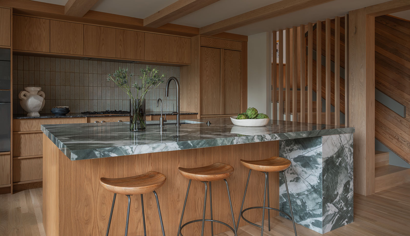
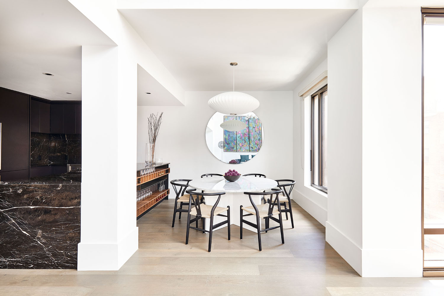
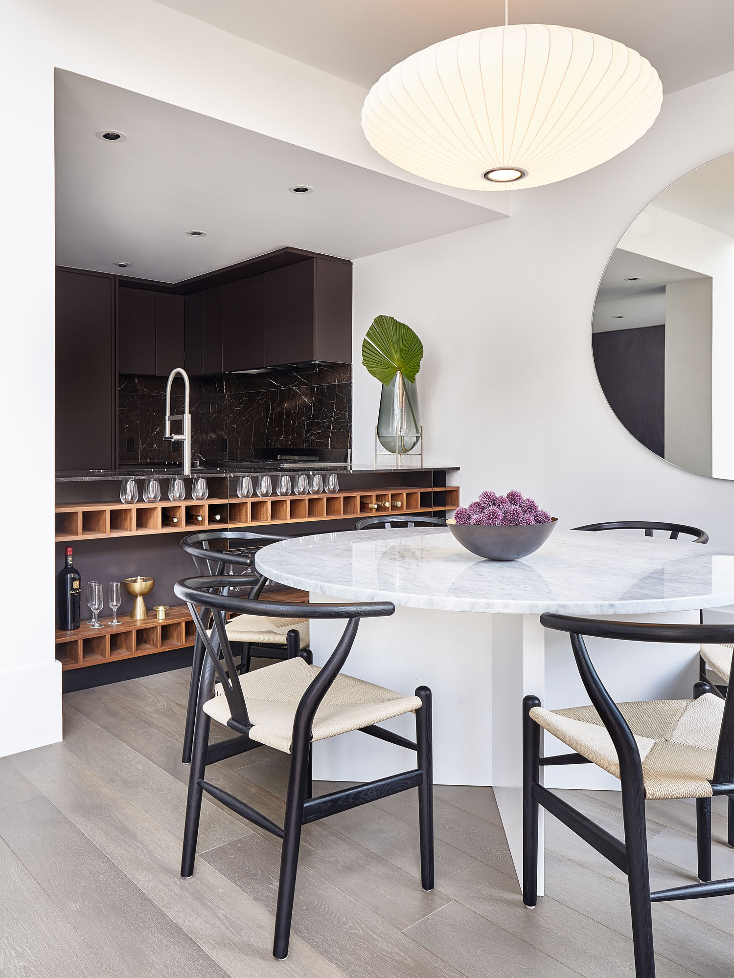
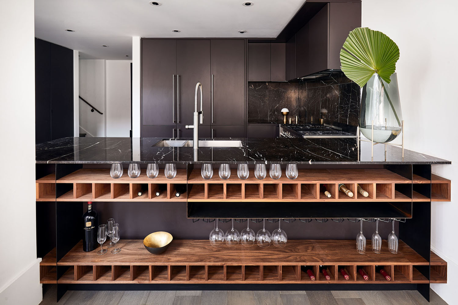
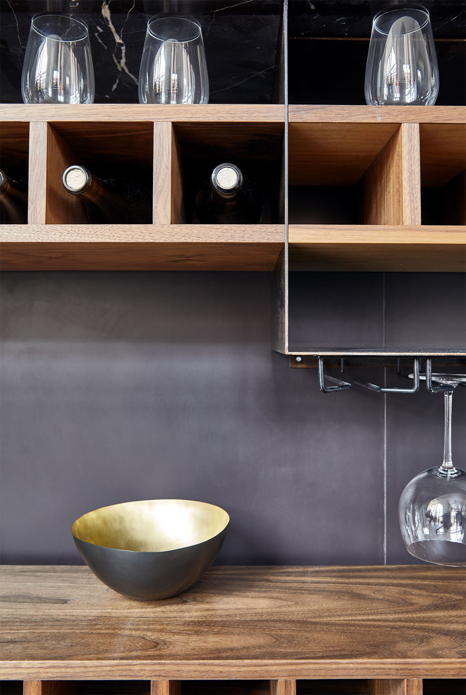
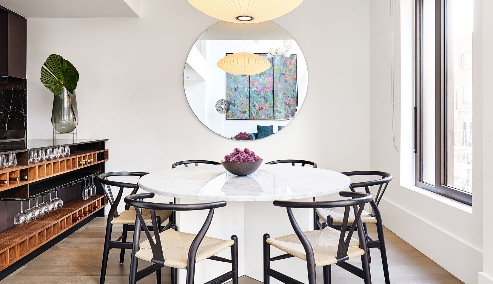
This was not an easy space to design, but what I am most proud of is how we took the difficult moments and turned them into feature moments. For example, the dining area was very small and felt cluttered with the area counter stools would normally go. Instead of choosing two competing seating arrangements, we utilized the space under the bar to create a wine storage feature area. Instead of a dead space, it evolved into a beautiful piece of walnut millwork.
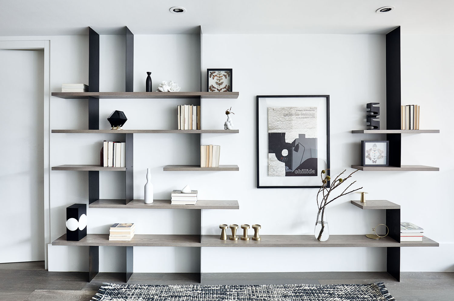
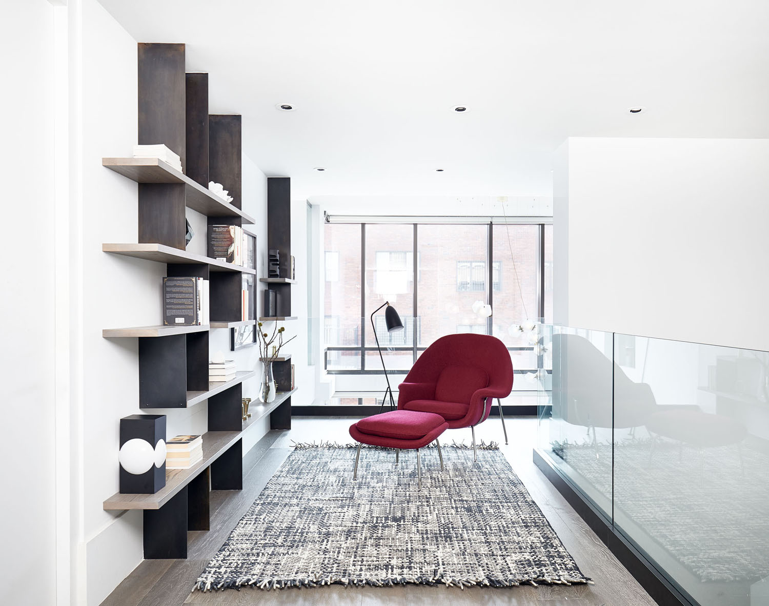
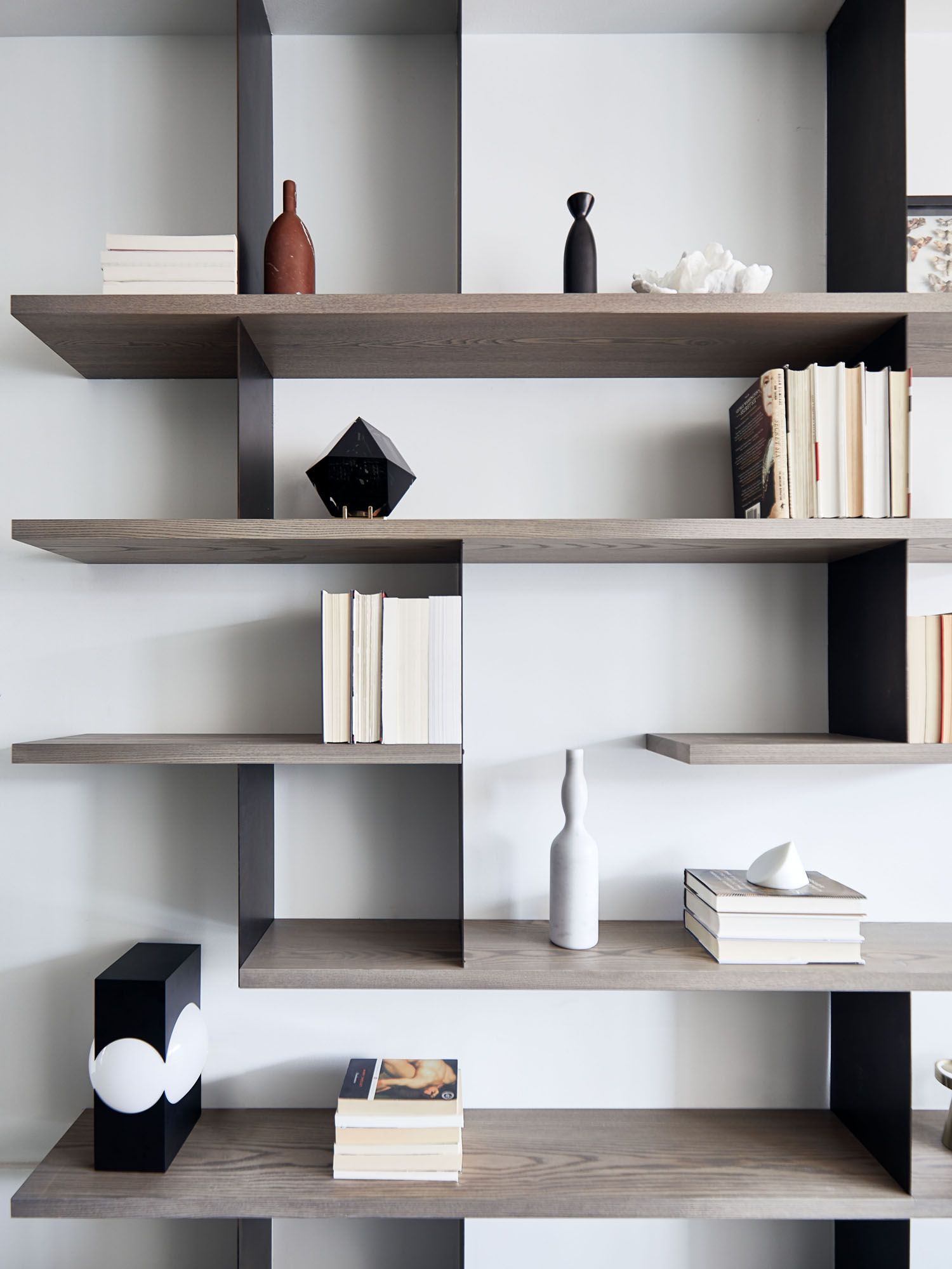
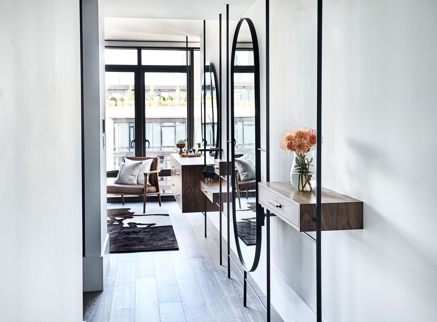
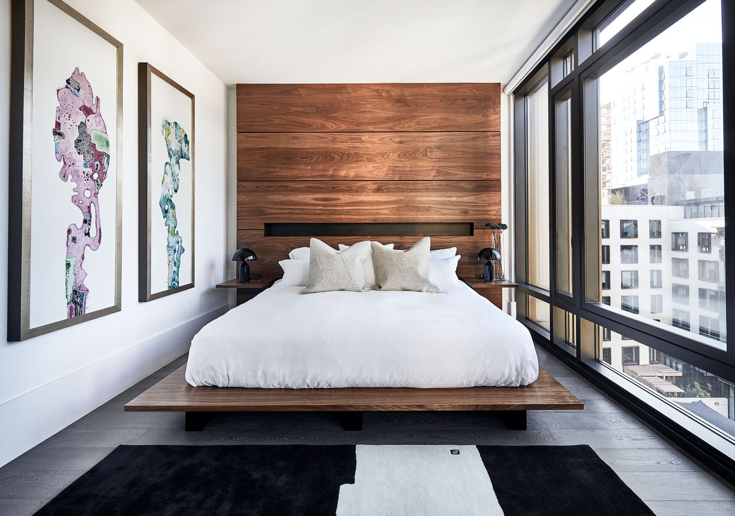
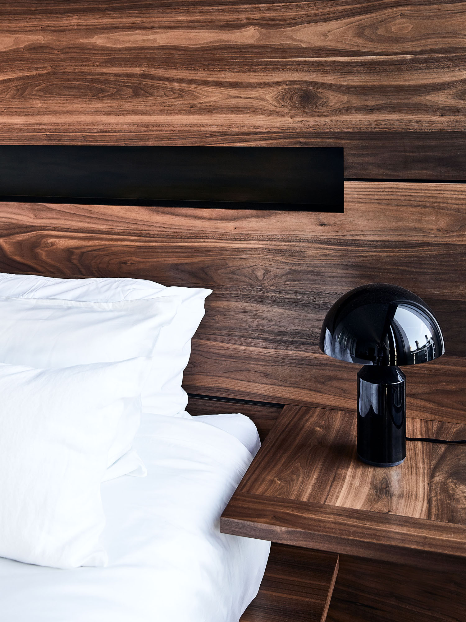
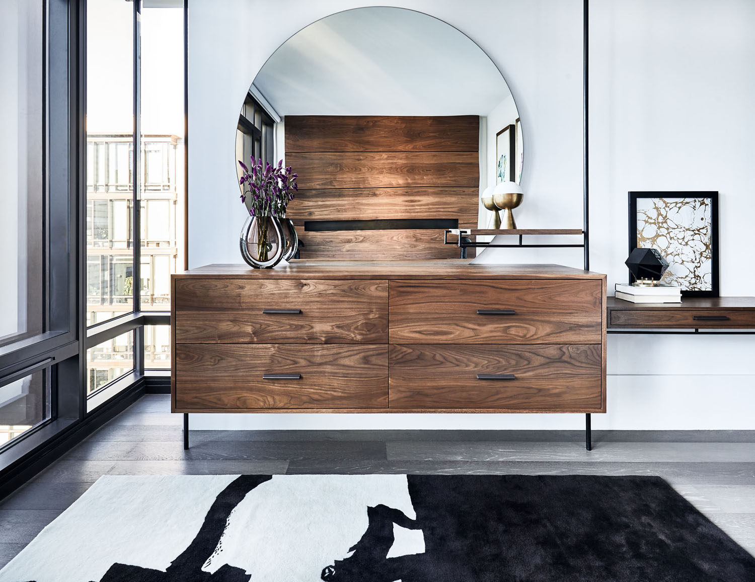
The primary bedroom was another area where we did this. Although the duplex is huge for New York standards, the bedroom felt narrow and uninviting. As design is all about visual trickery, we created a large custom bed with the headboard starting at the floor all the way up to the ceiling, to give the illusion of a grand space. In the hallway, we created a series of floating millwork, that felt lightweight but still added storage and interest to an otherwise dead and utilized space.
We know you were on a tight timeline with this one. Were there any hiccups?
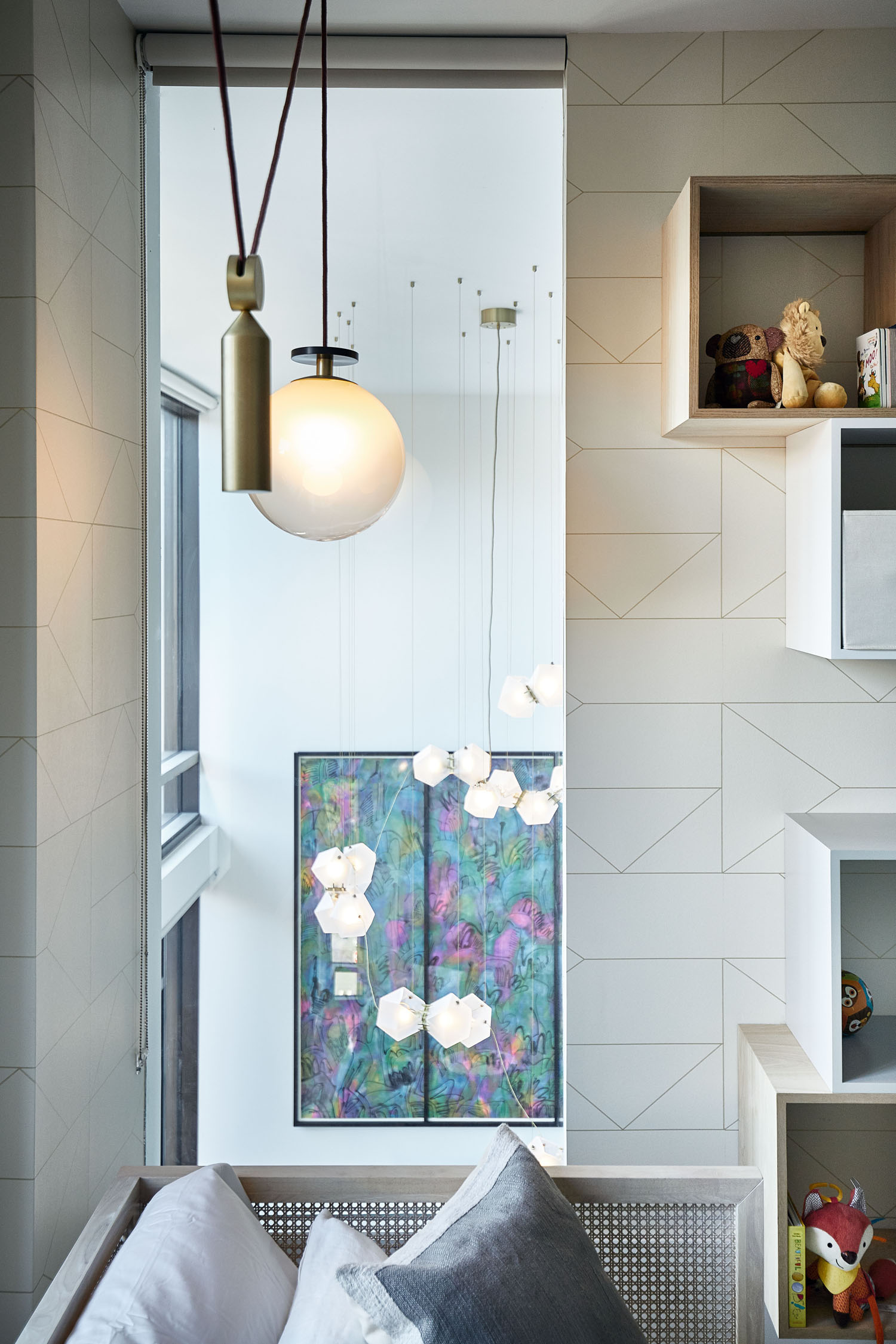
As our client’s had their own resources for commissioning artists, they ordered a very large oversized custom painting from Asia. When it arrived, we realized that it was impossible to frame and then get it through the door. We looked into hiring a crane and removing the windows, to no avail. We finally came up with the solution to do a customized triptych like frame, which would be broken into three pieces and could be assembled and installed on site.
This home is harmonious… east meets west, masculine meets feminine. How did you find the balance?
As I mentioned, my yin and yang approach is based on positive and negative elements. Which is a philosophy that you can find in Asian art but also in Western art periods like the Renaissance. To me, this approach is universal. The human eye wants interest but it also wants rest. To maximize the experience of any space, it’s about balancing the moments of intrigue with moments of calm. Hard materials with soft materials. Bright colors with neutrals. Big moves with no moves at all. It’s the dance of life and space.