
Designer Sarah Storms—the creative behind Styled by Storms—has a penchant for color. She studied Fine Art & Interior Design at James Madison University before living abroad in Vienna, Austria. It was there that she truly defined her style—saturated colors, a juxtaposition of historic vs. modern, and the influence of great artists & designers from the succession movement all became foundational in her work.
For this particular project, that point of view takes center stage. “While this is a family home with the clients living here with their young son, the living room was specifically designed to be a more adult space,” she tells us. “With a large den and playroom for toys and family time, the parents wanted a dedicated entertainment space where they can enjoy an evening cocktail listening to their favorite records or simply curl up and relax with a good book.”
Sarah employed a mix of dark and light, added bold patterns, and punctuated the space with brass accents. She tells us how it all came together:
What can you tell us about this home?
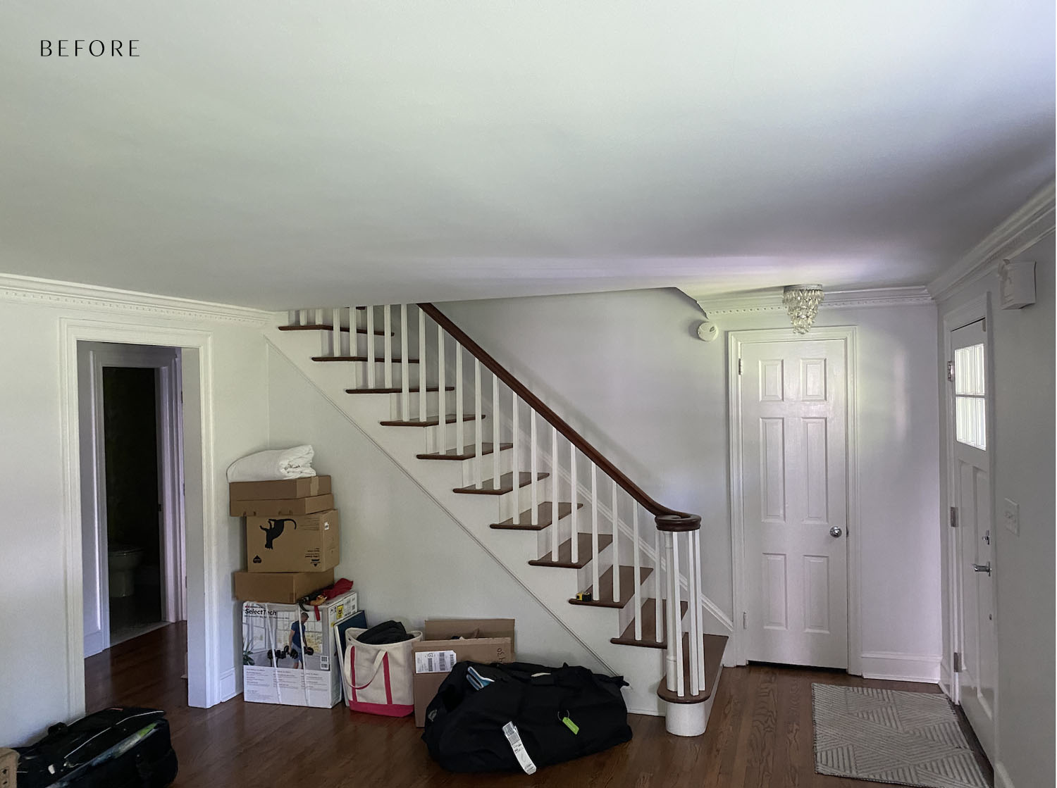
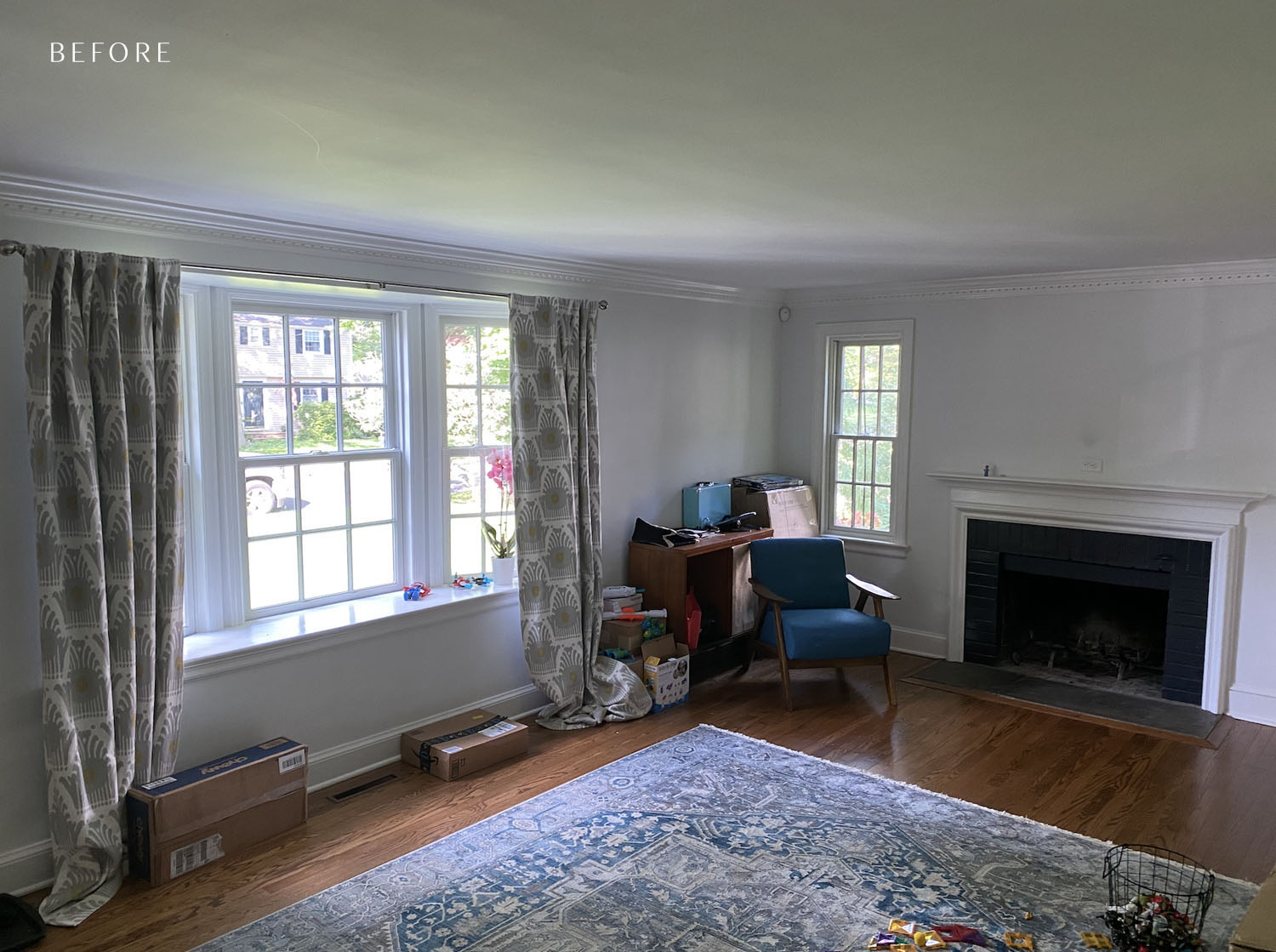
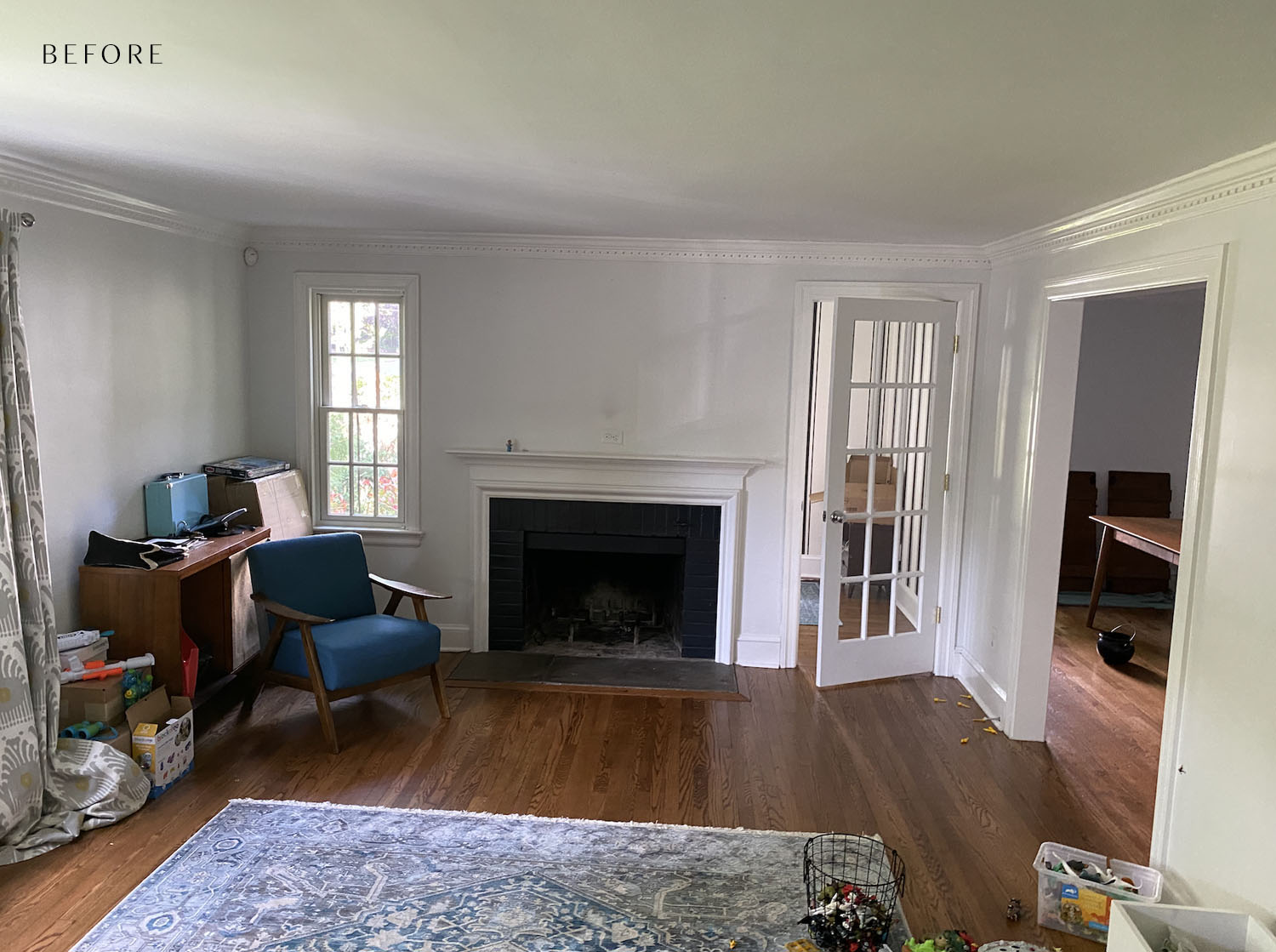
This Colonial home is located in Chatham, NJ. The owners purchased it about a year ago after renting in Los Angeles and Brooklyn for many years. Built in 1934, the home features many historic influences throughout, including that beautiful dental crown molding in the living room. While some may see these details as “small,” they provided huge inspiration for the current design.
The space is both moody and bright. How do you feel you struck that balance?
The clients reached out to me after seeing previous projects with dark and moody wall colors. They really wanted this space to channel a dramatic vibe, but they were nervous about the room’s lack of natural light. So, it became a balancing act to create a moody space that didn’t stray too far into the dark.
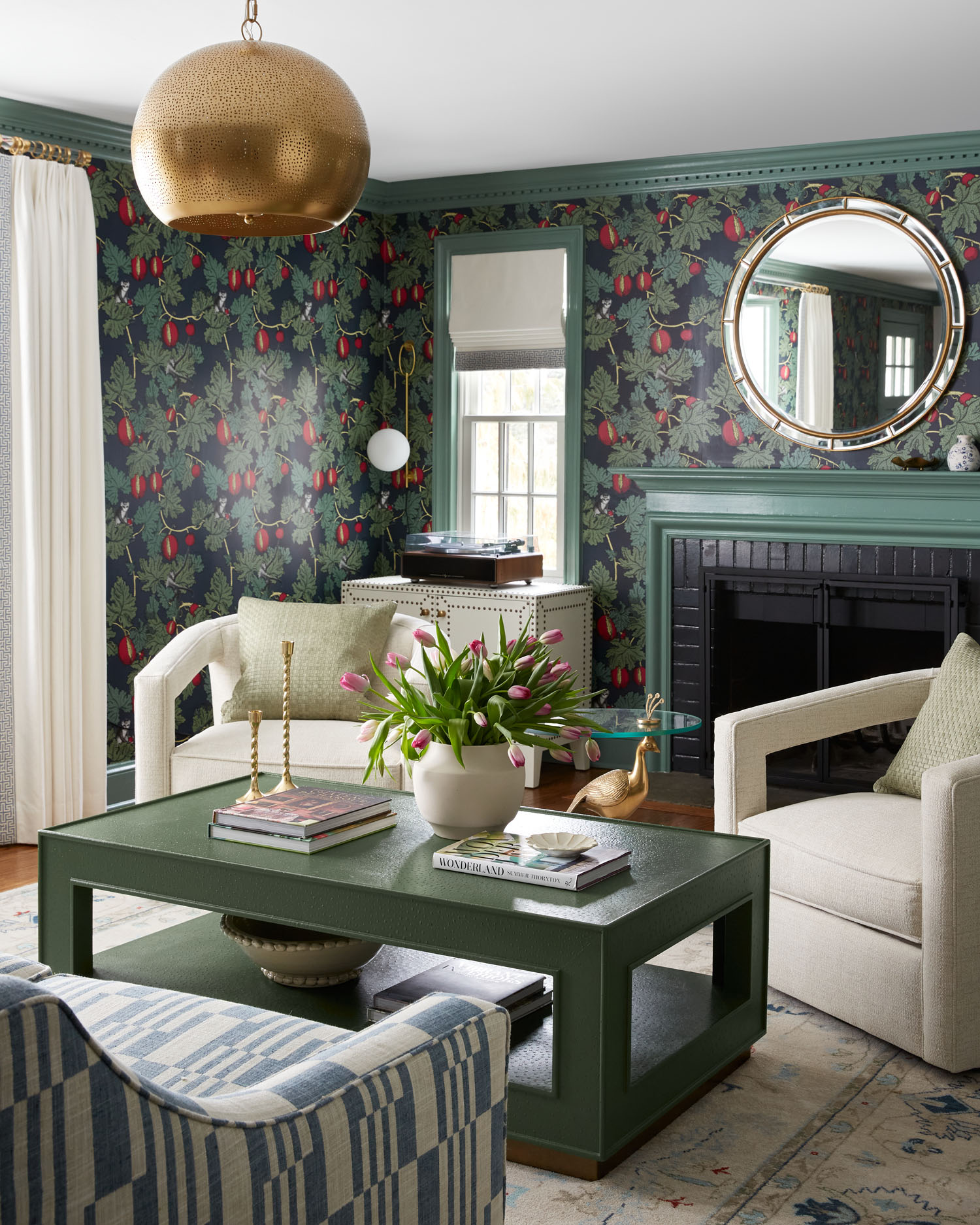
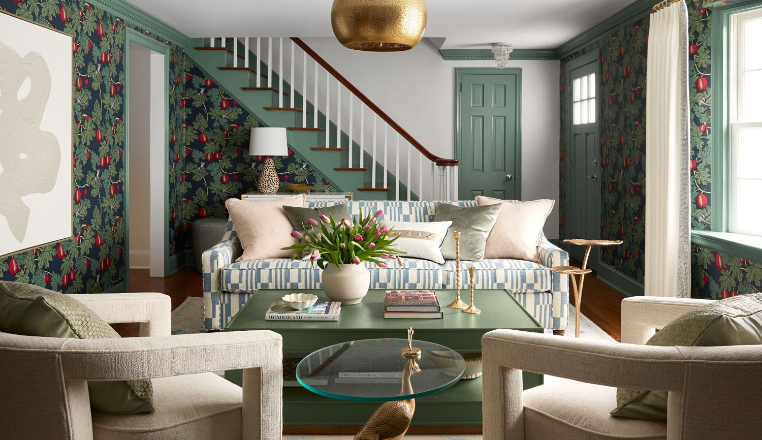
To achieve that I used a strategic mix or darker and lighter tones punctuated with bright pops. This is what makes the room feel like the kind of space that envelops you in warmth without overwhelming.
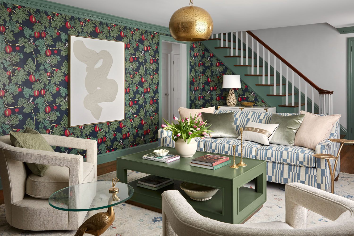
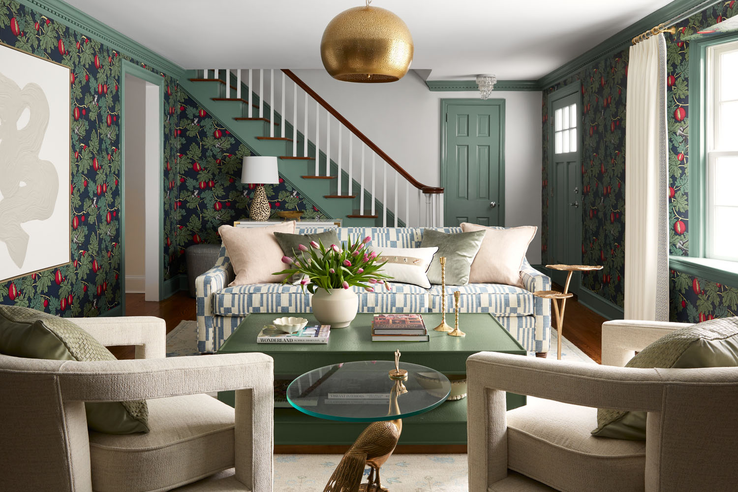
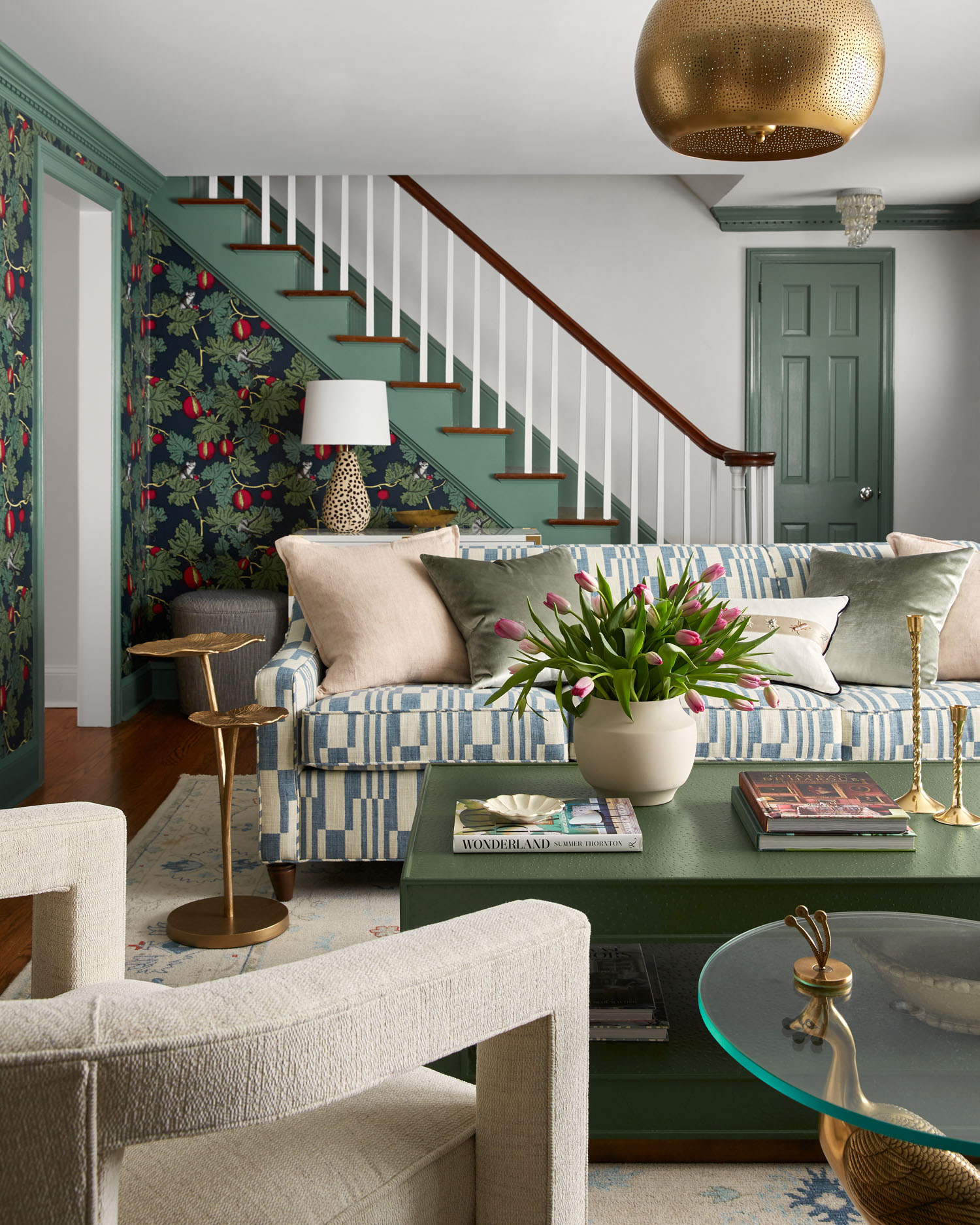
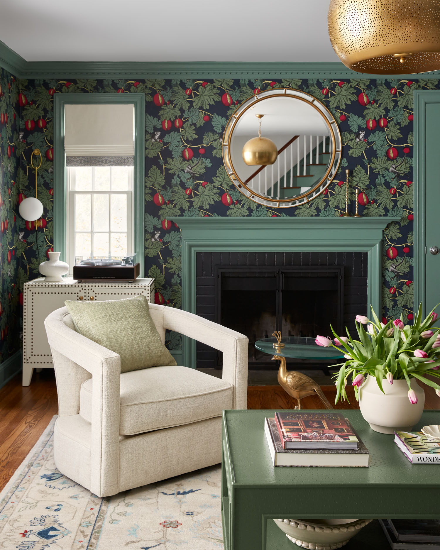
Like most of my designs, the inspiration came from the print in the wallpaper, which is Cole & Son Fruitto Proibito. The colors are so beautiful—deep, rich, and enveloping. That organic feeling of the foliage and the whimsical monkey peeking out is both whimsical and sophisticated with zero stuffiness. Perfect. The trim color was pulled from the paper. I knew this would make the room feel warm, but it was also a risk. I think my client was even a little nervous, but they really trusted me and process to pull off the moody & bright room. My secret weapon was adding the bright contrast through the rug and the furnishings instead of the traditional white trim.
What was your scope of work?
The scope was full concept to completion. The living room was completely empty when I started working with them, and my goal was to deliver the dream they desperately wanted — down to the very last details.
But before we could get to those final design flourishes, we had to start right at the beginning. First, we needed to address some electrical work in the space prior to the cosmetic upgrades. Besides rewiring some areas, we also added a beautiful, pierced metal dome pendant to add some drama along with recessed lights—all on a dimmer! Getting the lighting was vital, both to take into account for dreary New Jersey days when extra light was needed, but also to balance out all of the rich color that was going in.
This was more than a simple refresh, and the clients had a few special requests. What can you tell us about some of the more personal elements of the space?
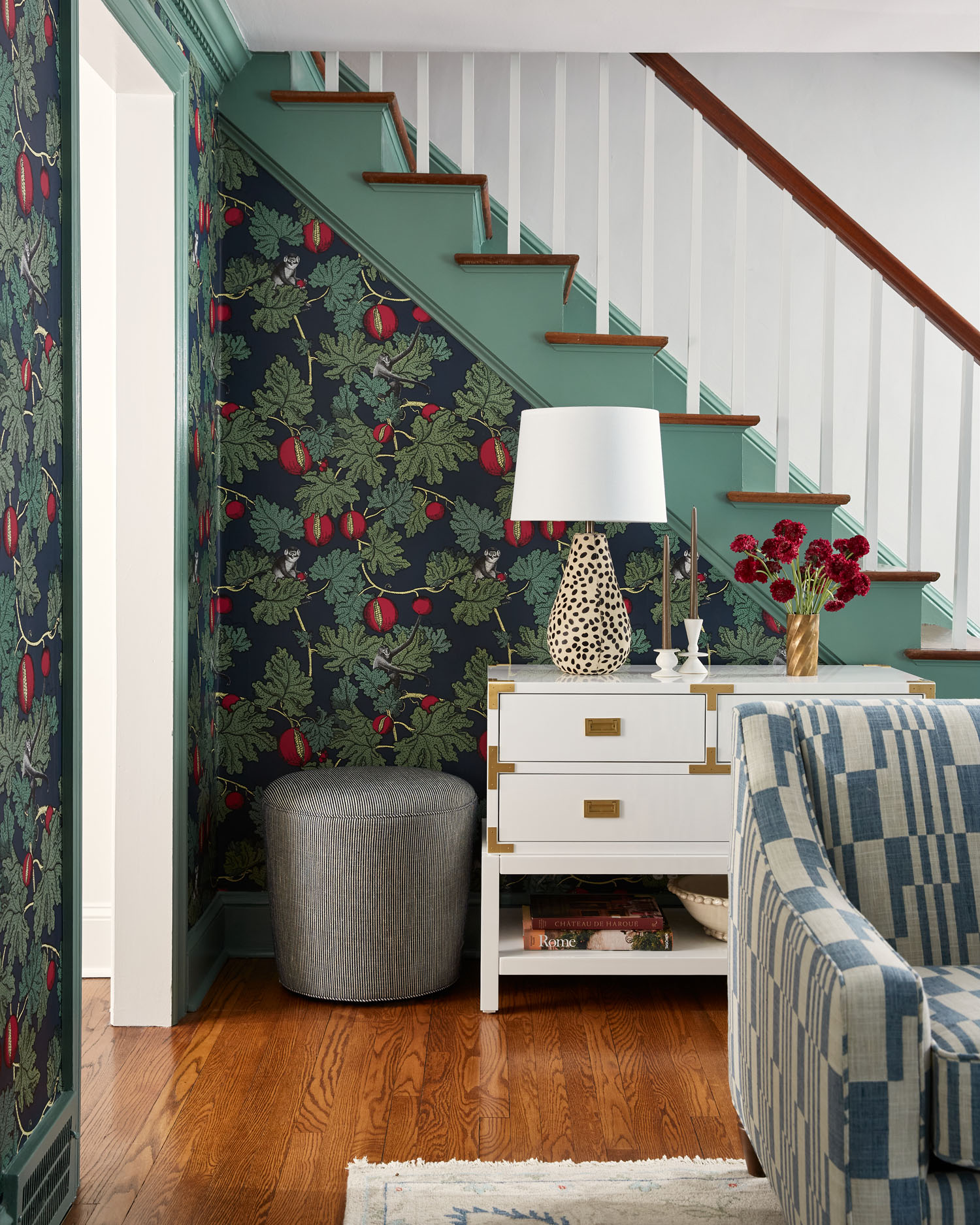
Besides feeling like an adult space, a major part of the scope was to create a foyer—where none existed. This home literally had no entry way. The front door goes directly into the living room with zero no place to place your keys or put your purse.
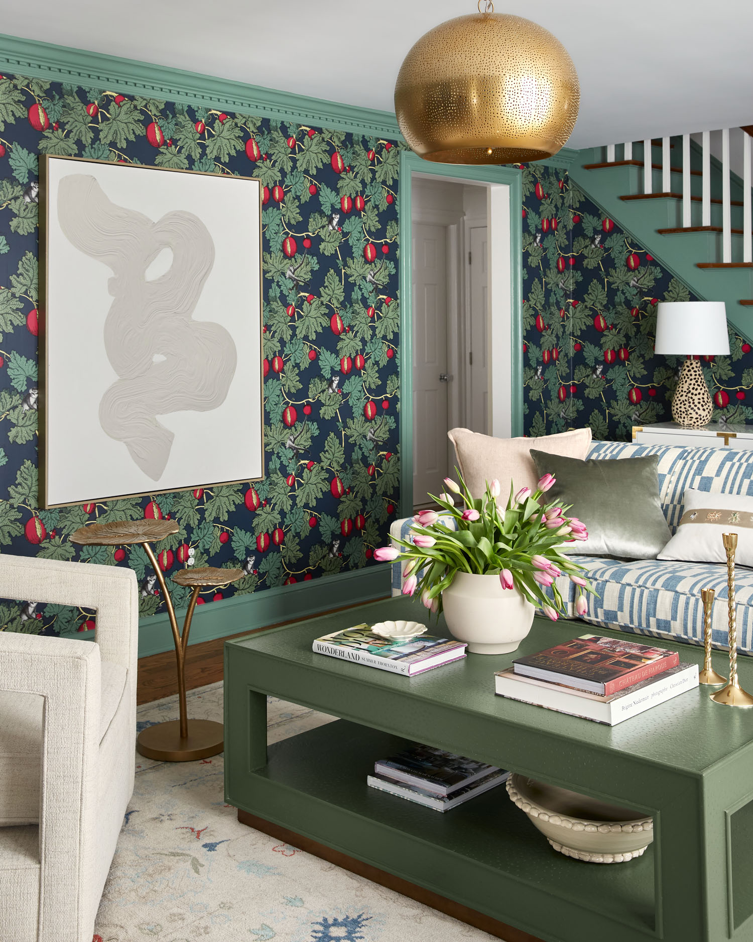
By orienting the room off the fireplace, however, we were able to create a walkway behind the sofa where we added a console against the stairs. Instant drop zone. And bonus points—with its white finish and brass campaign details, the console connects to the record player that is directly across the room, thus creating the light anchor points in the space. Swivel ottomans are on either side of the console for both functionality and additional seating for parties.
Almost all of my clients are asking for a dedicated space for their record players. Maybe it’s a Brooklyn thing? In the custom console, we were able to have a beautiful surface for the record player, but also within the console storage for albums and a media hole for cords.
With all the pattern on the walls, art can sometimes be tricky to layer in and sometimes people can be tempted to forgo art all together over wallpaper. But this can really leave a room feeling not quite 100 percent finished. Here we used a large-scale neutral abstract swirl to complete the space without competing with the wall pattern.
How long did the project take?
This project moved quickly. Design development started in July 2022 and we installed almost everything the 2nd week of December in time for the holiday. My clients are so happy and in love with the space. It is everything they were hoping for. It’s funny every time I see my clients, they can’t help but gush about something new they are enjoying.