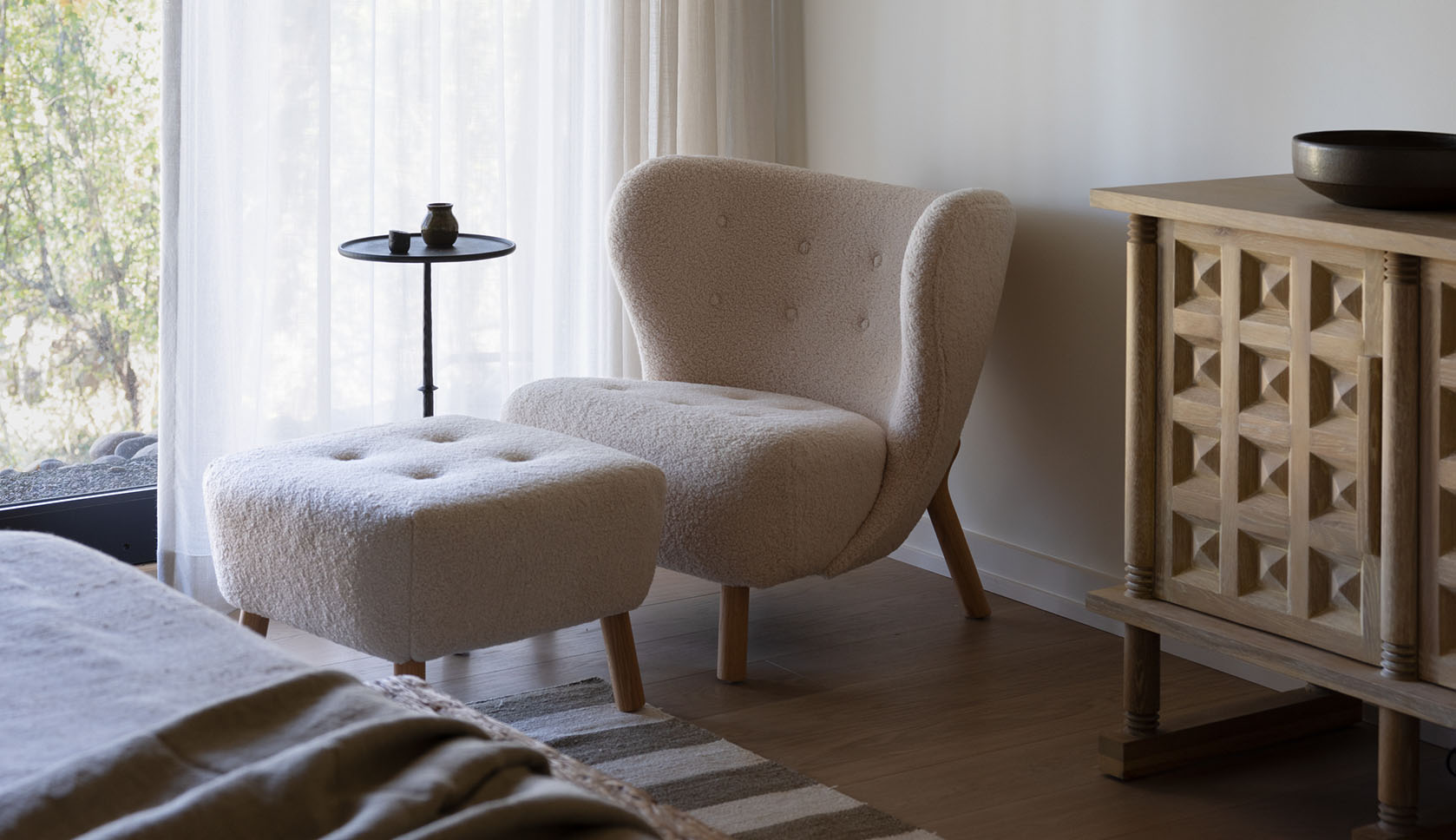

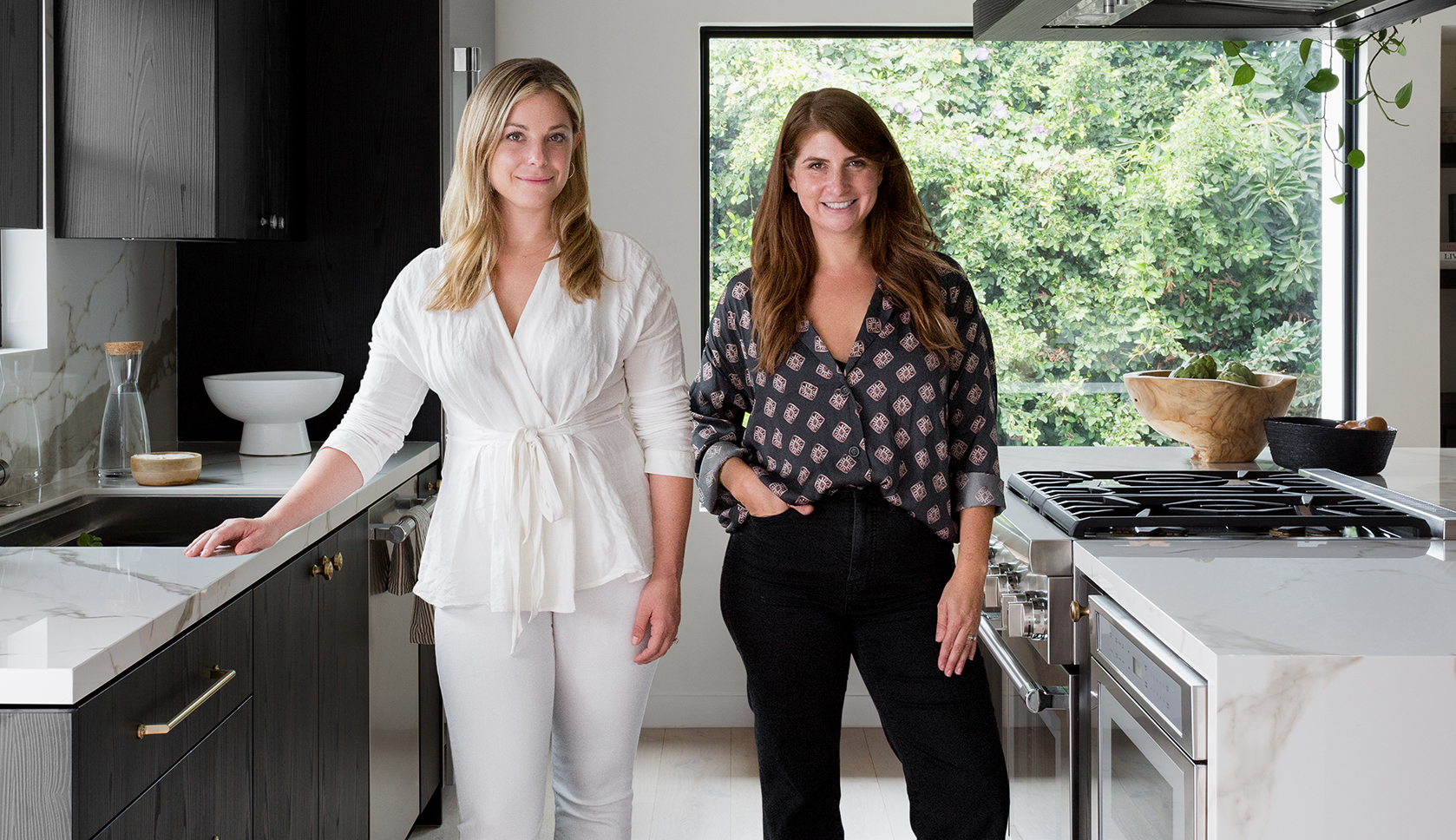
Designer Casey Gerber and her fiancé purchased this Los Angeles triplex with one goal: to slowly but surely remodel each of the units. Gerber, who had been working alongside designer Tarryn Brodkin for years, realized it would serve as the perfect canvas to launch their new design firm, Two Tone Interiors. The pair relied on smart storage solutions, a high-contrast palette, and classic California decor. Though small, it’s absolutely stunning and features a lot of clever design tricks any apartment could benefit from. In a recent chat, Gerber told us more:
Tell us a bit about the apartment. Where is it located, how big is it, and what condition was it in when you bought it?
The triplex is located on Montana Ave in Brentwood Glen. It was in original condition and was built in 1947. The total building is approximately 2,290 square feet, but the unit we moved into and renovated first is around 850 square feet. Overall, the building was very outdated and needed a lot of TLC — new plumbing, windows, roof, new electric, HVAC, etc.
What were your top priorities when updating the space?
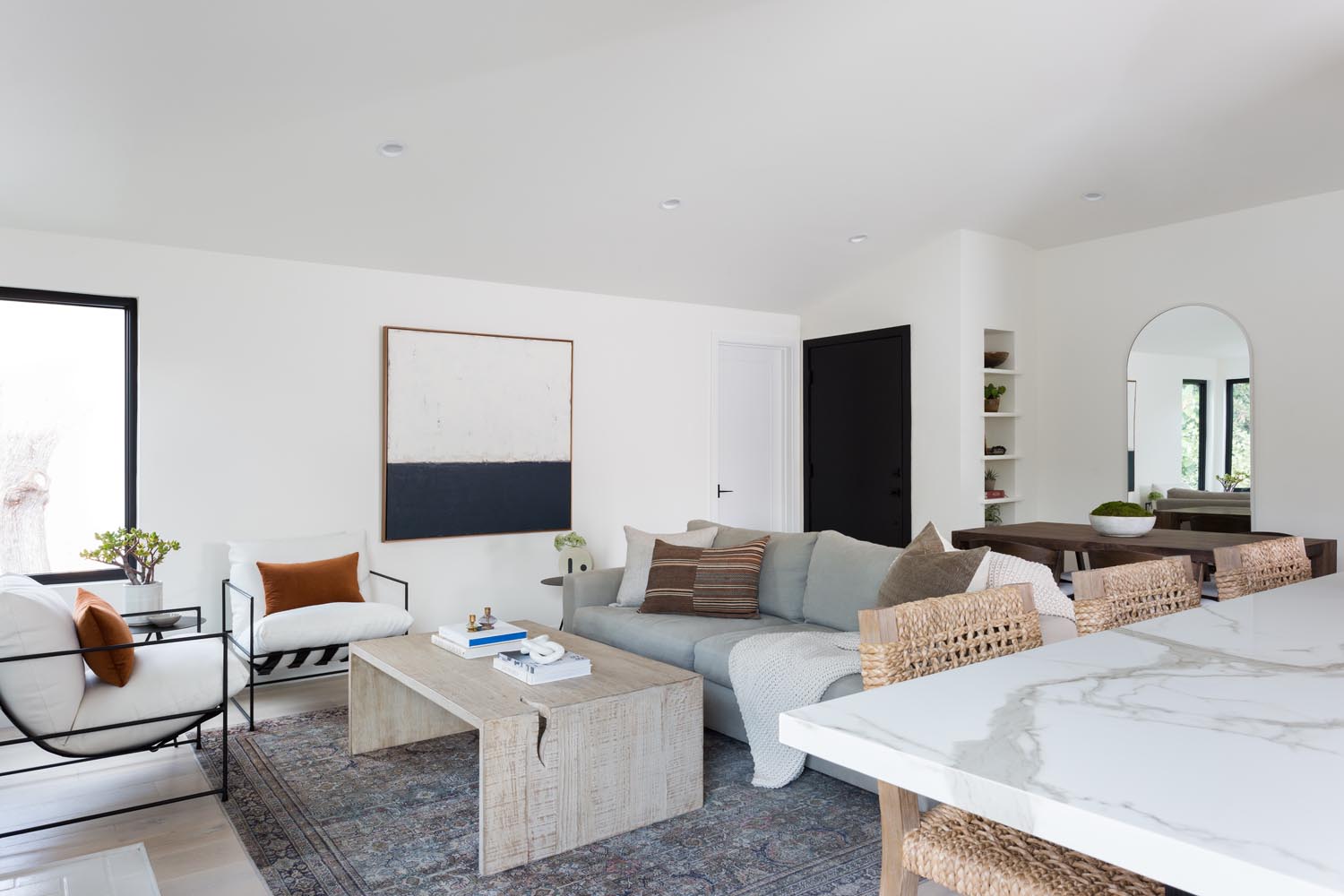
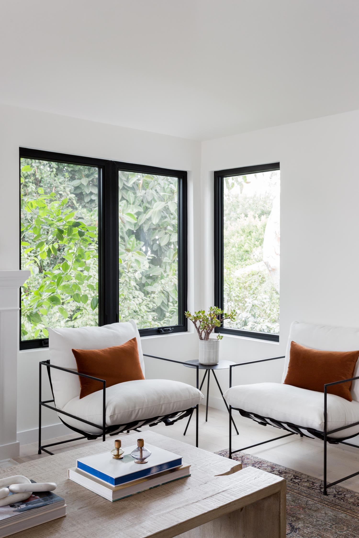
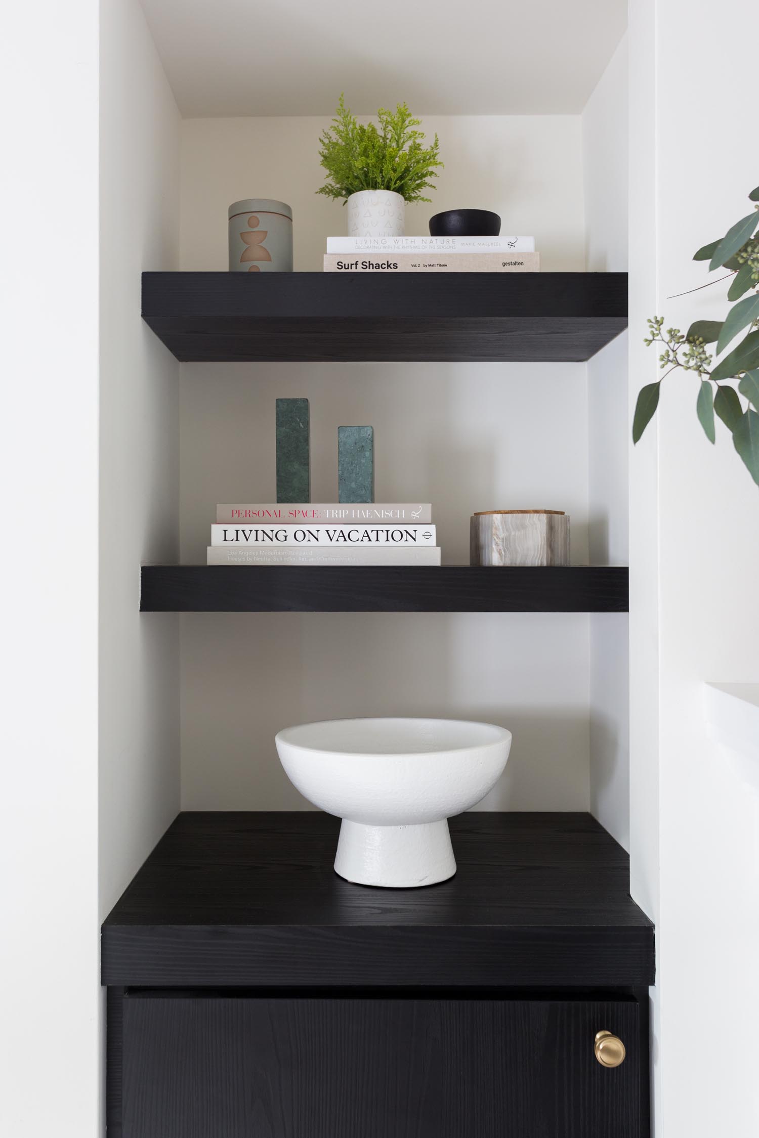
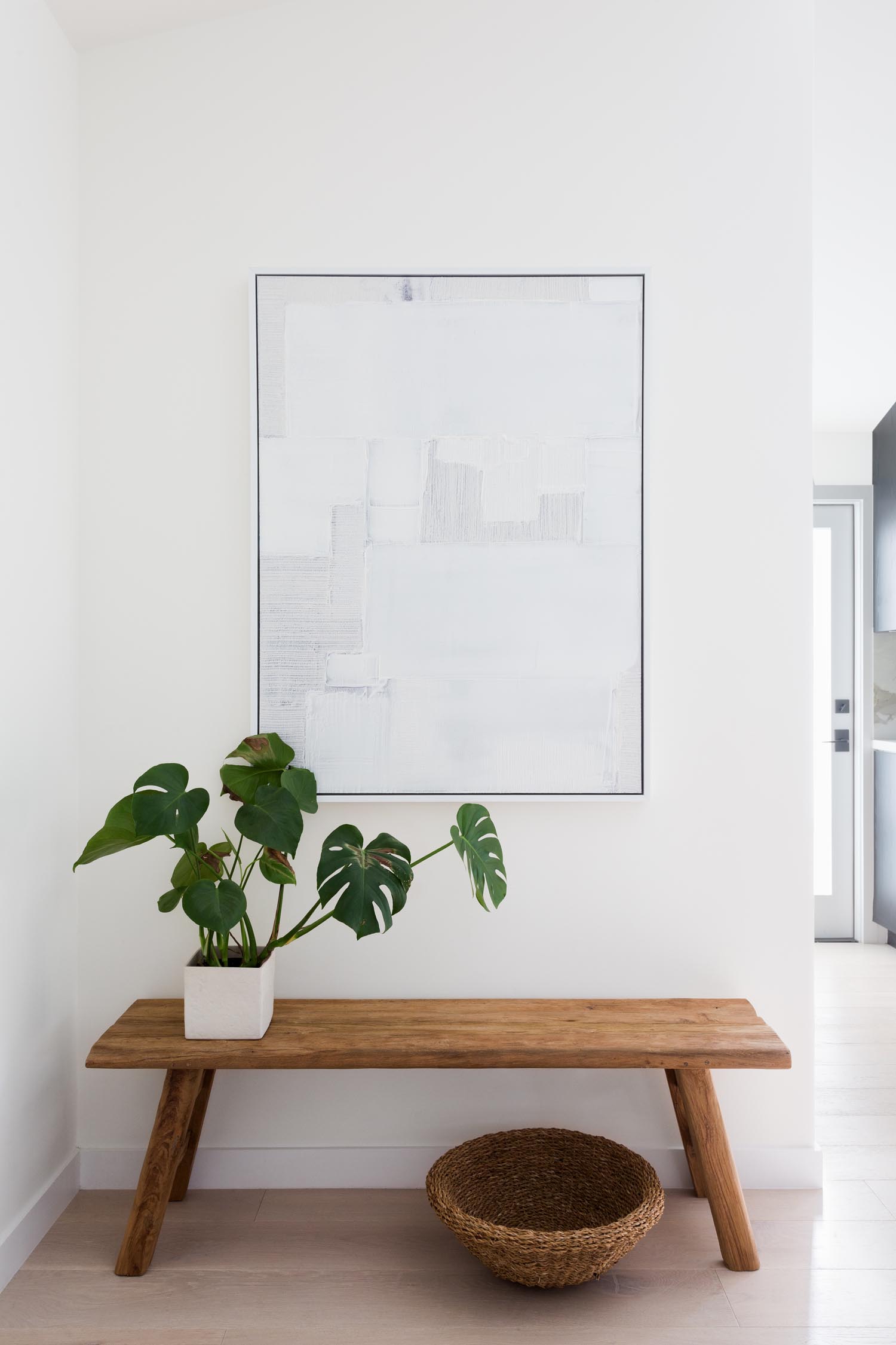
Our top priorities were to make the most out of the limited square footage, through added functionality and style. Since we were downsizing a bit, we needed to find clever storage solutions and make the layout of the space feel open. Vaulting the ceiling allowed us to create more space and adding large windows opened everything up so that we could bring the outdoors in.
Could you tell us a bit about your design?
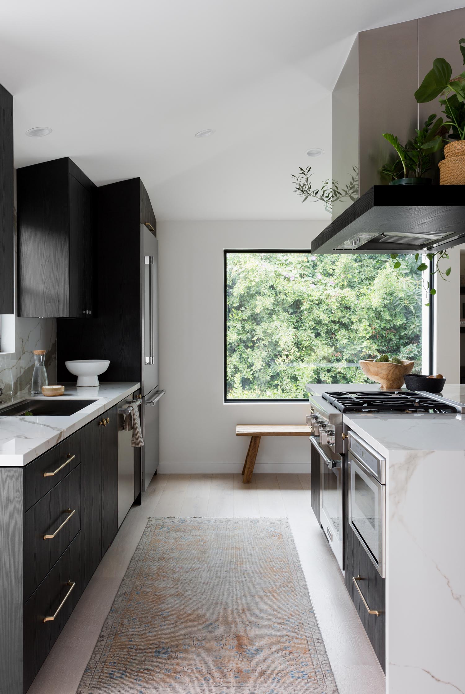
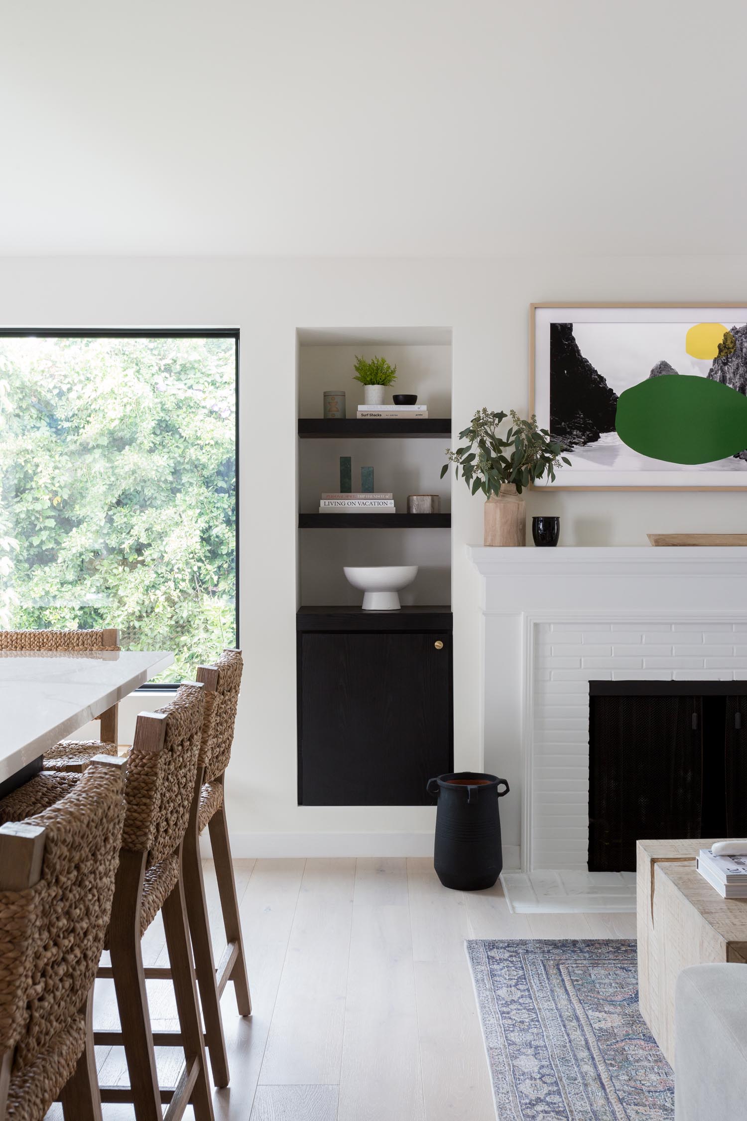
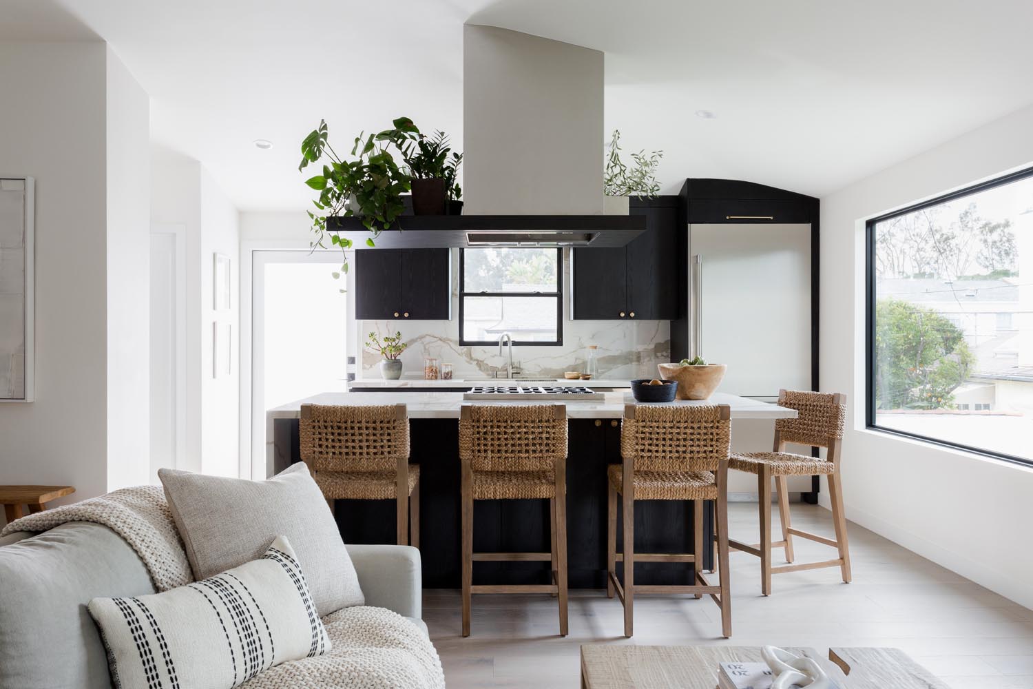
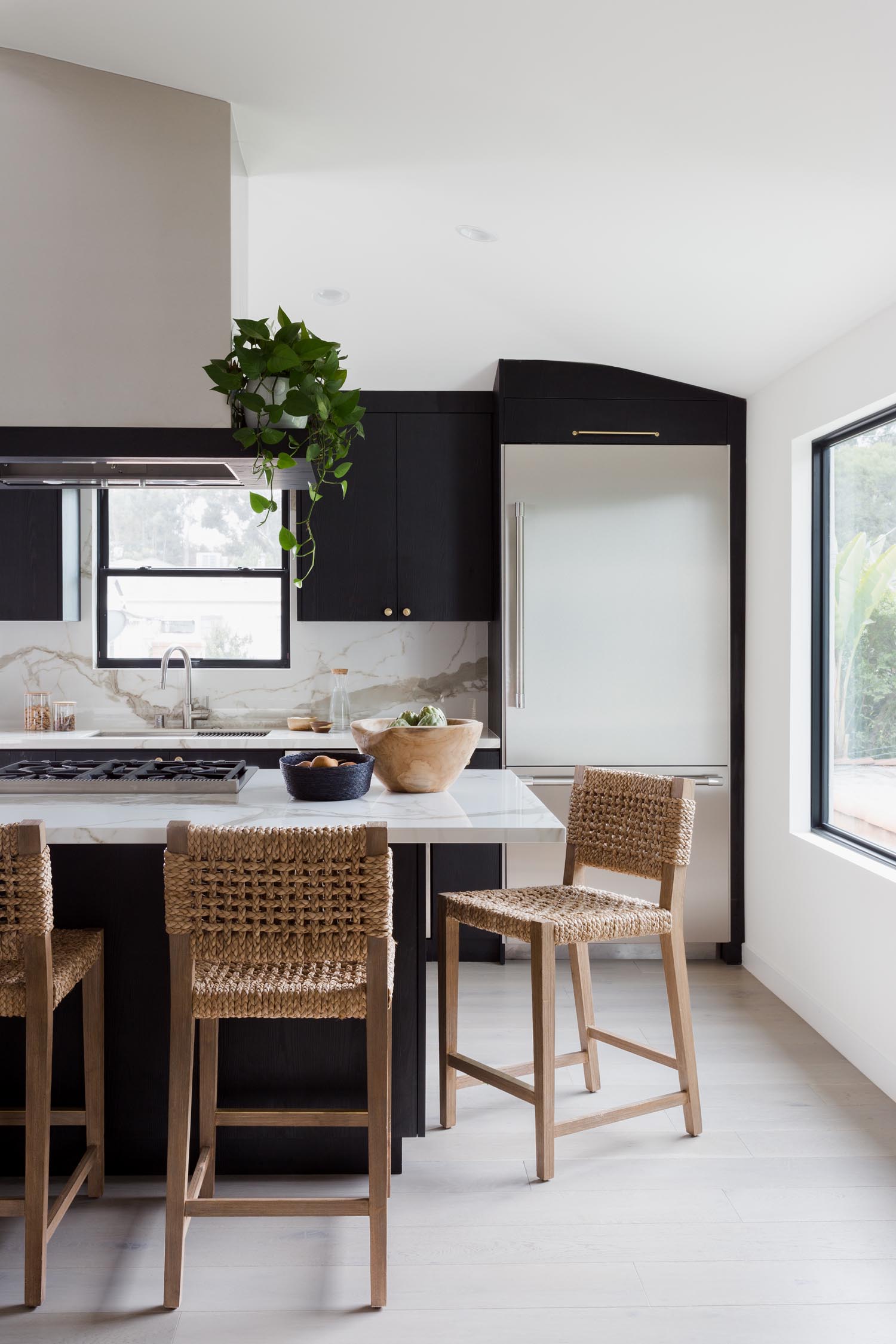
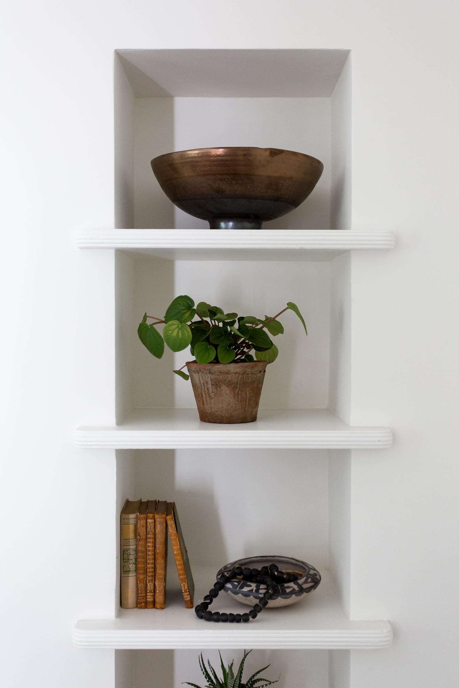
As you walk through the front door, you’re greeted by vaulted ceilings and the original 1940’s brick fireplace which adds a touch of charm to the space. Even though the square footage hasn’t changed since the remodel, the vaulted ceilings and open floor plan makes the space feel airy and much larger than it originally was. We opted for black cabinets instead of the traditional white to create a bold statement and to ground the kitchen area. It was a jumping off point to create the overall color palette.
Originally, the apartment was a one bedroom one bath, so we added value by including a powder room and ensuite laundry. By repositioning the kitchen, we were able to squeeze in all of the modern luxuries that renters and homeowners alike can appreciate.
The bathroom is dramatic, in the best way. We’d love to know more about this space!
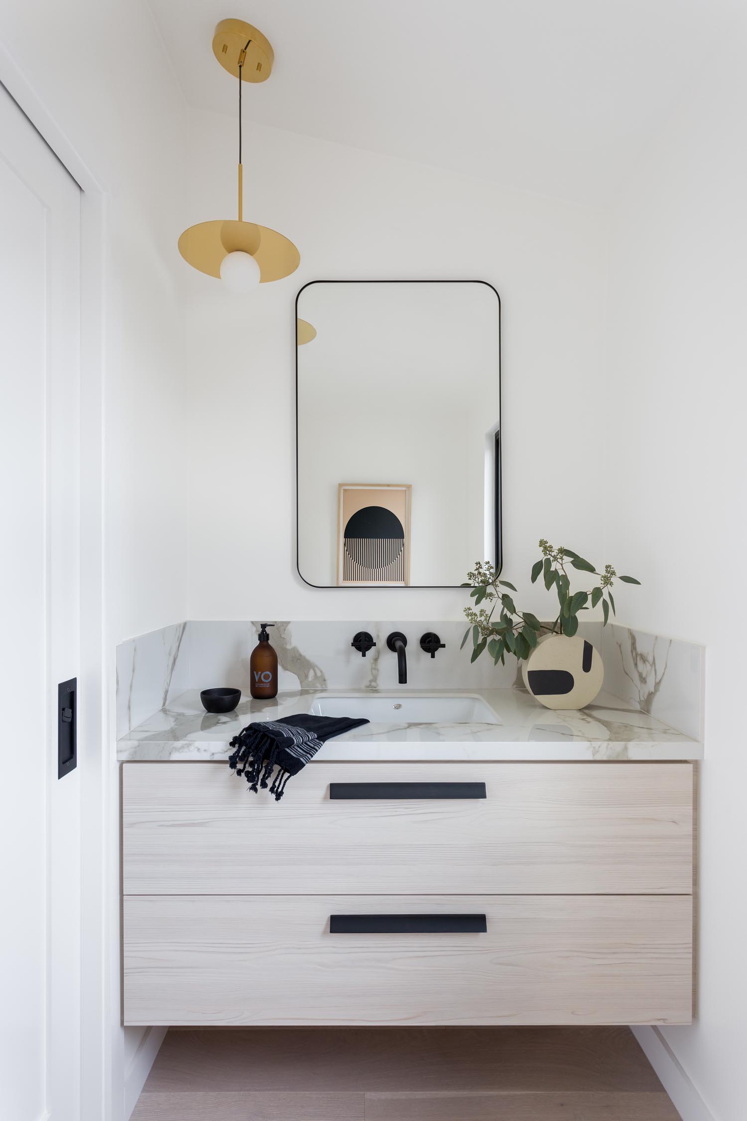
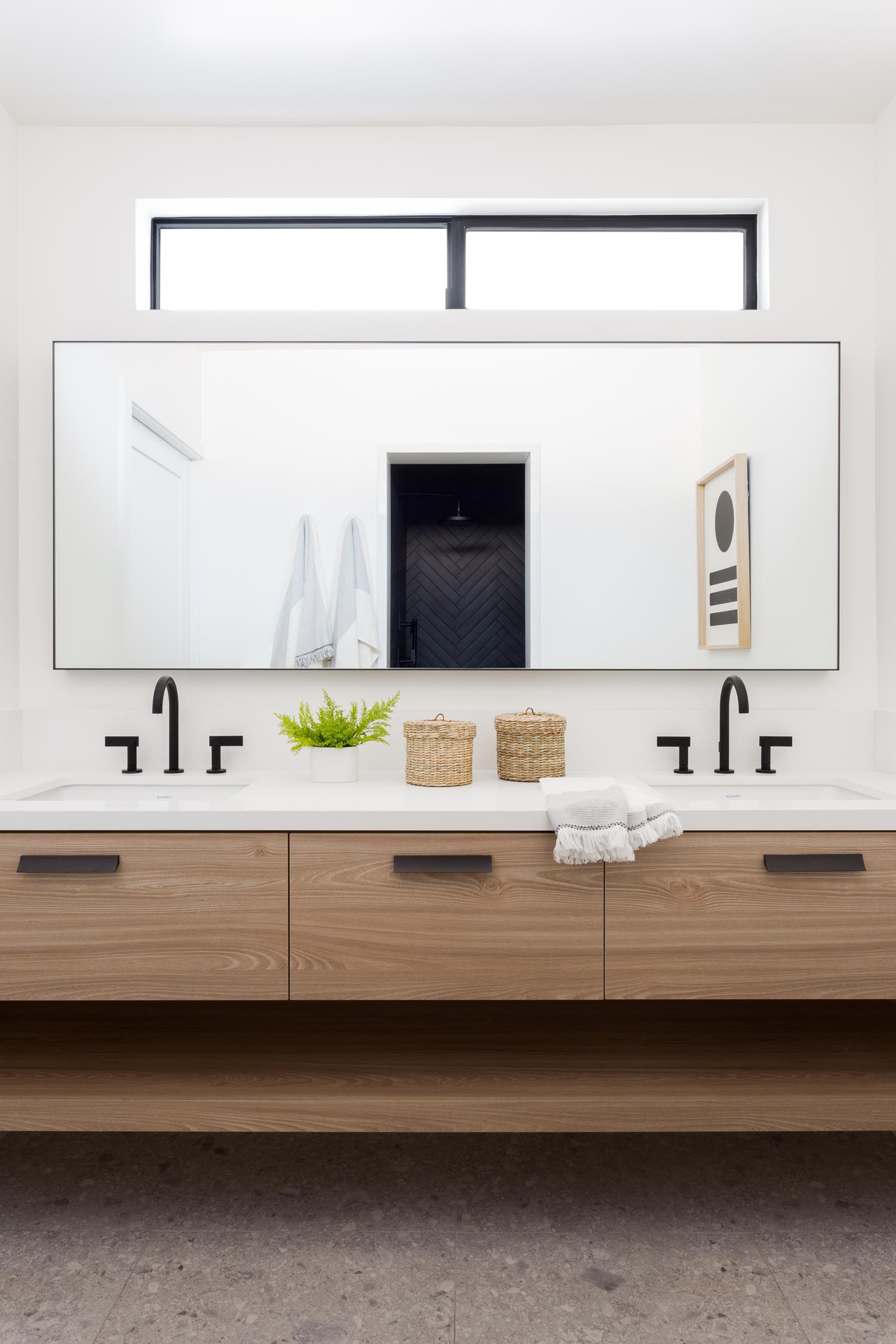
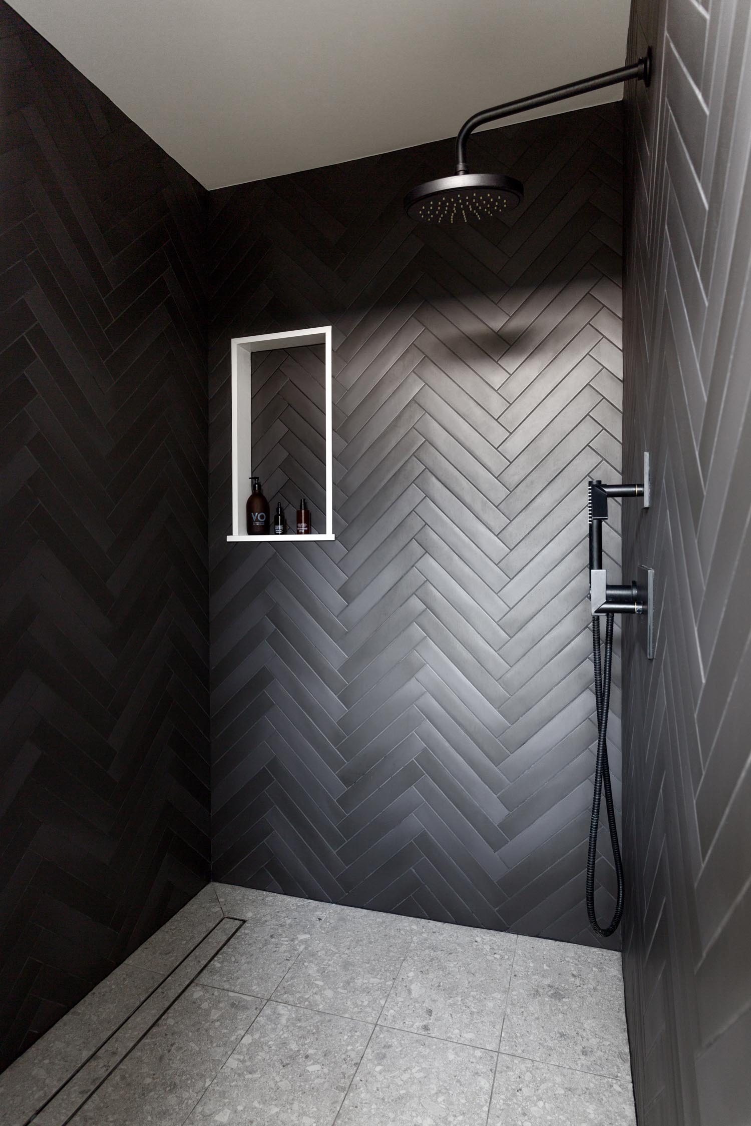
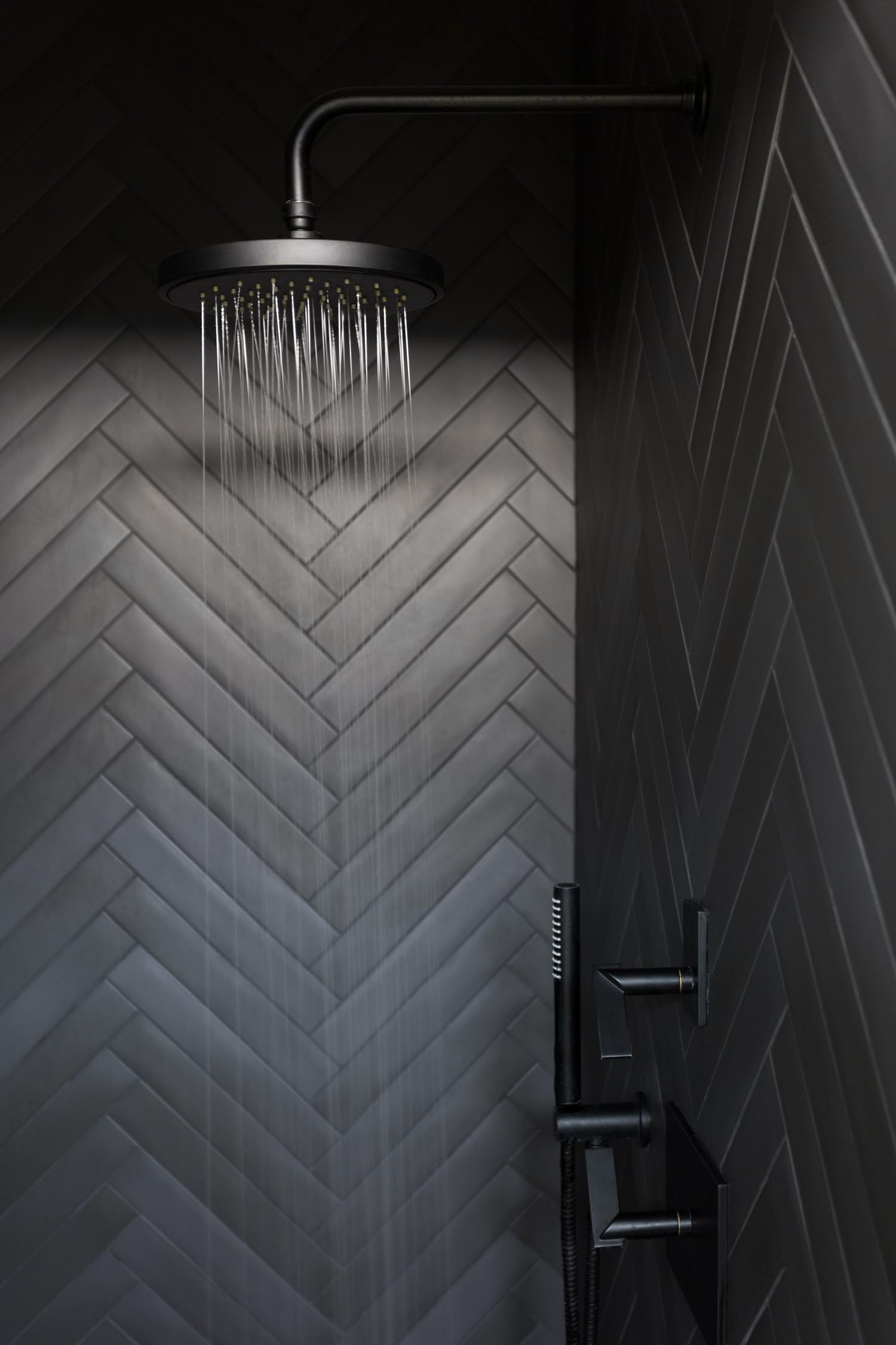
When it came to designing the bathroom, our goals were to keep it modern, and sophisticated through the use of clean lines and a minimal color palette. The daring dark herringbone in the shower took the space to the next level, making it feel like a luxury hotel smack in the middle of a small apartment.
What were some of the biggest challenges you faced on this renovation?
As with any project, we ran into our fair share of challenges. One in particular we can call the “hood dilemma” where we had no choice but to put the range right in the middle of the island. Unfortunately, we couldn’t do a downdraft so a hood was the only option. However, we thought it would obstruct the view and would be a very awkward length due to the height of the ceilings. The solution we found was to turn the eyesore into a focal point by building a giant floating shelf in the same black stain as the cabinetry. Now, the shelf serves as a decorative piece and also a place for all our plants.
What has this renovation meant to you?
This project has been a labor of love between my business partner, Tarryn and I. As soon as I got the keys, Tarryn and I started coming up with the concept and we are currently in the middle of construction on the second upstairs unit. This project launched our partnership, shared love for design, and the images that Amy captured enabled us to attract some incredible clients. We are so honored to be featured!