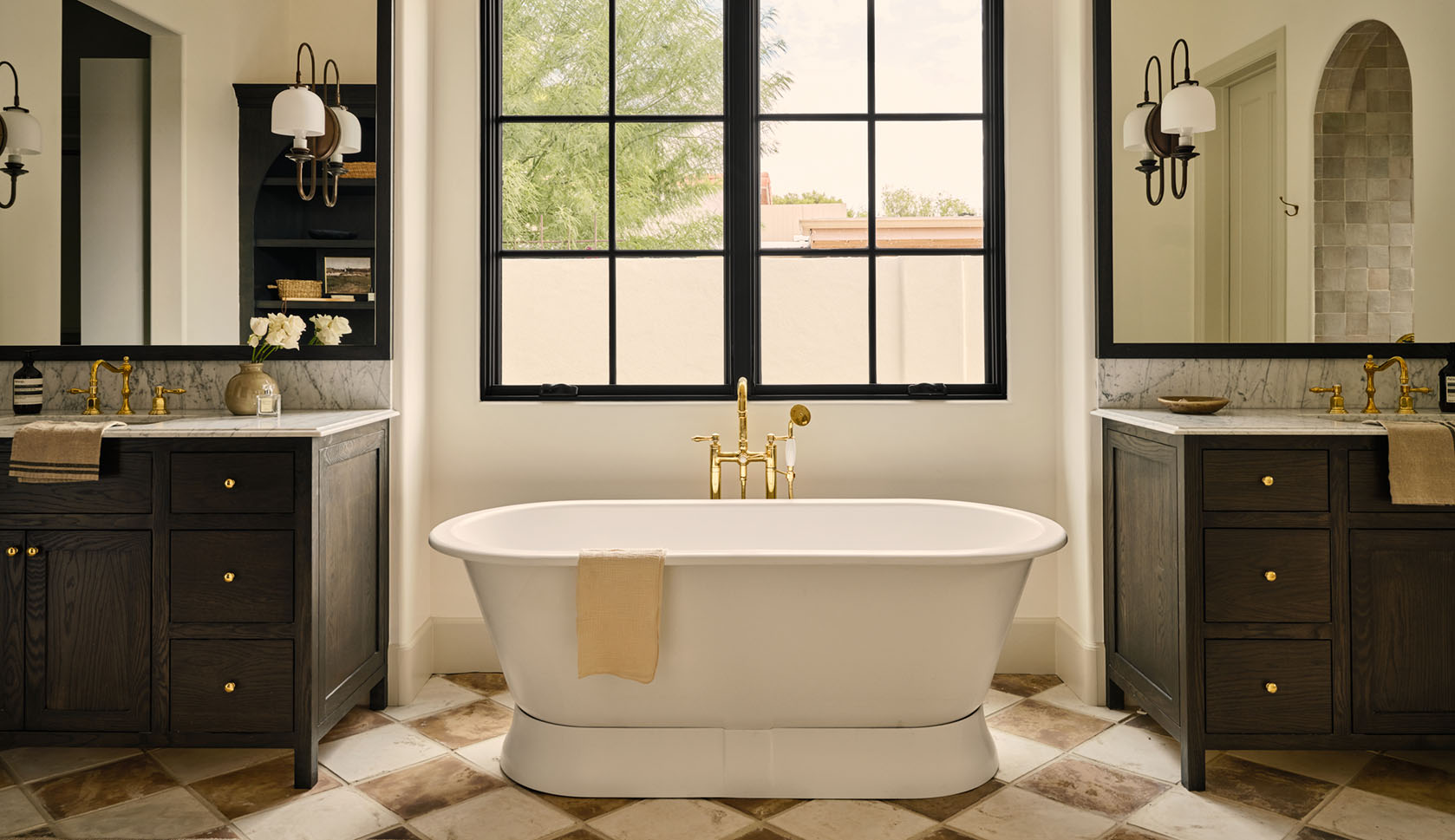

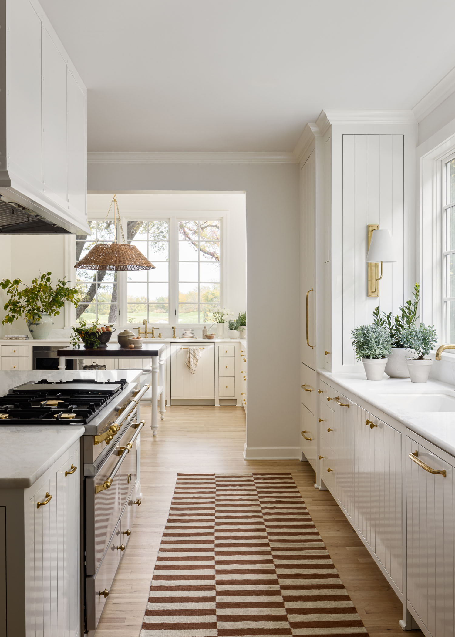
KOBEL + CO—a Kansas City, MO design firm—dubbed this renovation project “Windows to the Walls.” And while the nickname sparks an instinct to dust off our Lil’ Jon CD from 2002, the space is actually much calmer and serene. The firm is led by Mallory Robins and Elizabeth Bennett, who are redefining midwestern interior design with a one-of-a-kind approach. Once dated, this ‘90s home has now been transformed into a classic, relaxed, and cozy environment, with the kitchen design at the heart of this project. The designers tell us more.
First, tell us about the property. Where is it located? Did the neighborhood influence the design?
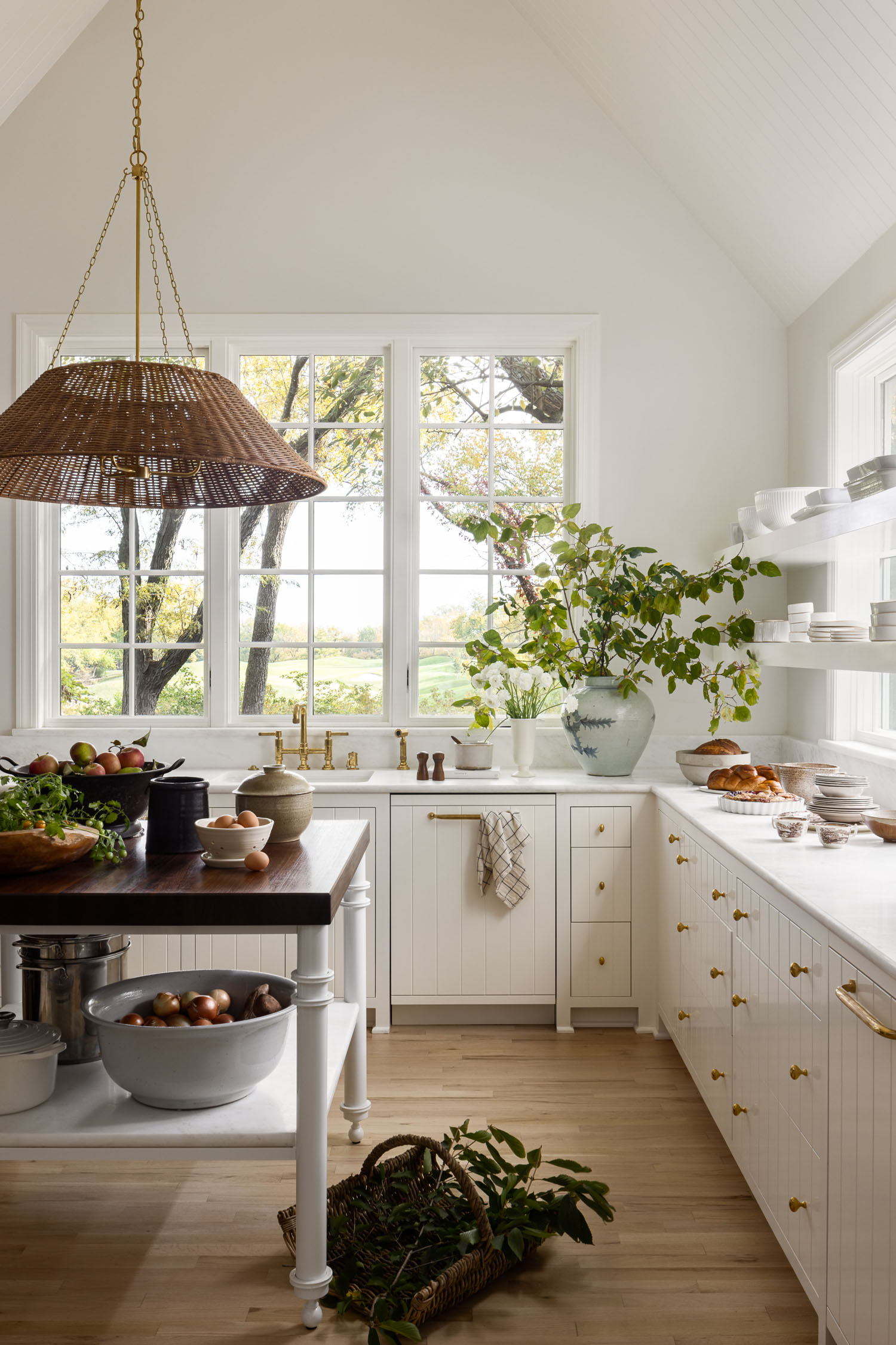
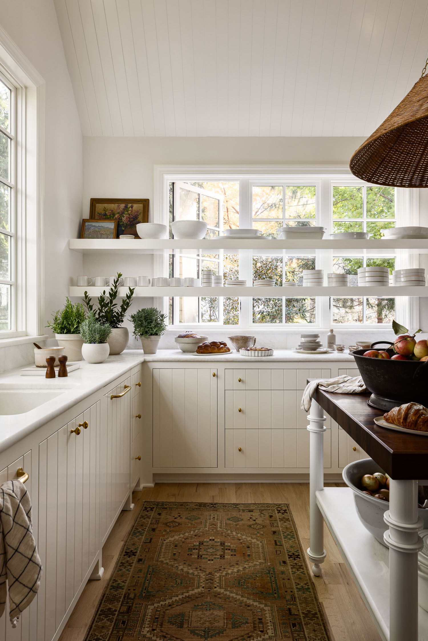
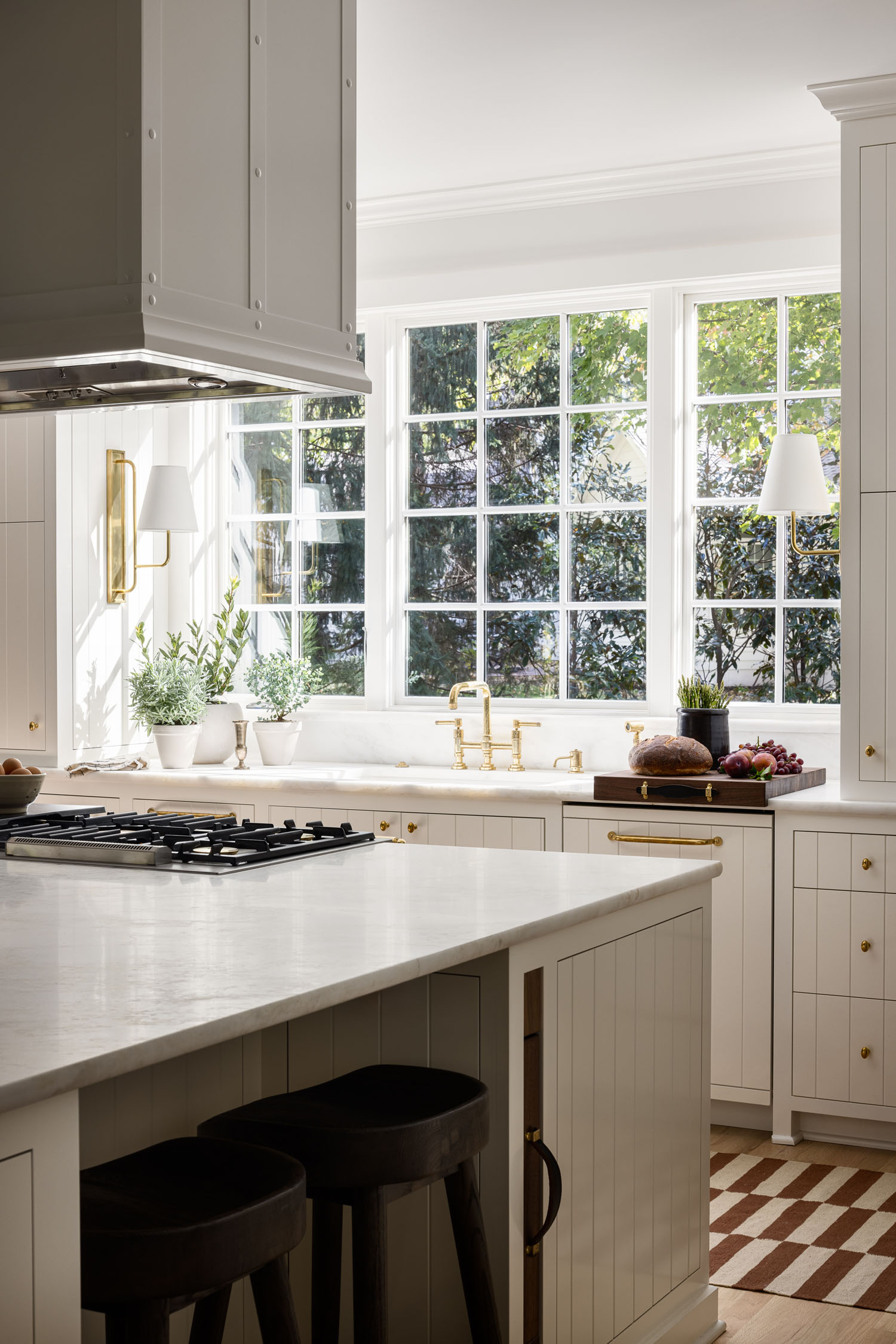
The home is located outside of Kansas City, in an idyllic Kansas suburb with rolling hills and streams. It is specifically situated on a quiet cul-de-sac, overlooking the golf course, which means primarily tree-lined and golf course views throughout most of the house. Because of this, we were able to take advantage of walls of windows and embrace the feeling of the house being more rural, rather than in a neighborhood.
Who are your clients?
This family has four college aged children. They wanted a home cozy enough for two, but ample enough for the whole crew to return home comfortably on holidays and extended breaks. They have owned/remodeled enough homes to know what they liked and disliked, and at this phase in their lives, they wanted a house that felt light and relaxed, always open to guests, and not fussy. Our biggest challenge was transforming the ‘90s bones into something timeless, relaxed, and approachable.
This fits the bill of “redefining midwestern style.” What does that mean to you?
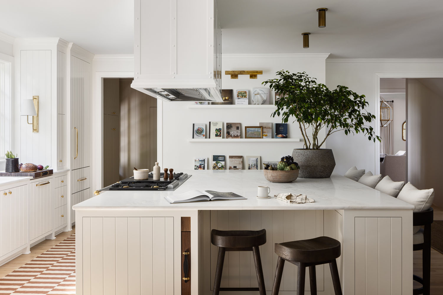
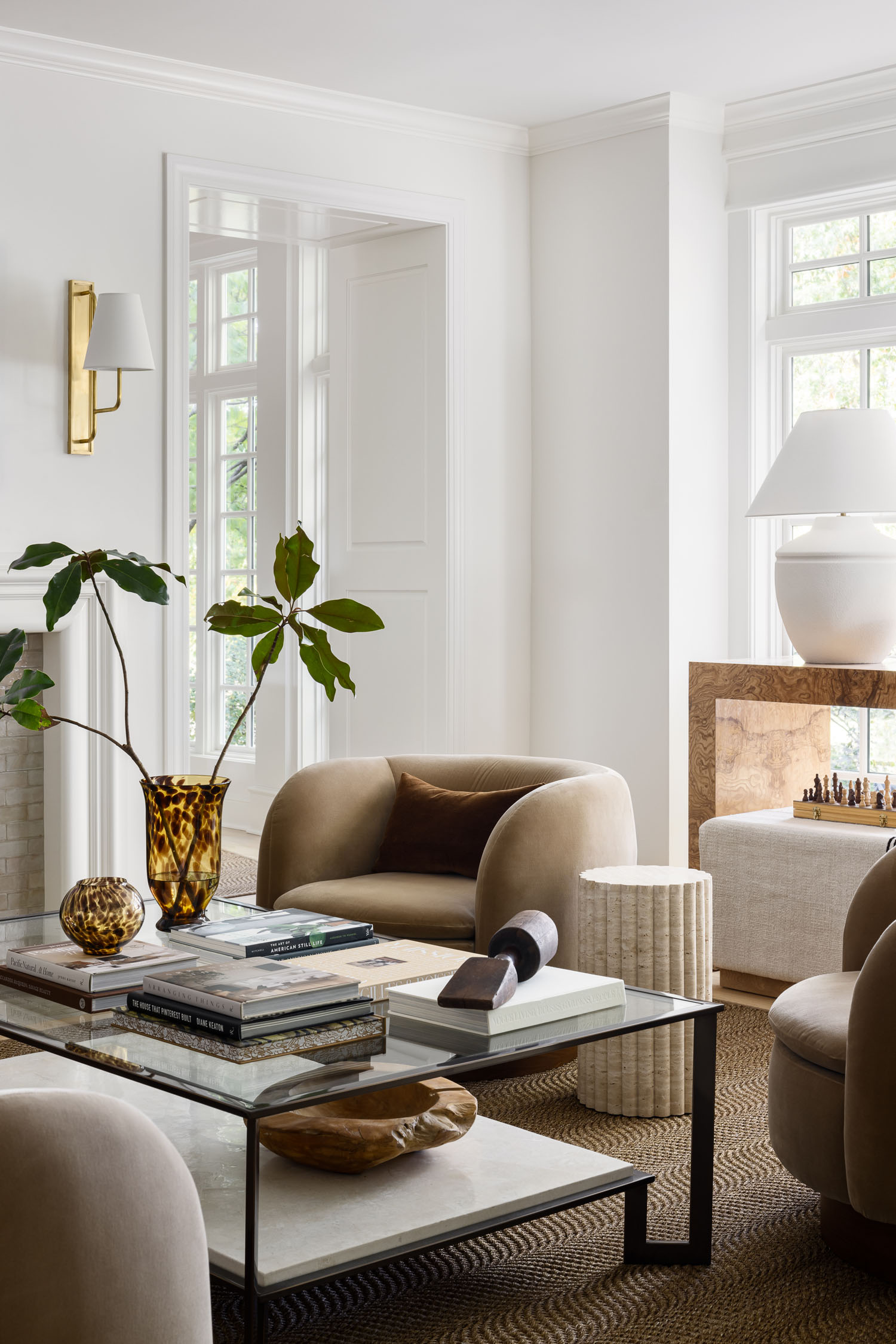
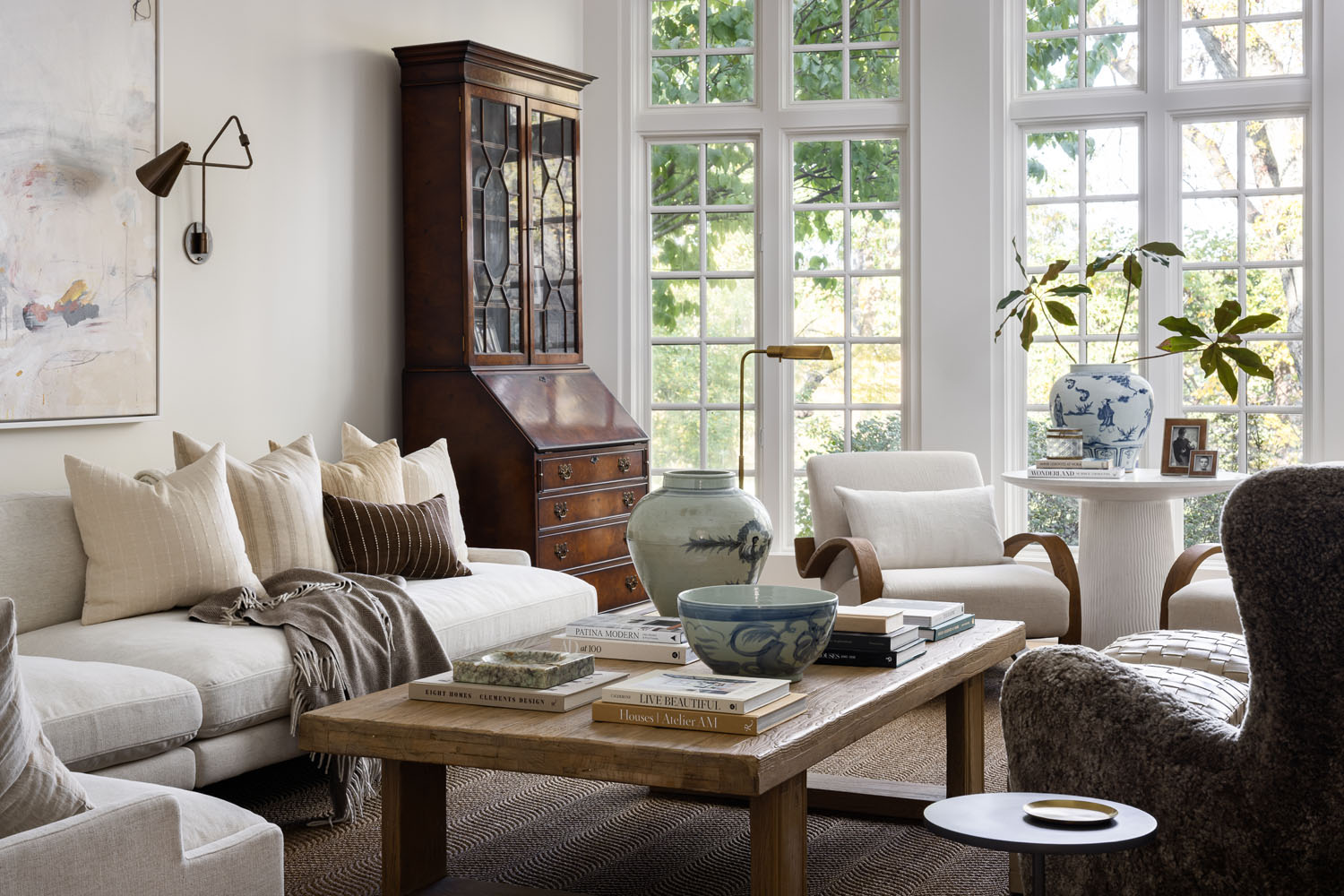
This particular client liked elements of “California casual,” but in order to make that feel at home in a Kansas suburb, we also needed to root the elements she was drawn to (light filled spaces, light colored floors and walls) in a house that felt timeless, with hints of traditional millwork and classic lighting laced into the space. To us, redefining midwestern style means leaning into our ability to “borrow” design elements from adjacent regions, but at the core creating spaces that feel livable. Our aesthetic is beautiful but not precious, with spaces designed to feel pulled together but also inviting (put your feet up!). Culturally, the Midwest is inviting—with emphasis on raising families and welcoming friends—and our spaces reflect that functionality.
Did this project have any challenges? If so, could you tell us how you overcame a few of the hurdles?
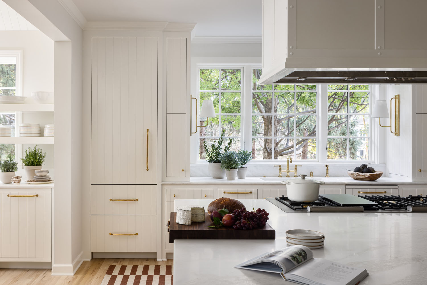
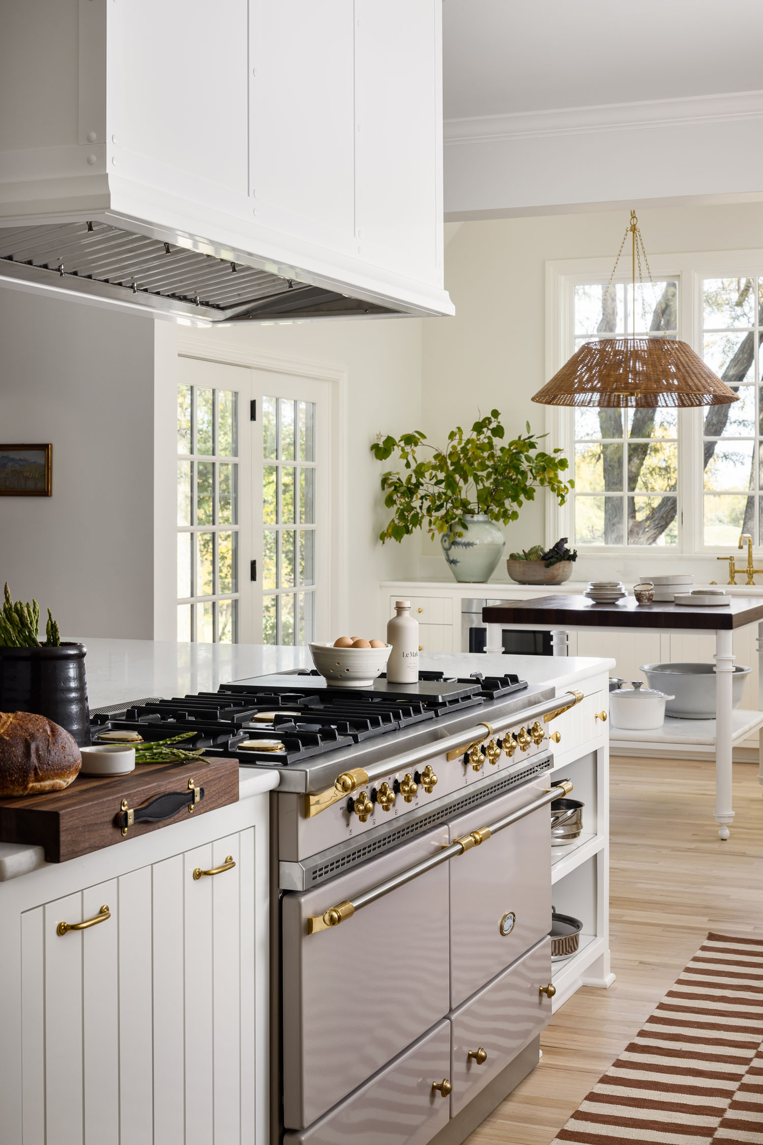
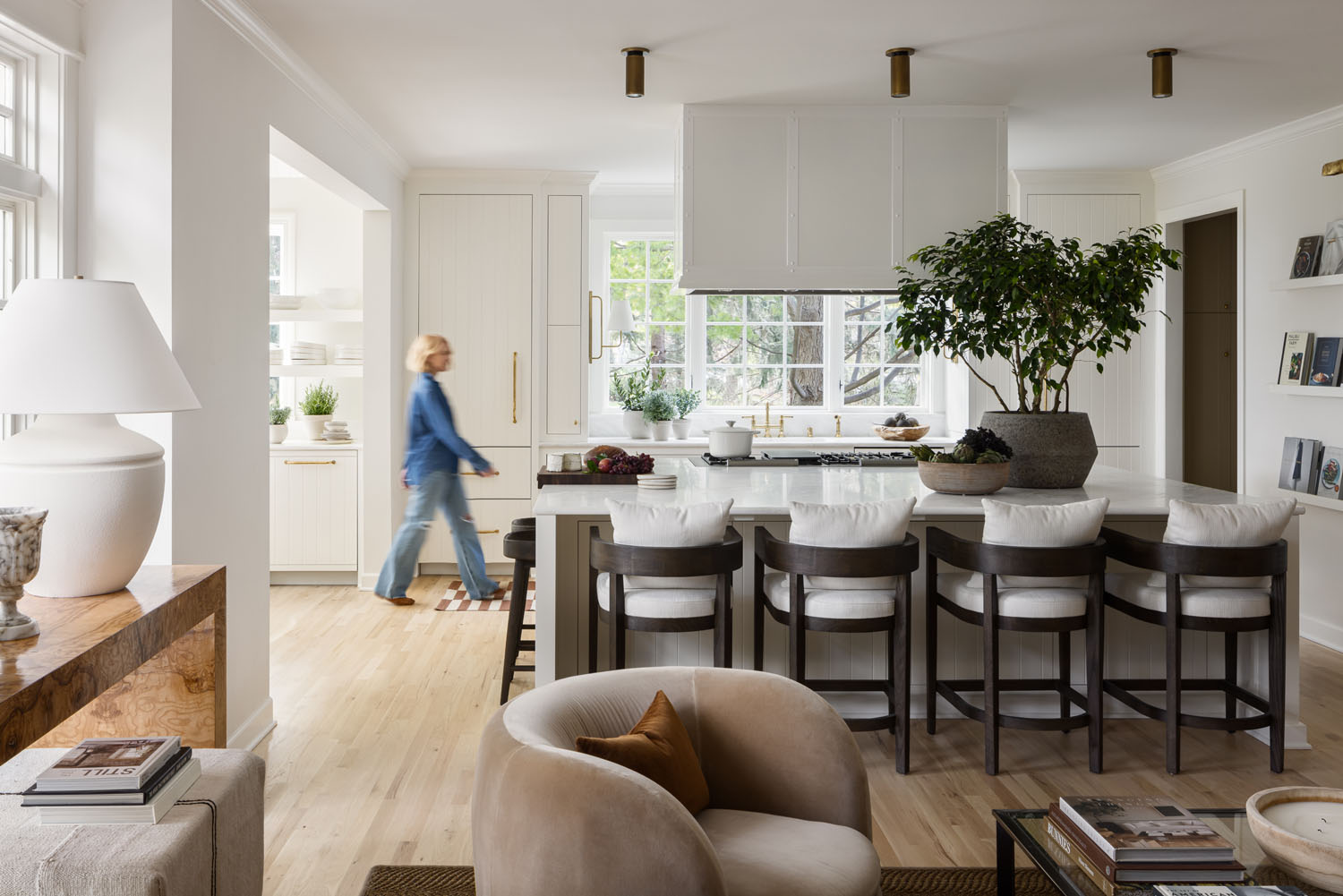
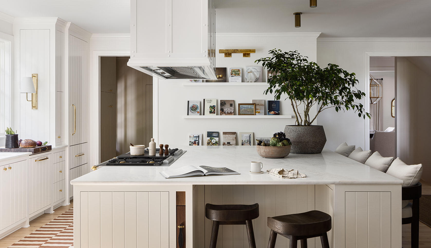
The biggest hiccup on the project was that the client fell in love with a beautiful marble early in the project, along with the “frangipane” color for her French range. The two materials, combined, help set the tone and palette for the entire project. Unfortunately, as we closed in on fabrication, we found out the contractor had failed to secure the stone as discussed. After exploring all of our options, we pivoted to the Bianco Imperial you see featured here. While less dramatic than the original stone, its soft, buttery tones paired with the gentle French bull nose edge detail ended up being the perfect choice to complete the space, and we can’t picture the kitchen looking any differently.
How long did the project take, and what did the client say when they saw the finished space?
We started the project in winter 2022 and completed in early fall 2023. The client couldn’t wait to have her entire family around the island; we finished just in time for Thanksgiving, and she said they were overjoyed at how they could use the space together as a family—cooking, eating and entertaining in the heart of the house.