
Total fixer-uppers require two key things: a patient homeowner and a visionary design team. This 4,000 square foot Chicago rowhouse in the bustling Lincoln Park area was blessed with both. Aimee Wertepny, founder and principal designer at PROjECT, says that though the rooms were quite small and closed off, the home had great bones: a large deck, a two-car garage, a large entryway skylight and a designated primary suite on the third floor. Using creative spatial planning, Aimee and her team maximized space and minimalized the superfluous design. Custom solutions balance form and function, and a beautifully minimal color palette bring a dose of high fashion to each room. She tells us more.
Tell us about this home. Where is it located? How did the neighborhood influence the design?
This project was a gut-rehab of a shotgun-style, single-family row house that was originally built in 1989 in Chicago’s prestigious Lincoln Park neighborhood. With chic national retailers, boutiques, bookstores, restaurants, and coffee shops; top elementary and high schools plus DePaul University; amazing residential vibes; and close proximity to green spaces and the lake, Lincoln Park is an in-demand zip code. When conceptualizing the design for this long and narrow abode, we knew that we wanted the exterior to organically blend into its environment—but without being cookie cutter or basic. Keeping in mind the neighborhoods’ mix of (mostly) French classic and modern homes, and its mix of architecturally significant cultural institutions—the Lincoln Park Conservatory, the Chicago History Museum, the Peggy Notebaert Nature Museum, the Education Pavilion by Studio Gang—this project was all about respecting the history/architectural environment while shaping the future of Chicago design by putting a progressively PROjECT. stamp on it. For a starter home tucked away on a lovely, quiet cul-de sac street in the heart of Lincoln Park, this location can’t be beat.
Tell us about your clients. What were their design goals for their home?
The clients are a young Chicago couple who, at the time, had just been married. For the next phase of their life, they wanted more space—and liked the idea of a fixer-upper that could be customized. They ended up buying this 4,000 square foot home [4 bedrooms, 4.5 bathrooms] on the same block as the townhome they were already living in. The wife had spied our work on a blogger’s feed on Instagram and simply picked up the phone to ask if we’d be down for the project. Our convo made it clear that she had an eye for design—and that she was aware of her own capabilities and limitations. While she was confident that she could pick out ‘pretty pieces on her own,’ she wanted a designer with a command for interior architecture to really level up the new home’s depth of space, movement and texture—and to layer in thoughtful, curated design that would go beyond beautiful faucets and a nice marble surfaces. She was super interested and involved in the entire design process. She wanted to soak it all up and learn—and is now taking AutoCAD classes and plotting her own future in design!
With a fixer-upper like this, where do you begin?
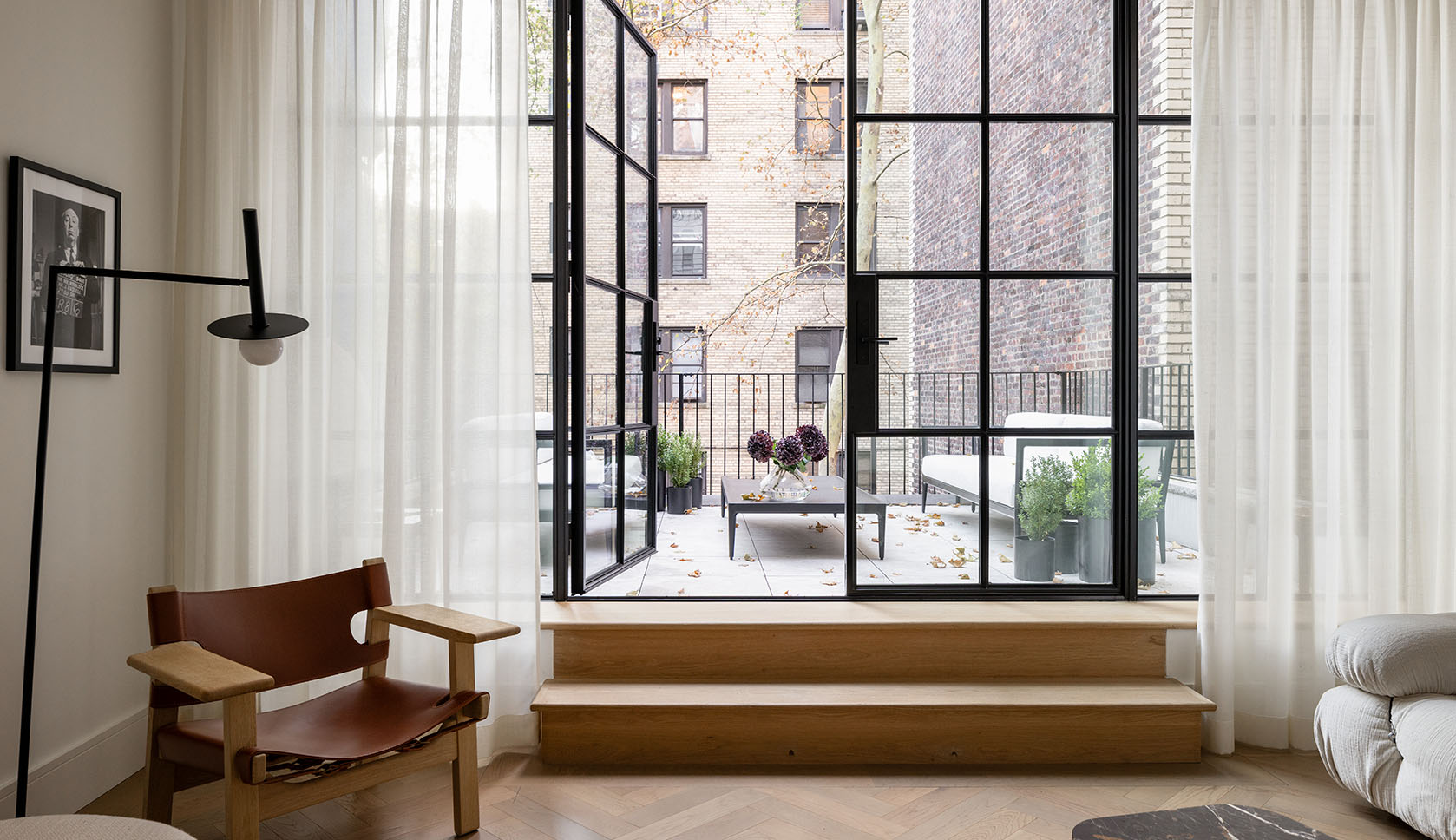
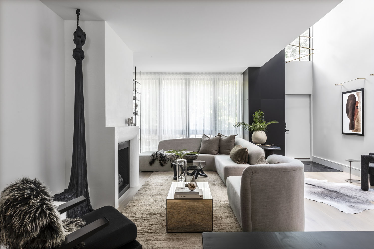
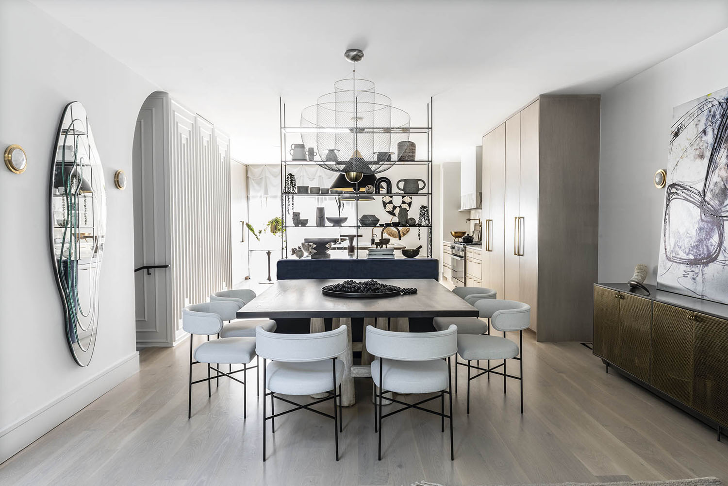
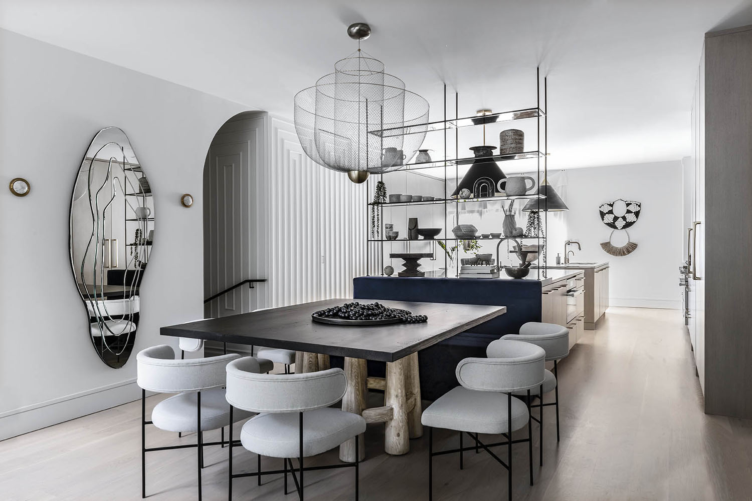
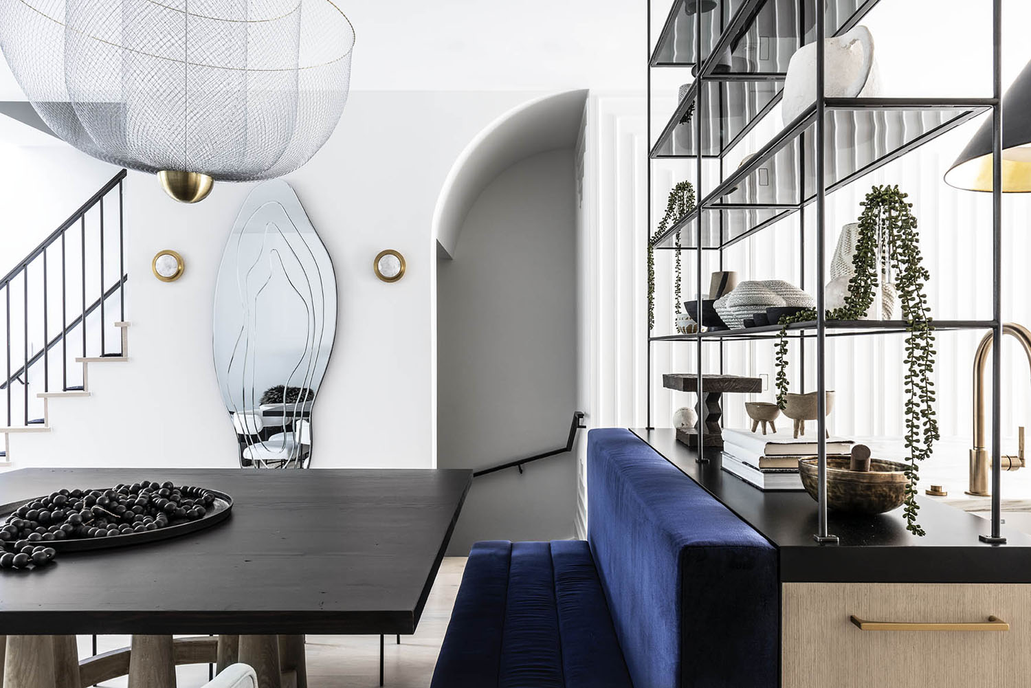
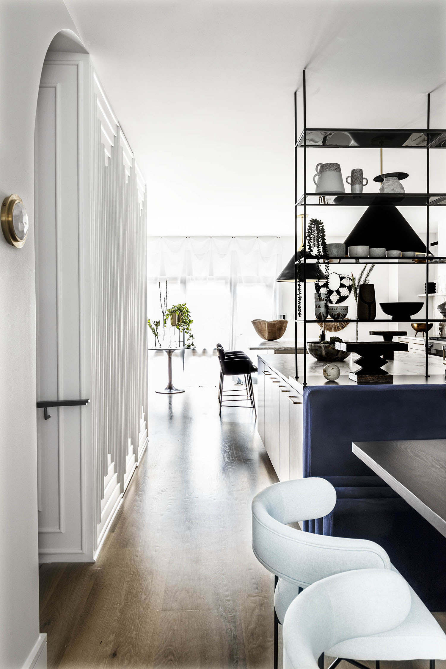
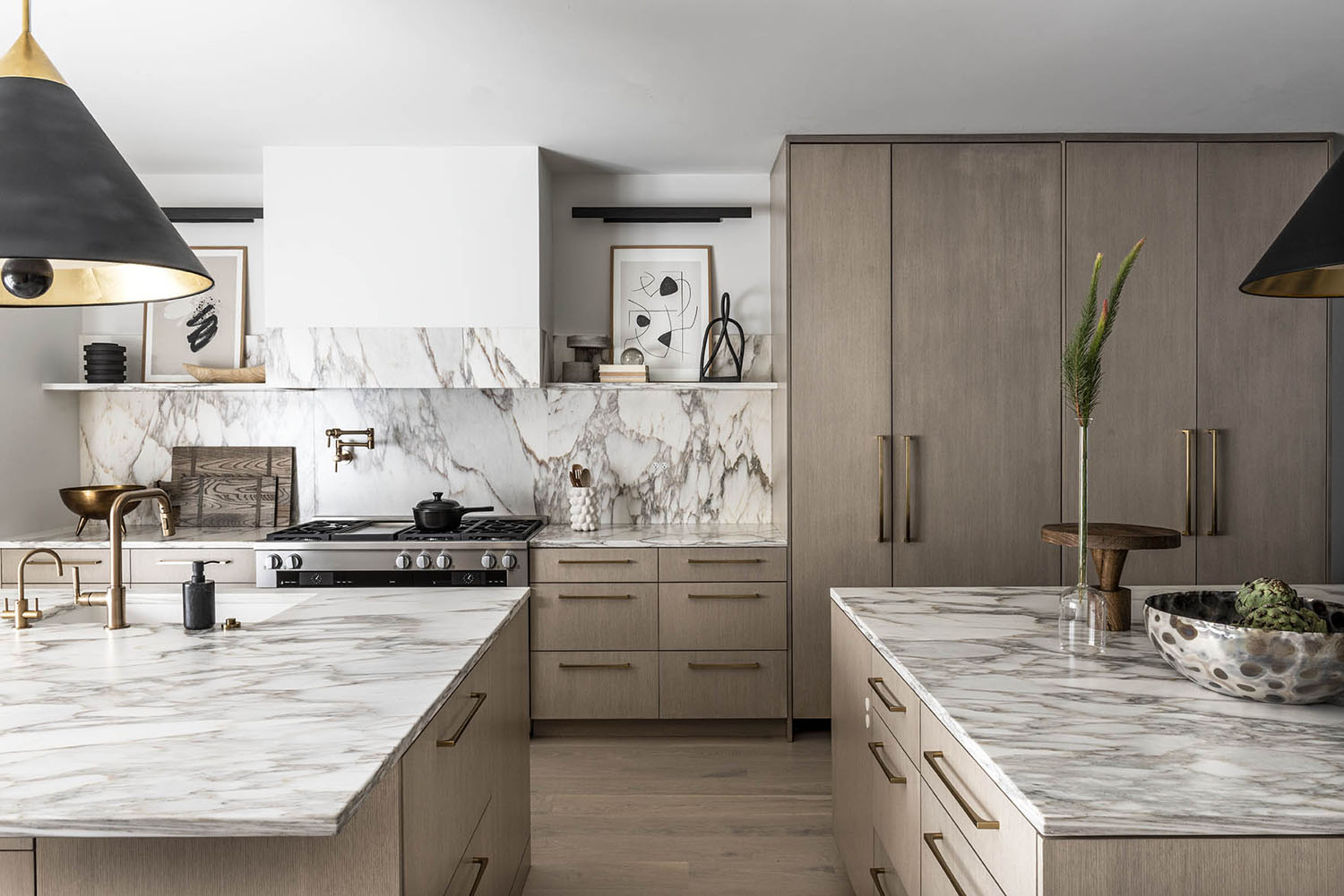
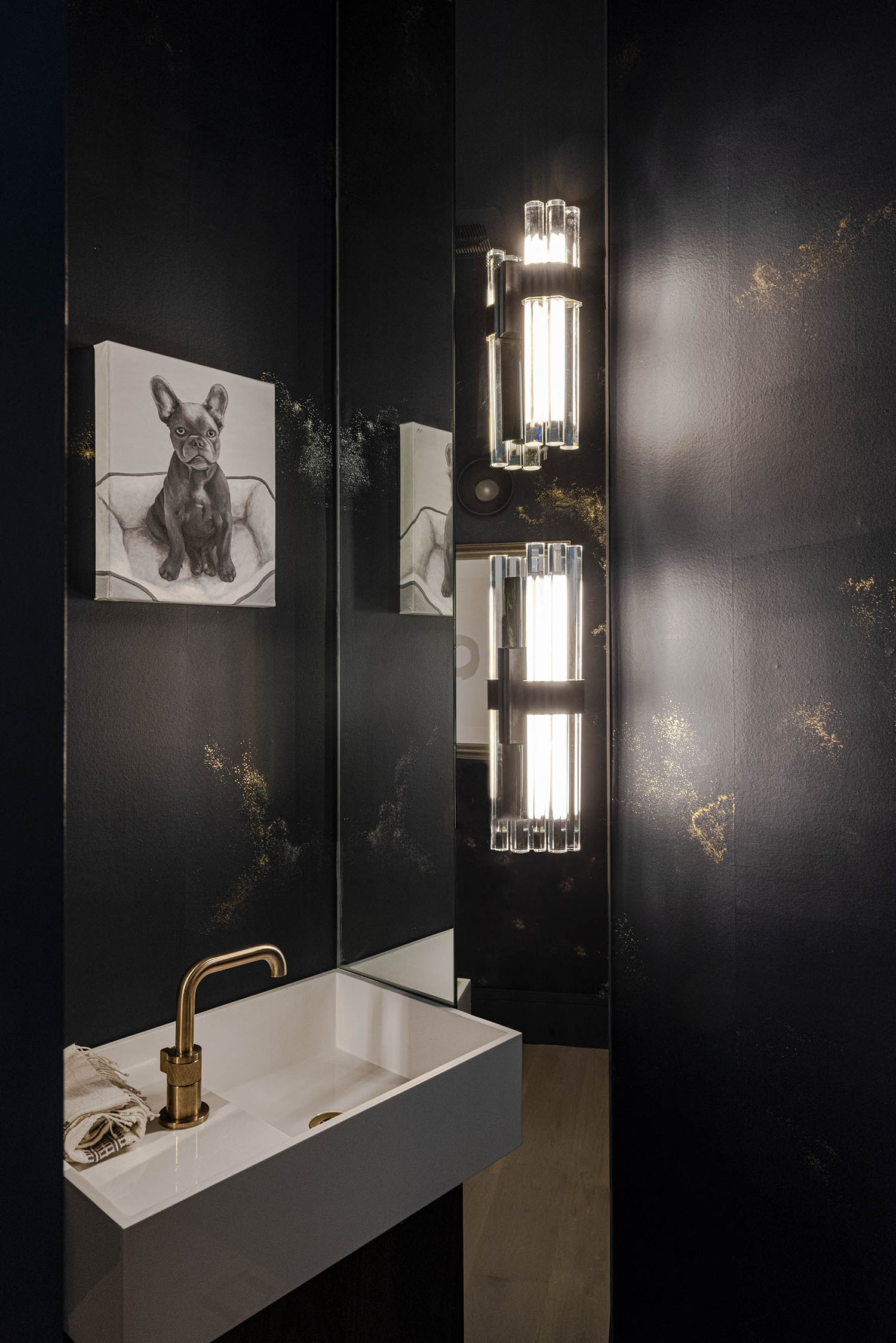
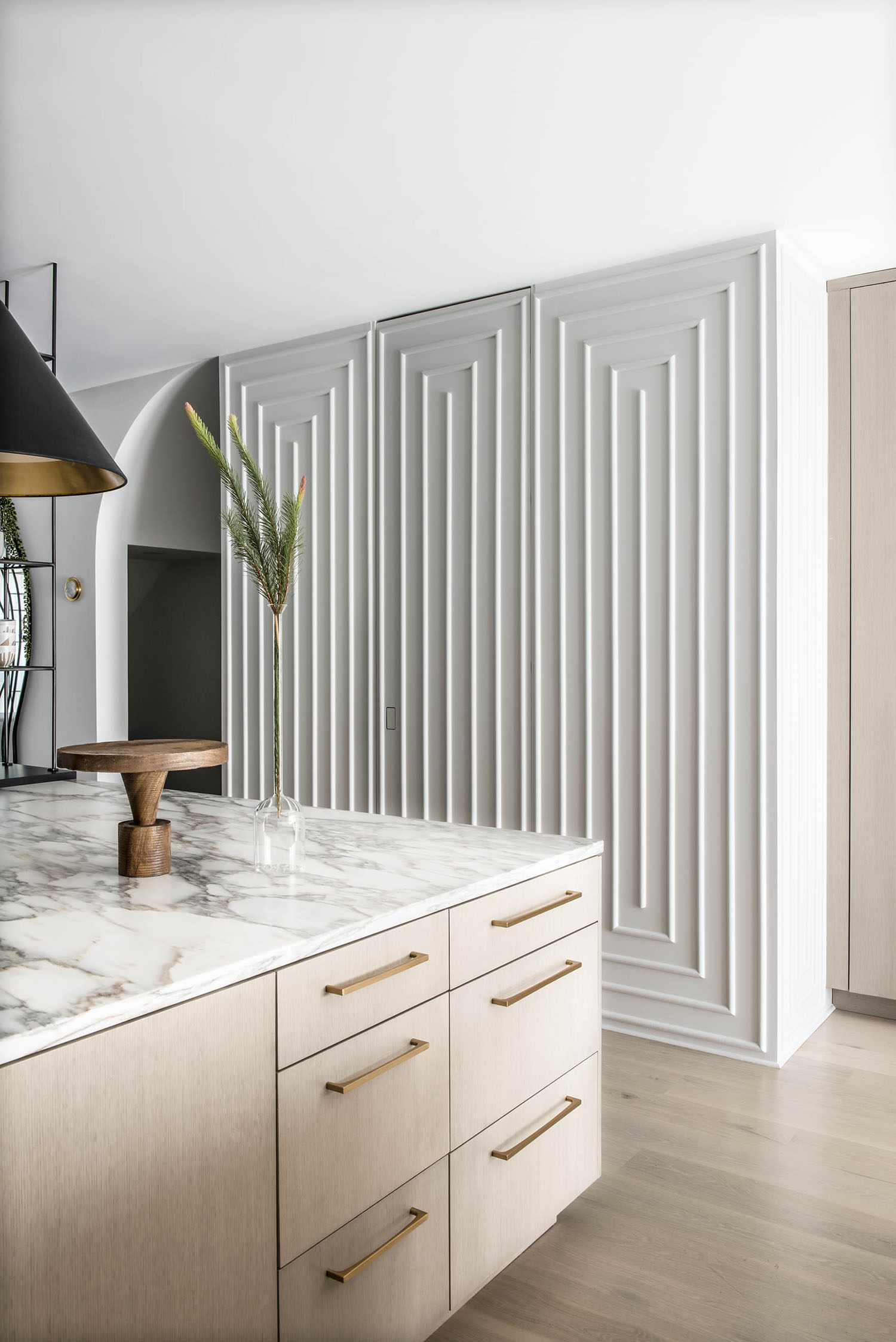
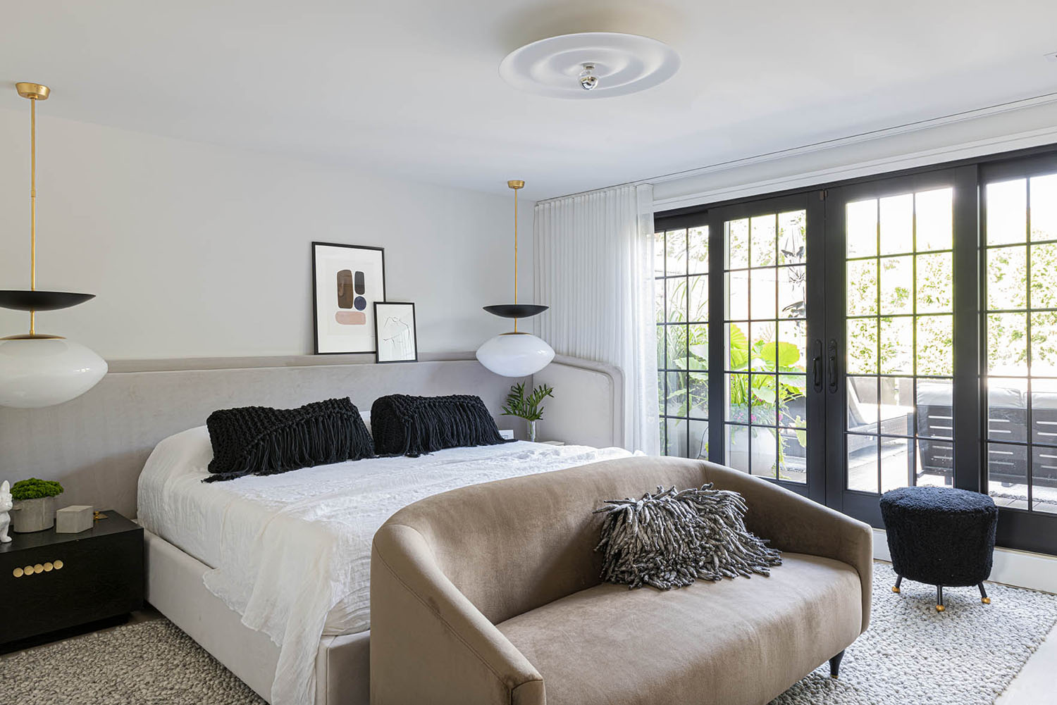
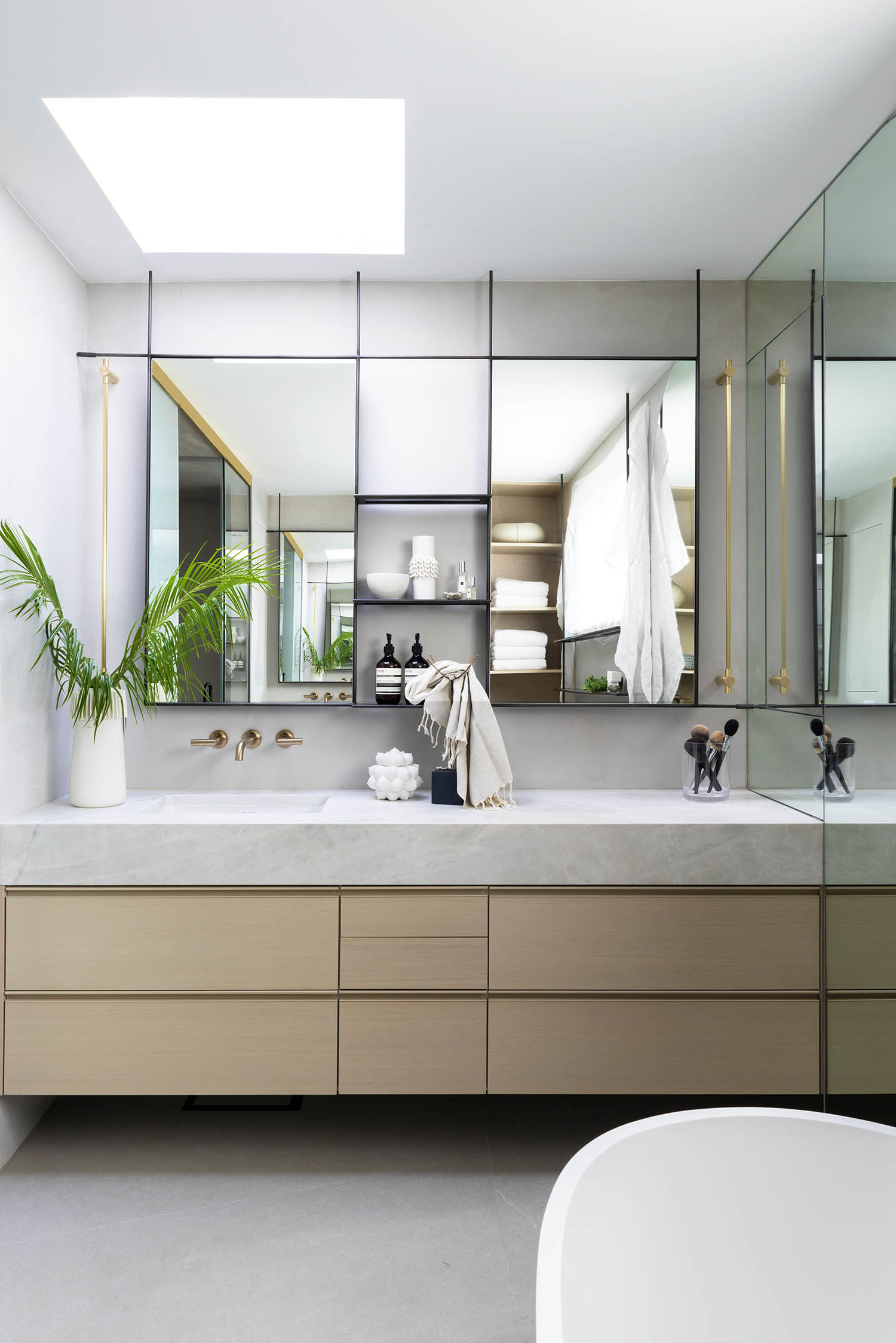
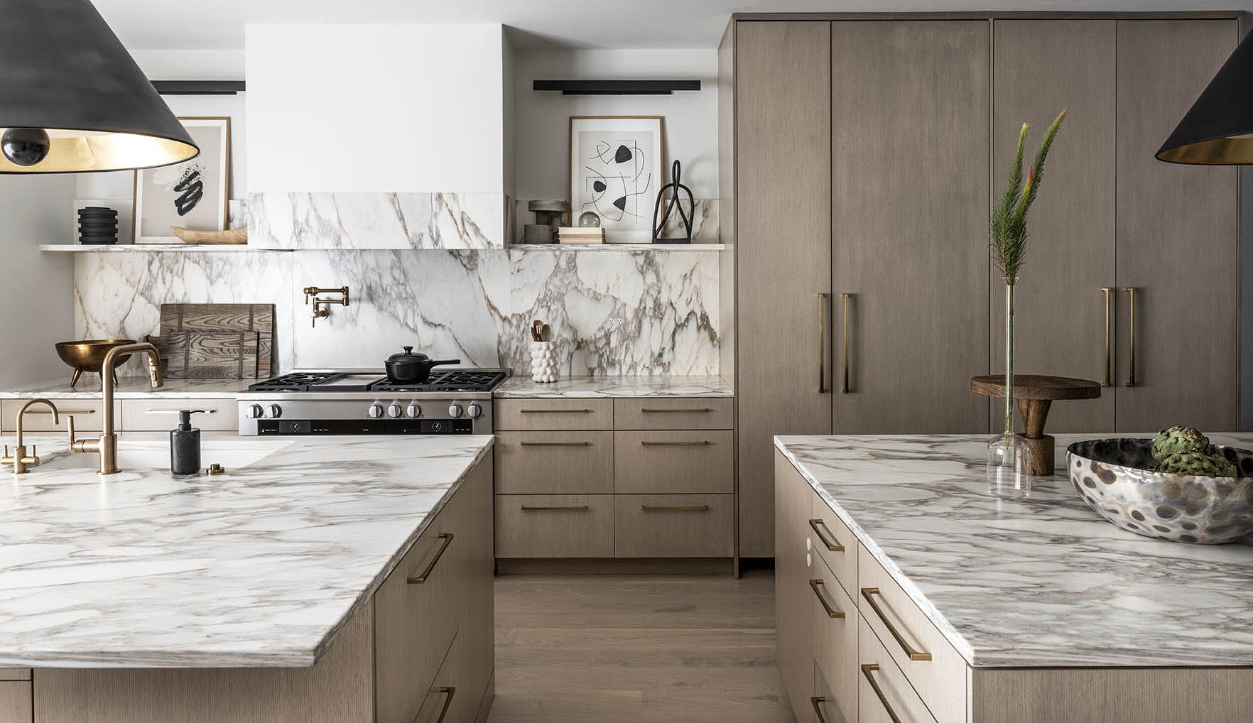
Our first item of business was coming up with a couple of renditions for the floor plan to maximize space and minimize superfluous design. To do so, we really had to get creative when it came to the interior architecture, in particular blending sleek material selections with strategic-yet-elegant living and storage solutions, all while being mindful of transitional spaces for flow. And, as we do, we totally flipped convention on its head with moves that were informed by the homeowners’ lifestyle. They love to cook and wanted a kitchen big enough to accommodate boisterous cocktail parties with friends. So, we prioritized a big entertaining space around the kitchen and ditched the formal dining room altogether, a space they said they would never use anyway. Here, our biggest challenge with this narrow footprint was how to keep the entrance to the powder room out of the kitchen without moving it. Taking a cue from Chicago’s old speakeasies, we carefully hid the entrance behind this beautiful custom millwork paneling and added an invisible pull on the door—a secret for those in the know.
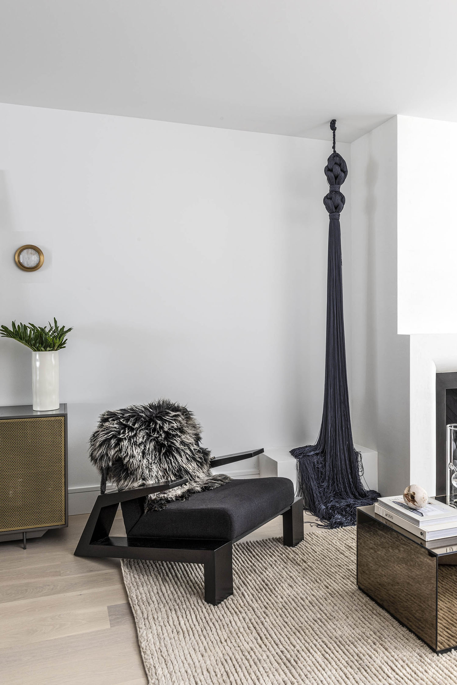
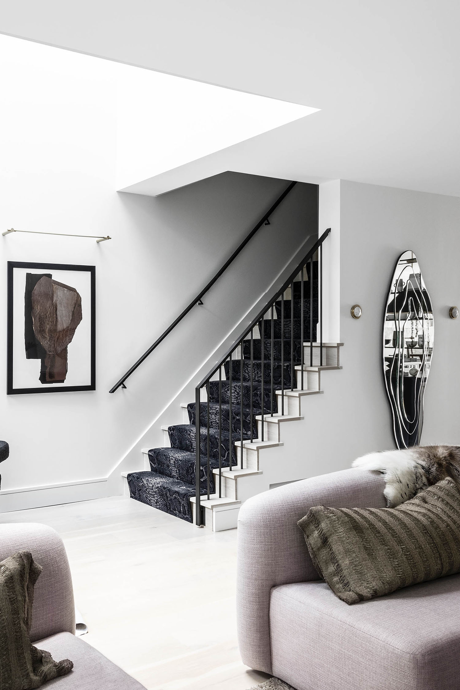
Another example of this is how PROjECT. addressed the header for the upstairs staircase. It wasn’t presenting an even plane on the downstairs ceiling, so we hid the issue with an arched opening that makes the architecture feel smooth and sophisticated. With renovations, you always have to be ready for creative problem solving and we loved pushing these clients to open their minds to the possibilities that their space presented.
The palette is beautifully monochromatic. What are your top tips for designing with minimal colors?
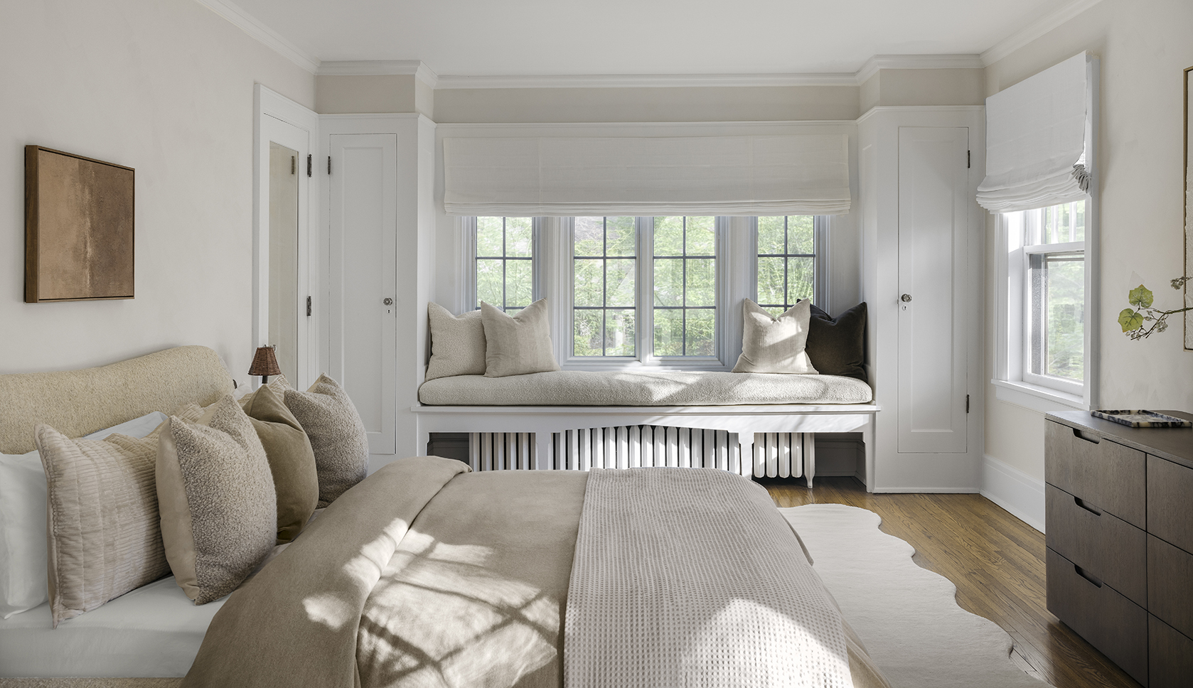
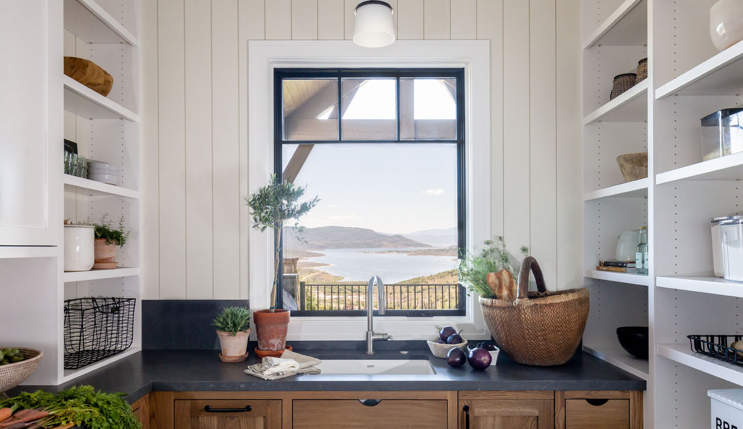
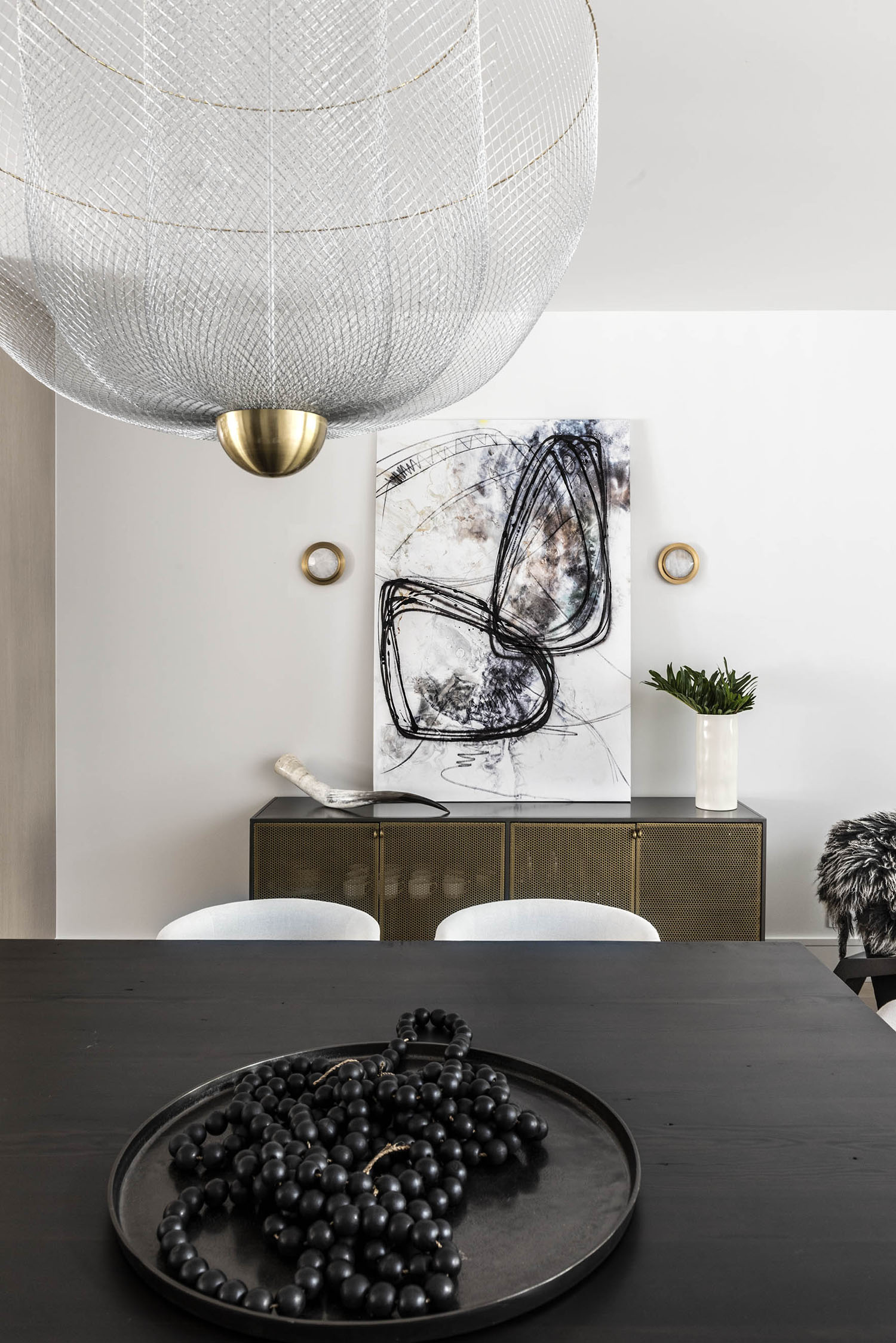
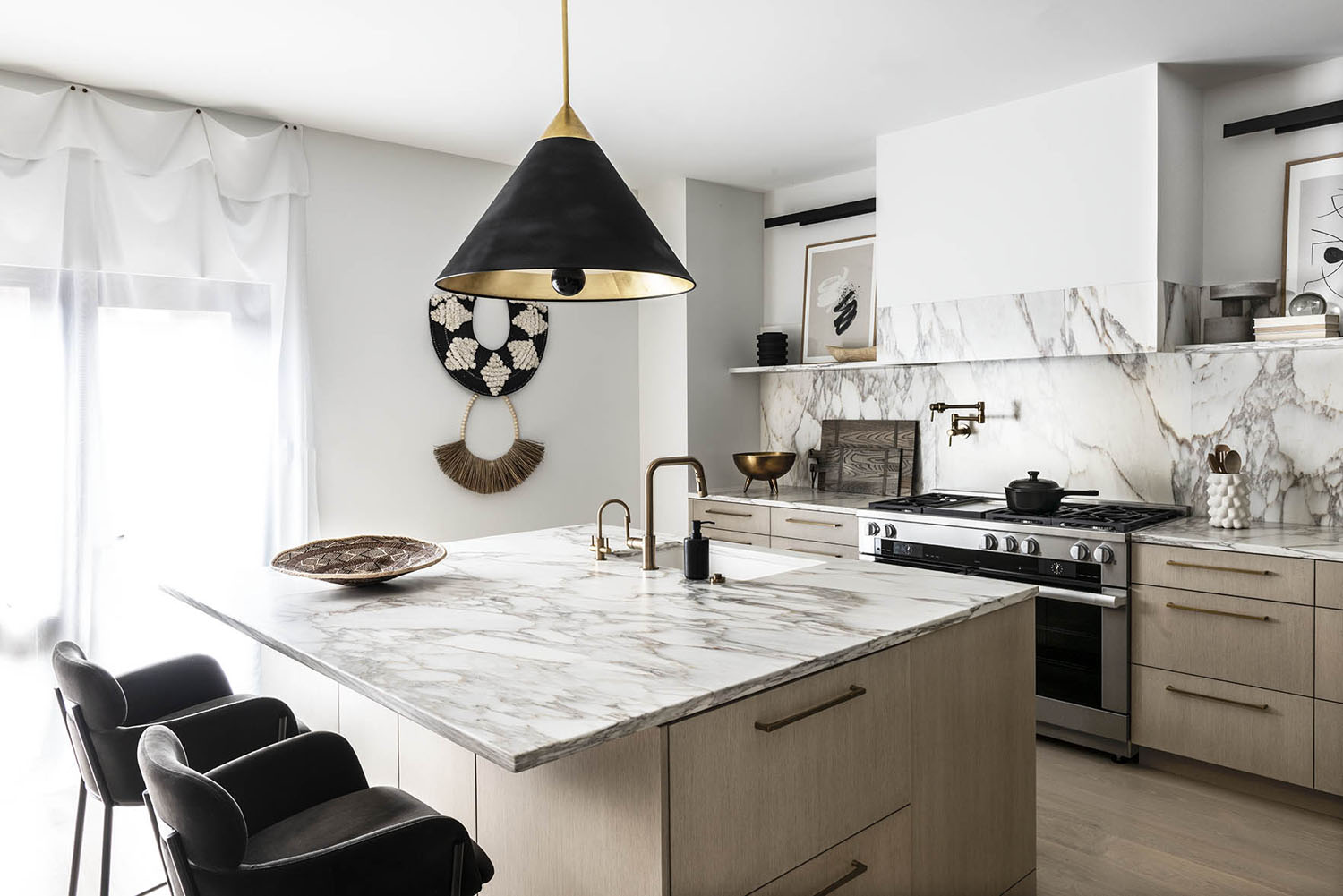
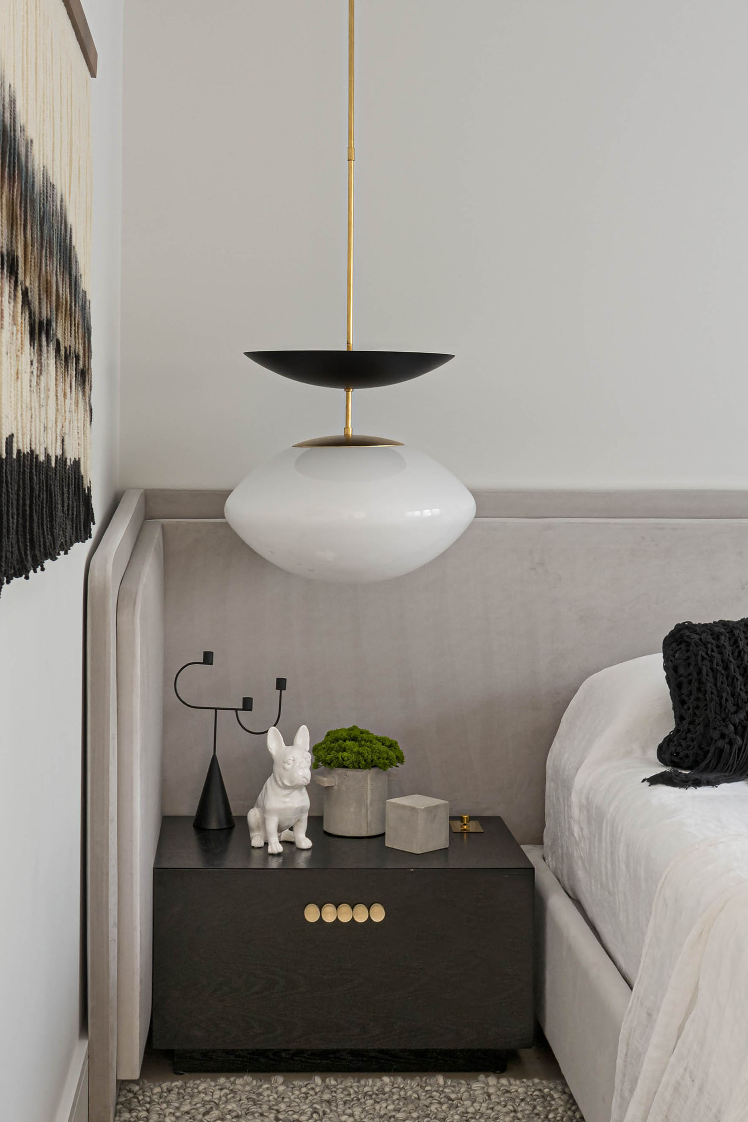
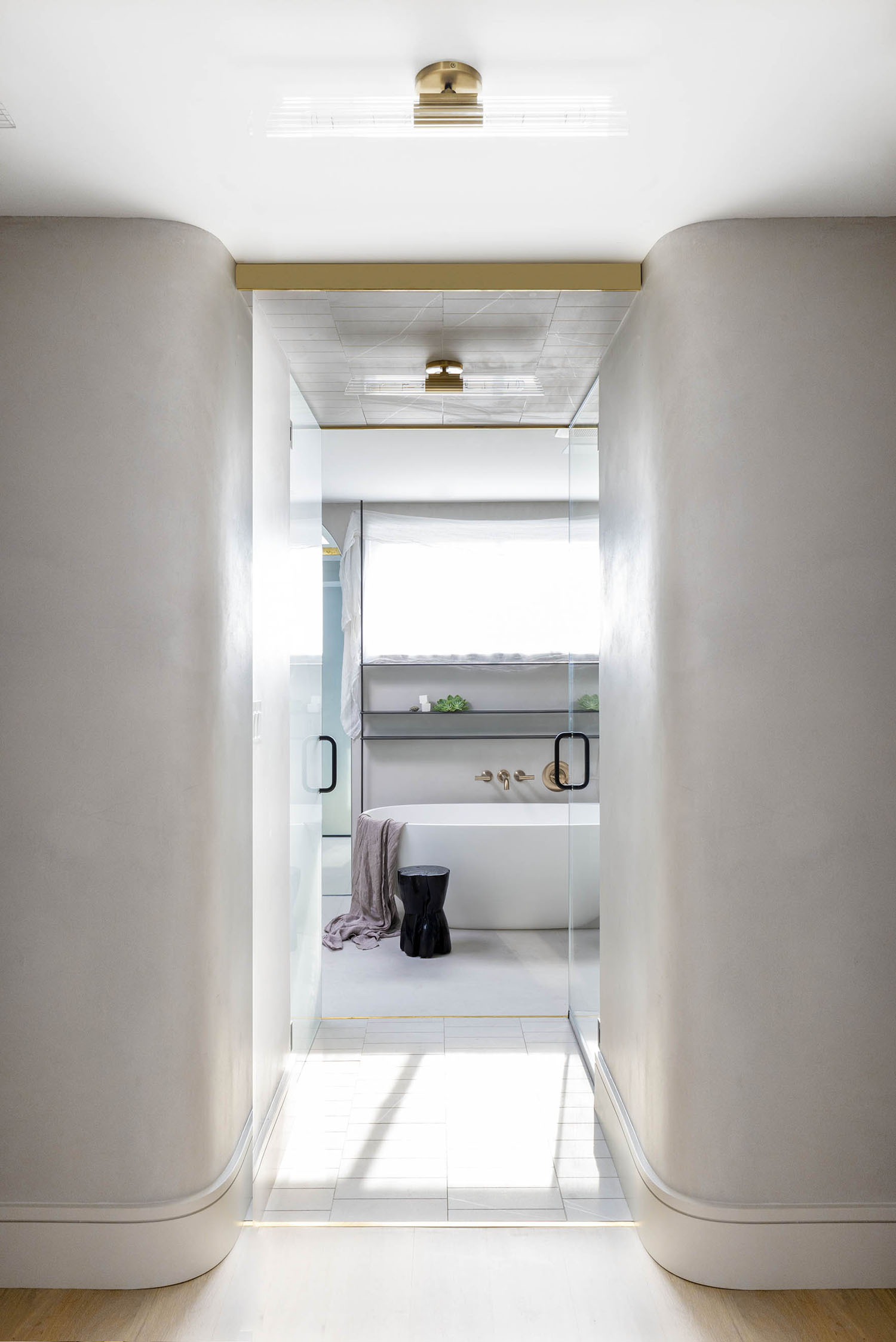
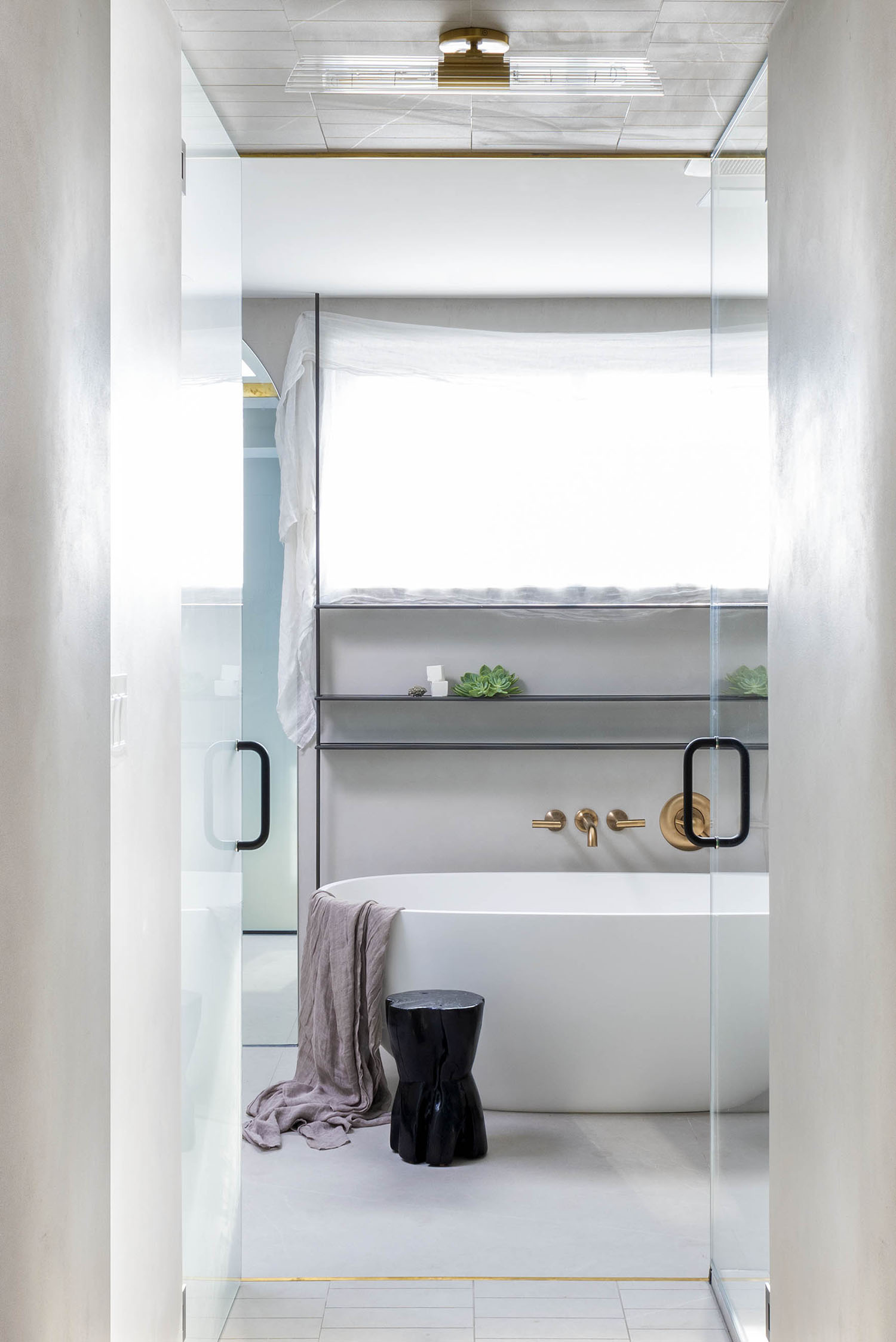
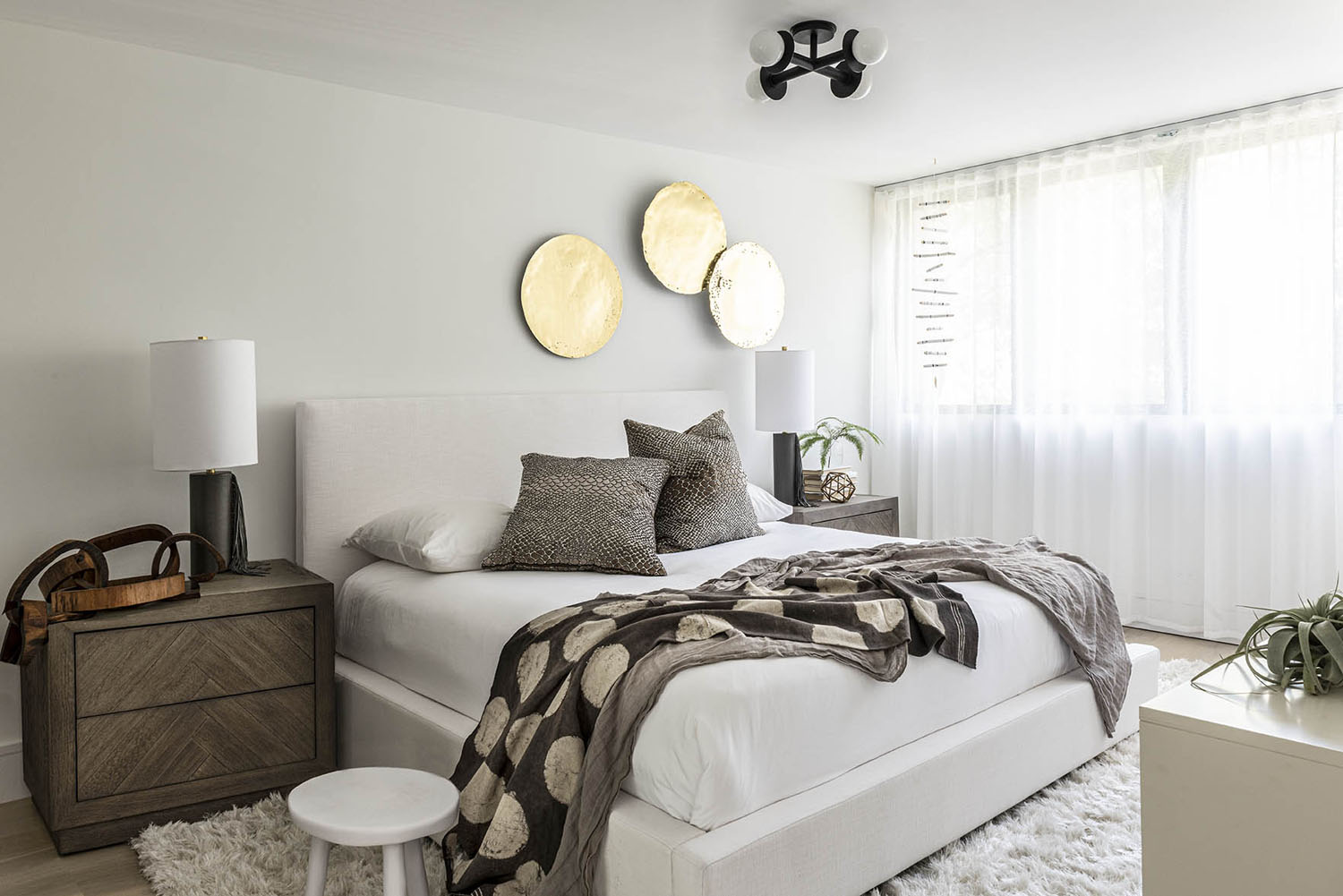
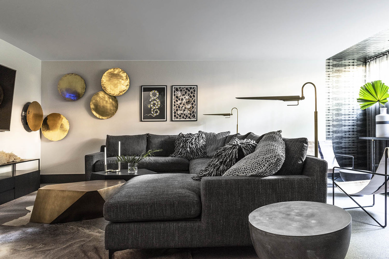
I’m a big believer in chromotherapy, and how we, as humans, respond to color. Humans associate psychological characteristics to hues based on intuition. Warm colors—like reds, yellows, and oranges—are associated with active feelings, while cool colors—like blues and greens—are widely believed to be calming and healing. At PROjECT., we are always thinking about how our design can empower our clients to be the best versions of themselves. How they feel, react and respond to their day-to-day surroundings is a huge part of their overall wellness. My tip is to spend some time thinking about how different colors make you feel. I find that organic shades—woody browns; sky-hued creams and blues; and organic greens and muddy blacks—are the most soothing. From there it’s all about creating contrast for visual interest. The kitchen is one great example of this. Moving away from the common monochromatic palette of gray, black and white, we introduced this ‘gray-eige’ (a taupe-y gray/beige) color concept full of earth tones, woody browns and shades of caramel for organic warmth. It makes for a captivating, inviting space that is perfect for the couple who loves to welcome guests and entertain. And the warmer color palette against the white backdrop really pops—and creates this engaging contrast. The client has a fondness for the mountain- and desertscapes out West, so that was part of the influence for this room’s colorway as well.
How long did the project take, and what did the client say when they saw the finished space?
From demo to final polish, the whole project took 15 months (from start date in February 2019 to install May 2020). We had great synergy with these clients because they have great taste and were willing to take artistic risks—and because they truly enjoyed being a part of the creative process. They were hip to our style before the project started and reached out to us to bring it, so that trust was there. I’d say this was a success story from a couple different standpoints. First, the clients introduced our team to the contractor on the project which made for a successful collaboration and encouraged the homeowners to continue buying these row homes to renovate and sell them. Additionally, the person who bought the unit next door actually begged the homeowners to be introduced to us after seeing how we transformed their home with reactive design. As we mentioned earlier, the wife was inspired to make a big career decision and go into design herself because of this project. And the husband told design assistant, Stacey Kallenbach that ‘Through the whole process, I was half in, half out, but the things you guys came up with were beyond my own imagination.’ And it’s safe to say that the home continues to have a big impact on guests, too, who are always commenting that they are ‘obsessed’ with the design.