

Designer Annouchka Engel, Principal Designer at Engel+Falaise Studio, had quite a task ahead of her when repeat clients asked her to work on their new home—the penthouse of a 1920s Art Deco building in San Francisco’s swanky Cow Hollow neighborhood. Though most homes in the area are single-family structures, this property was one of a handful of Art Deco buildings with incredible views of the Bay. The two-year project resulted in the space being painstakingly demolished and rebuilt with care, with an attention to detail that rivals only the sweeping views outside. The designer tells us more:
Tell us a bit about your clients. You’d worked with them before?
The clients are bi-coastal (with a residence in New York as well) and I had designed their first rental apartment when they arrived in San Francisco a few years prior. Since this was a long permitting and construction process, they ended up moving in with their first child, 2 1/2 years later.
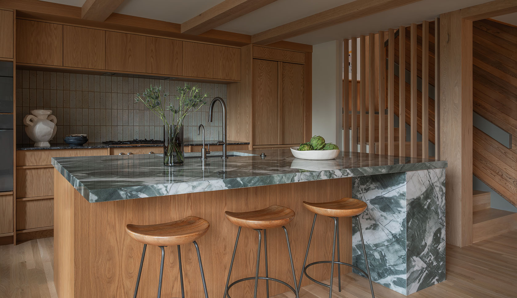
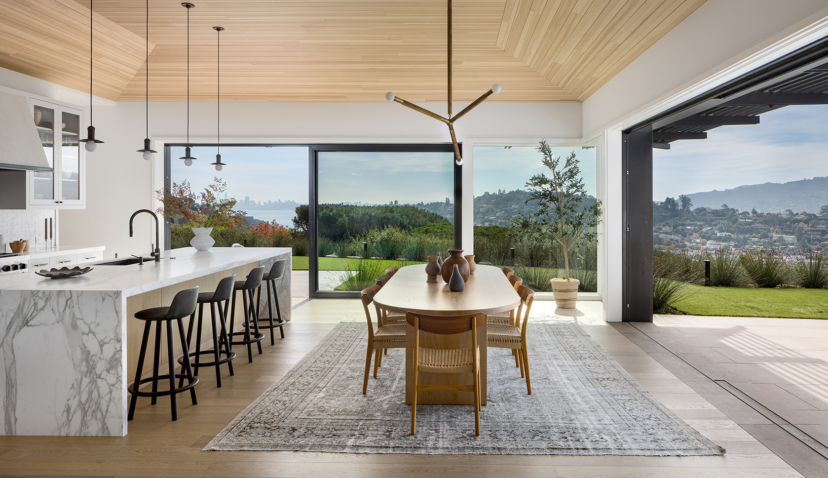
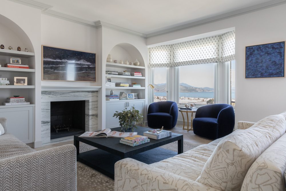
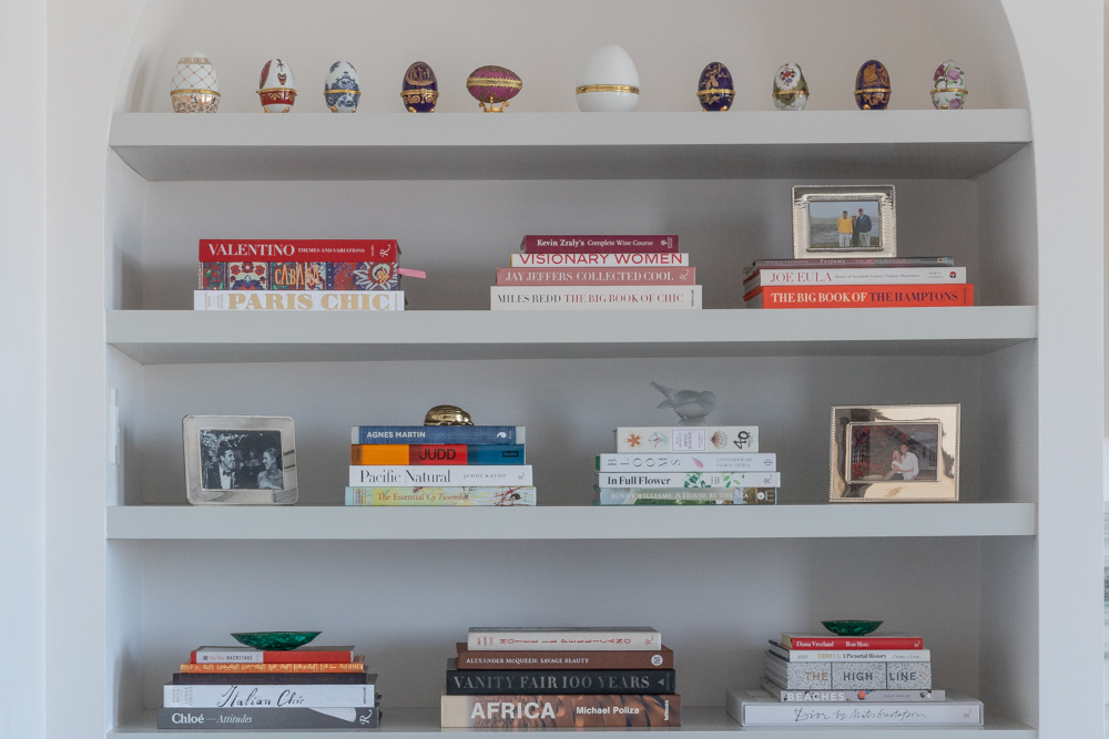
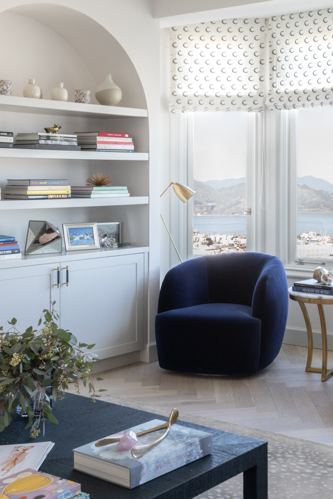
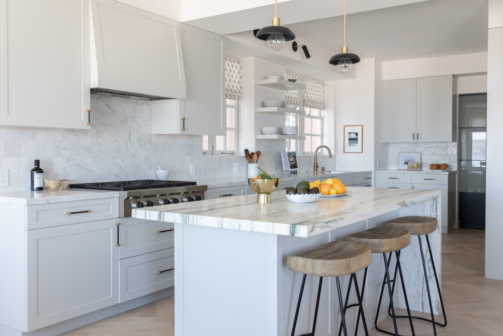
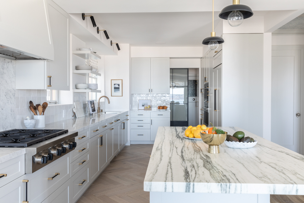
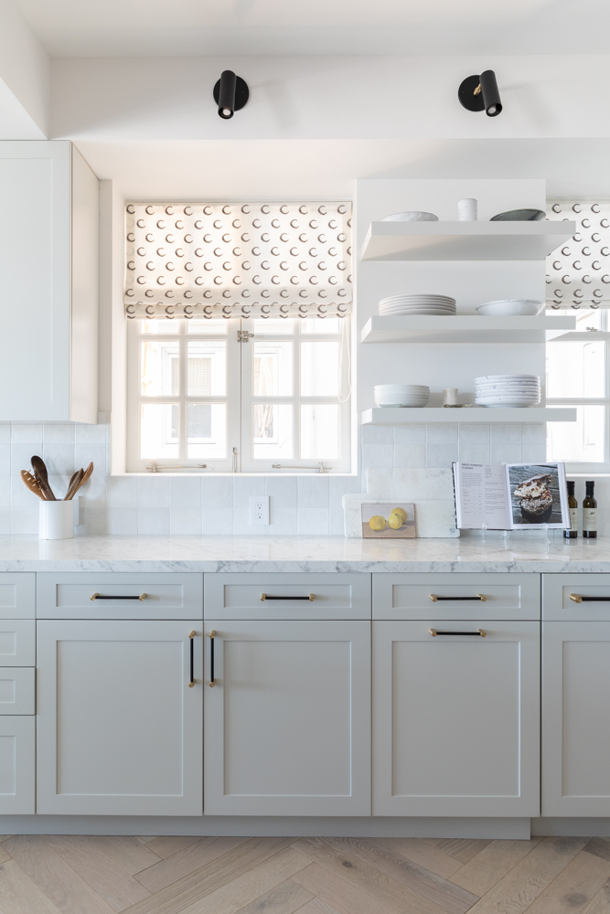
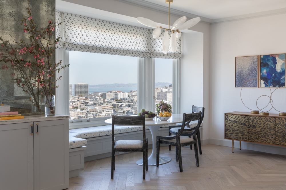
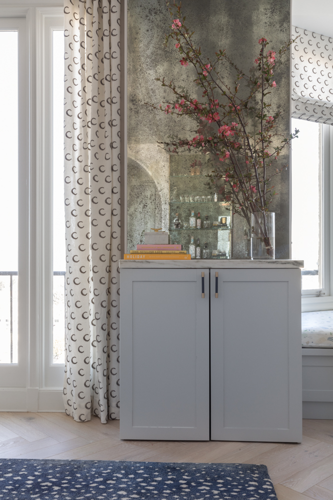
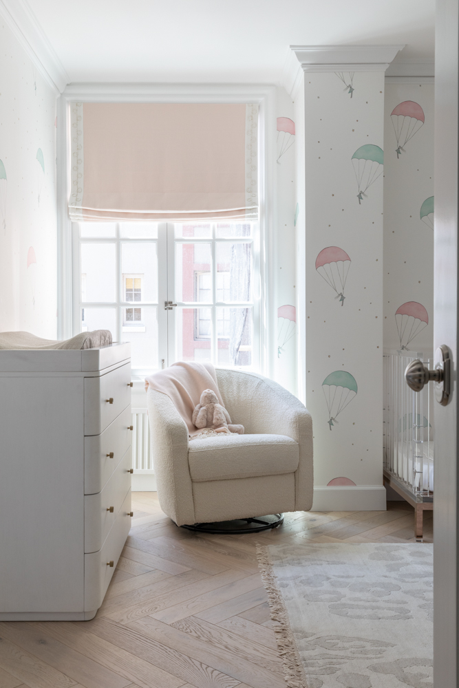
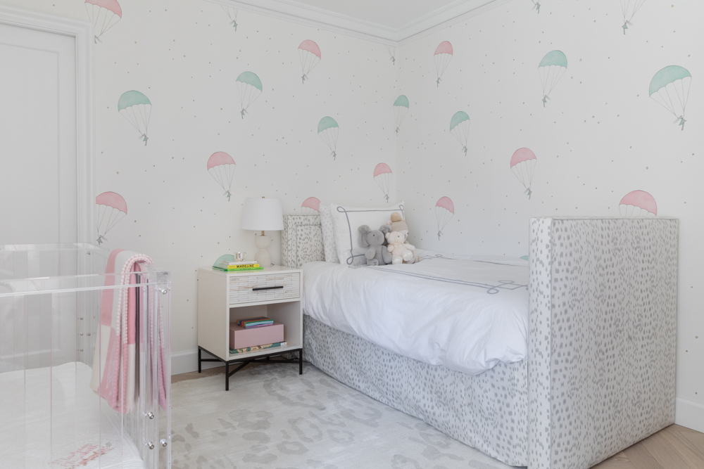
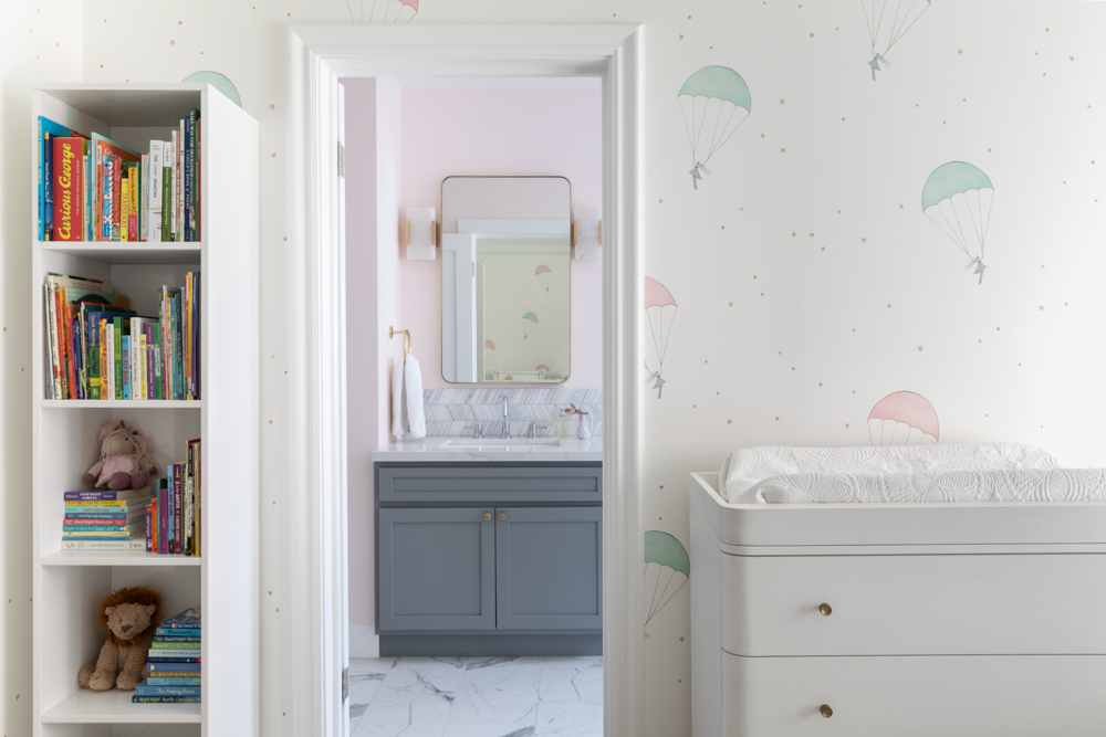
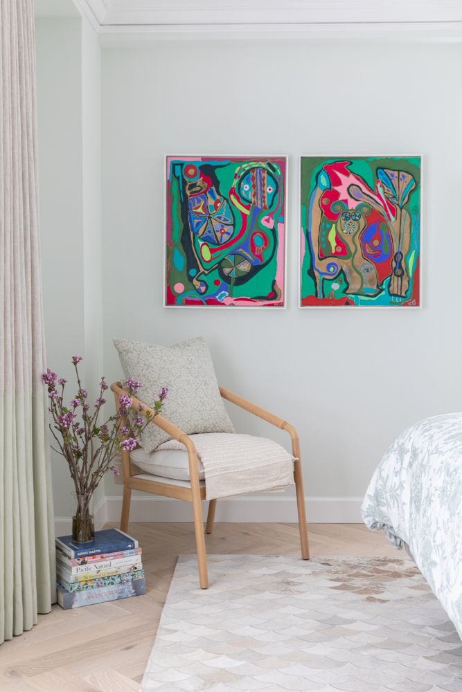
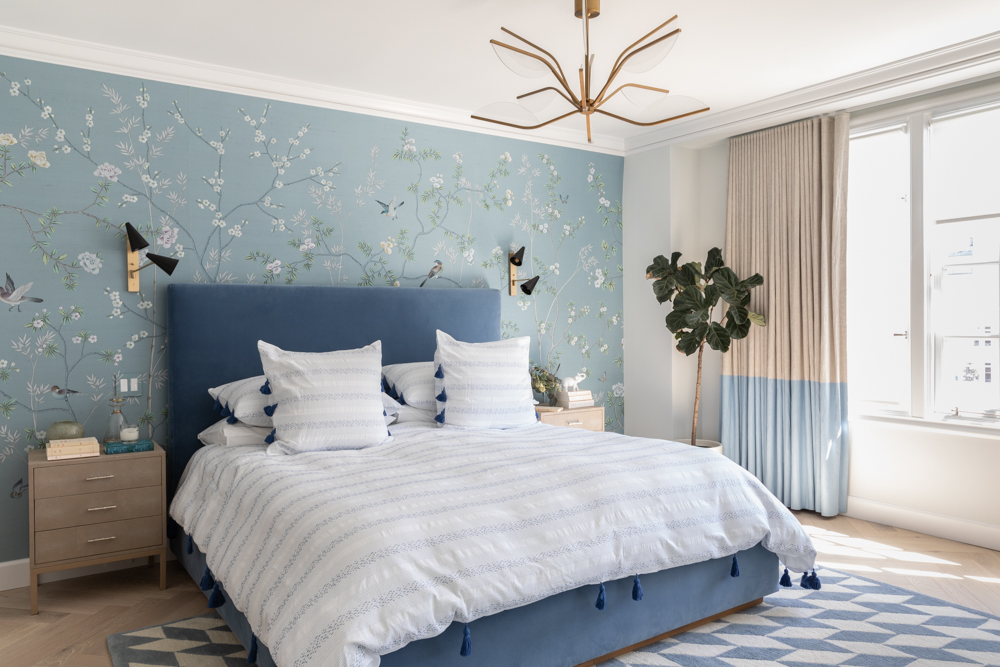
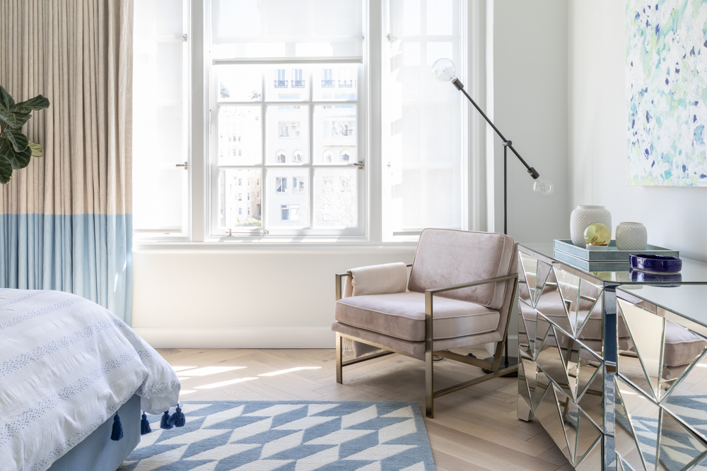
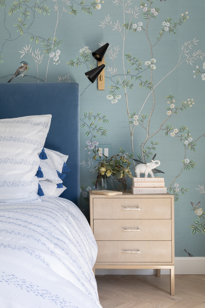
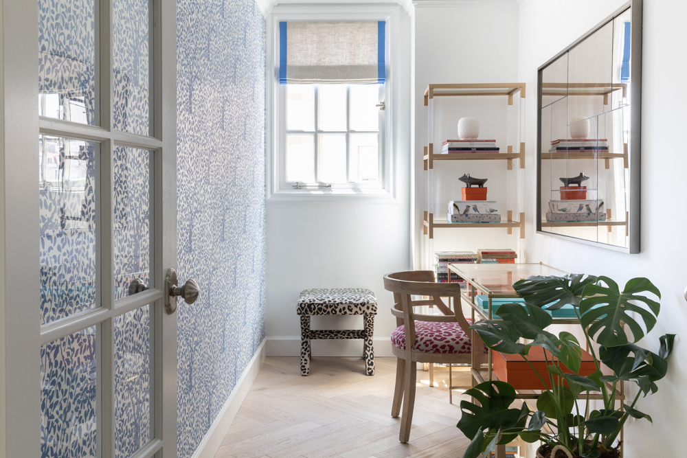
What was most important was to make the views the focal point. We did so by creating a main living space that was geared towards entertaining informally with different seating nooks and a bright and well-functioning kitchen. The clients also love bright, textural, and bold patterns & colors. We had to reign that in to create a cohesive environment that flowed nicely from one room to another.
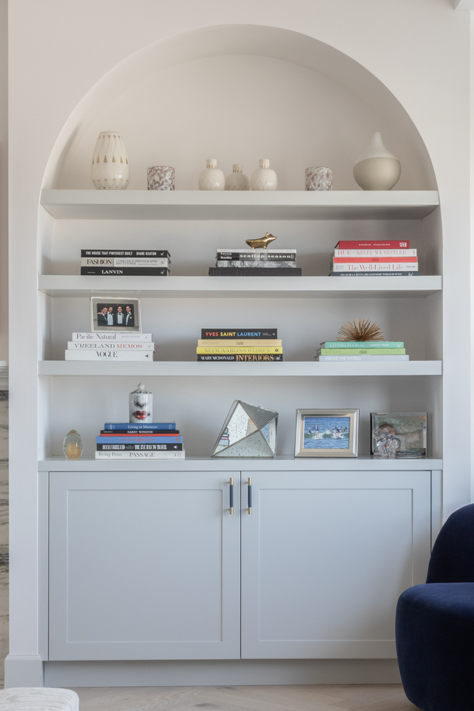
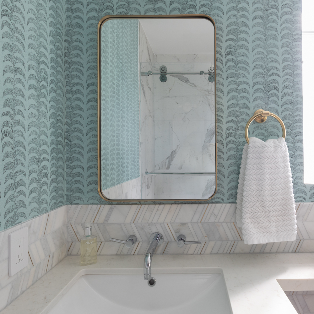
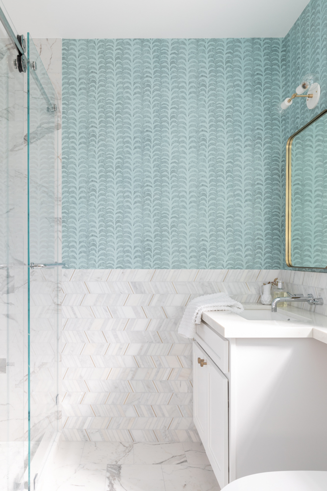
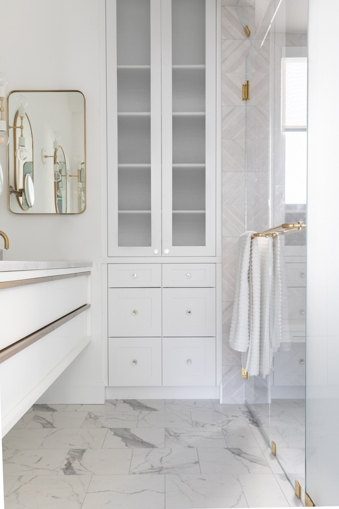
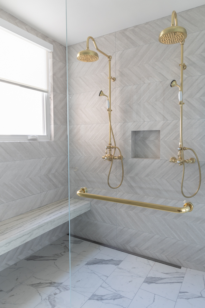
I kept the historical elements of the building in mind when I designed the space, so it was reflective of the surroundings. We included lots of arches, rich materials, brass accents, and geometrical shapes while updating the home to 21st century comforts.
The home needed a lot of work at the start. What condition was it in, and what were the top priorities when it came to the design?
This apartment is a complete concrete build and it had to be painstakingly demolished in order to be rebuilt. The apartment had not been touched since the late ‘60s and was a never-ending set of small awkward unfolding rooms. The electrical and plumbing system had to be updated and every concrete wall had mesh wiring within it…our contractor was an ace at navigating the complexity of these issues.
It’s hard to pick favorites, but what do you love most about the finished space?
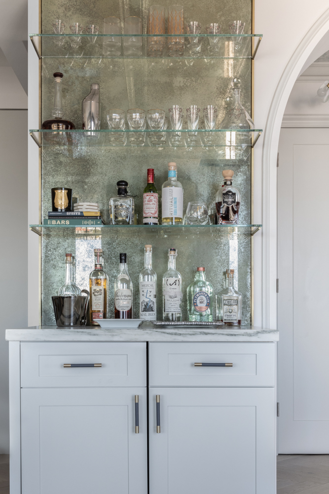
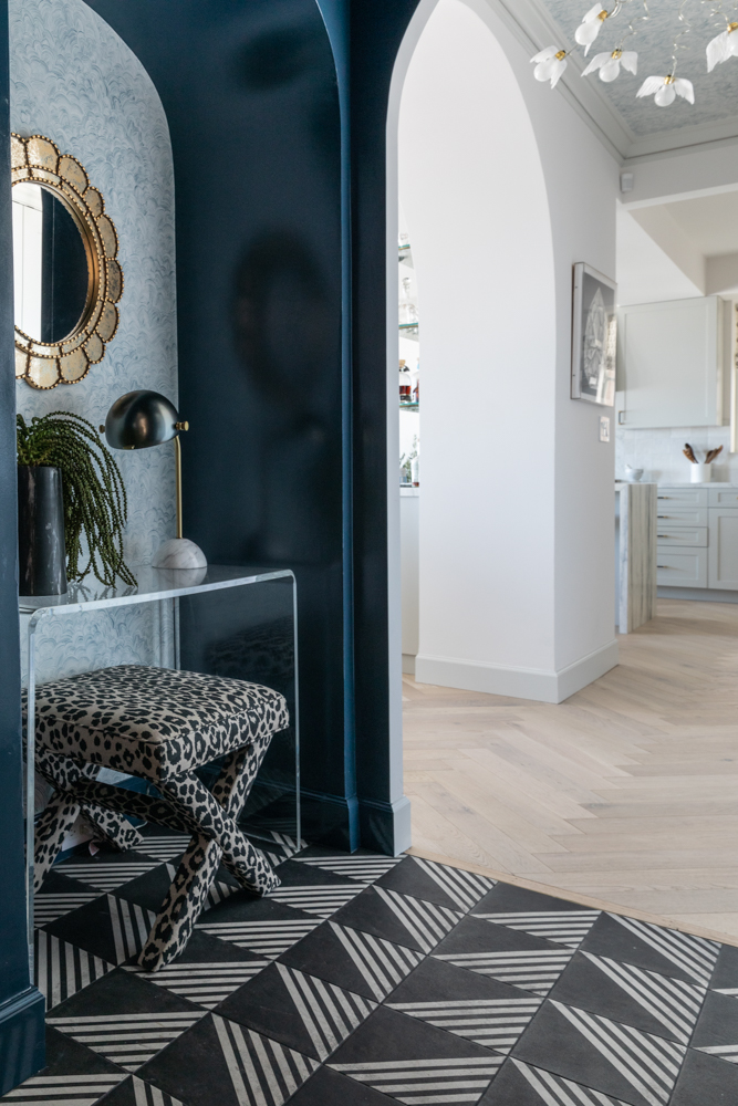
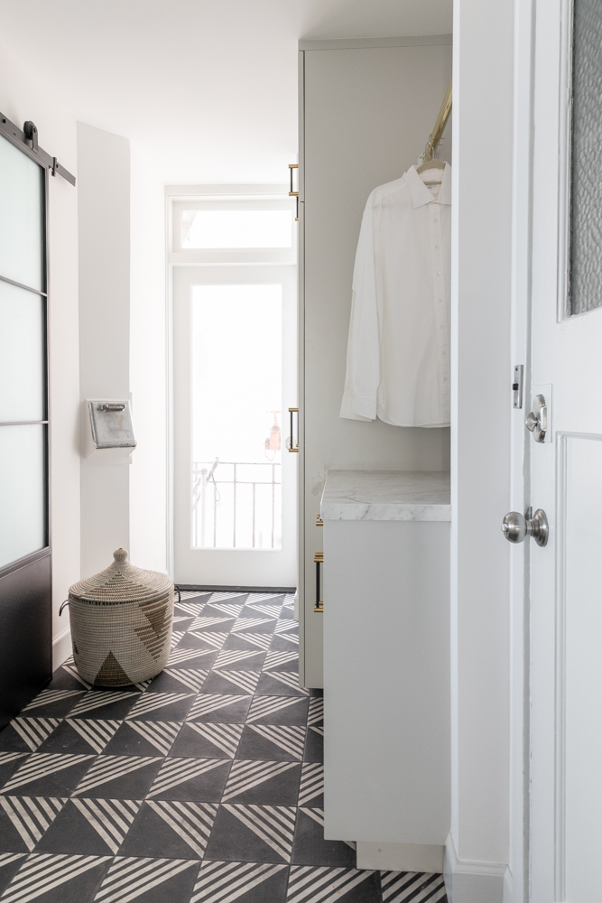
One of my favorite areas of the home is the vestibule—the entrance before the entrance. It’s a dramatic moment with the high gloss navy paint and Rebecca Atwood wallpaper coupled with the eye-catching black and white geometric cement tiles (that are repeated in the laundry room) as well as the Ingo Maurer Birdie chandelier which captures so much of the essence of the magic we were trying to create in the home.
In such a unique space, we’re sure it’s tough to answer…but how do you describe the style?
Can we call it Nouveau Deco? Chic, serene yet bold with a hint of whimsy.
Take a tour in the slideshow.