
This house, built in the early 2000s, was in great condition—the layout was fantastic, and most of the kitchen and living space had custom details. However, style-wise, they were a little past their expiry date! Enter Southern California design firm A 1000x Better. Lead designer Patrick Maziarski worked with the family, longtime clients of the firm, to create a welcoming space they’d enjoy being. He brought in modern conveniences, bold design elements, and plenty of sophistication. Read on to learn more about the striking space.
Hi Patrick! This space is amazing—where is it located?
The home is a gorgeous, stately craftsman located in the foothills of Sierra Madre, CA. The neighborhood is idyllic – a scene from your favorite childhood film. The home was built in the early aughts, but many nearby properties maintain a rich history and pedigree; qualities we wanted reflected in the newly designed kitchen and family room.
We’d love to know more about the family. Had you worked with these clients before?
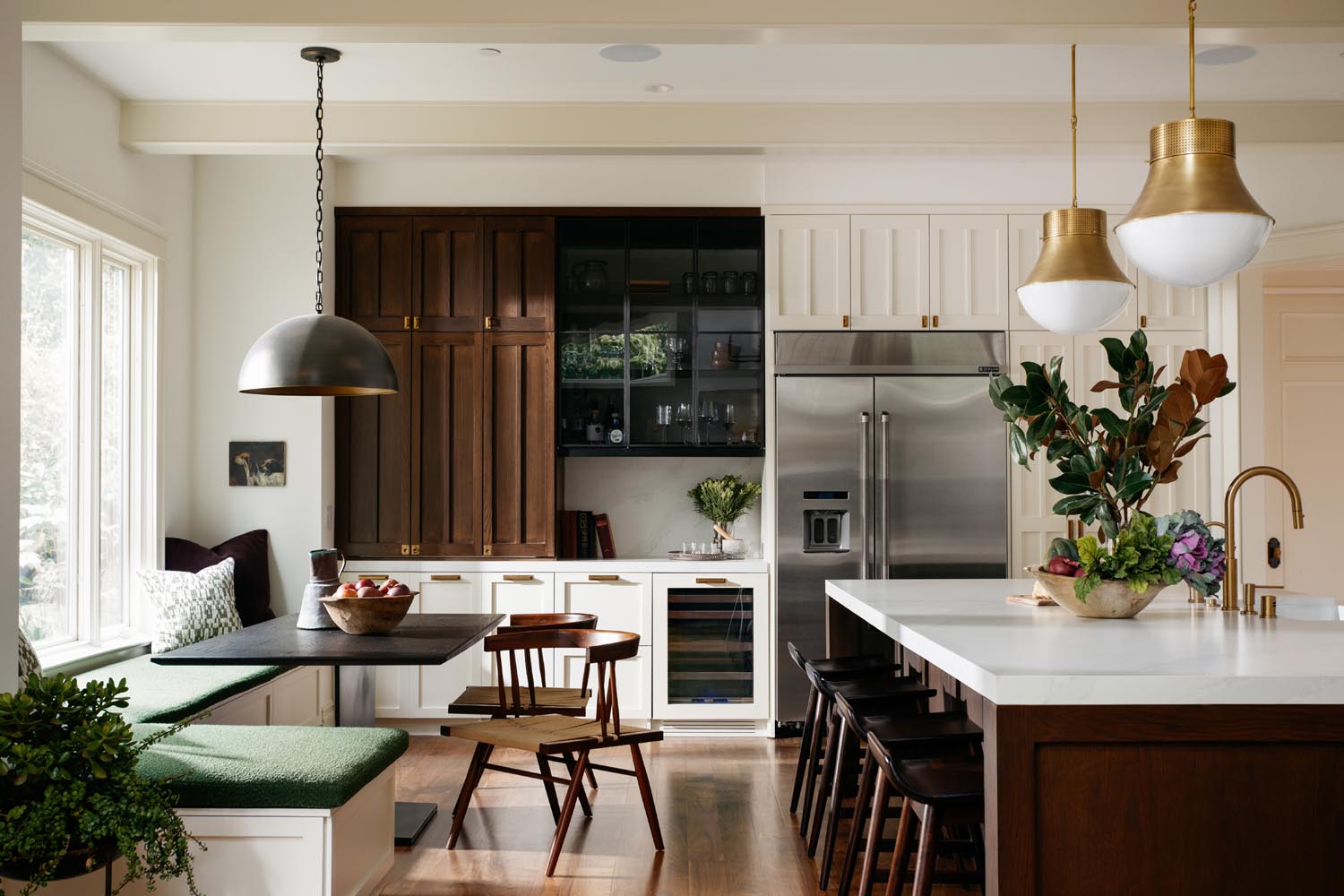
Longtime clients of the firm, this family moved into the home roughly three years ago. With three teenagers, they had outgrown their previous space, and found this exceptional home in the same neighborhood. Up until this project, however, we had only done decorating jobs with them. Clear was their goal to create a welcoming, family-oriented space with all the modern conveniences of today’s kitchen, and then some. Their main goal was a space where family could convene comfortably. Second, to address the butter-yellow, ornate cabinetry and fixtures that didn’t quite seem to fit the overall aesthetic of the home. We provided them with a modern yet era-appropriate space, filled with classic details and unexpected accents.
Design wise, what was your “jumping off point” for the project?
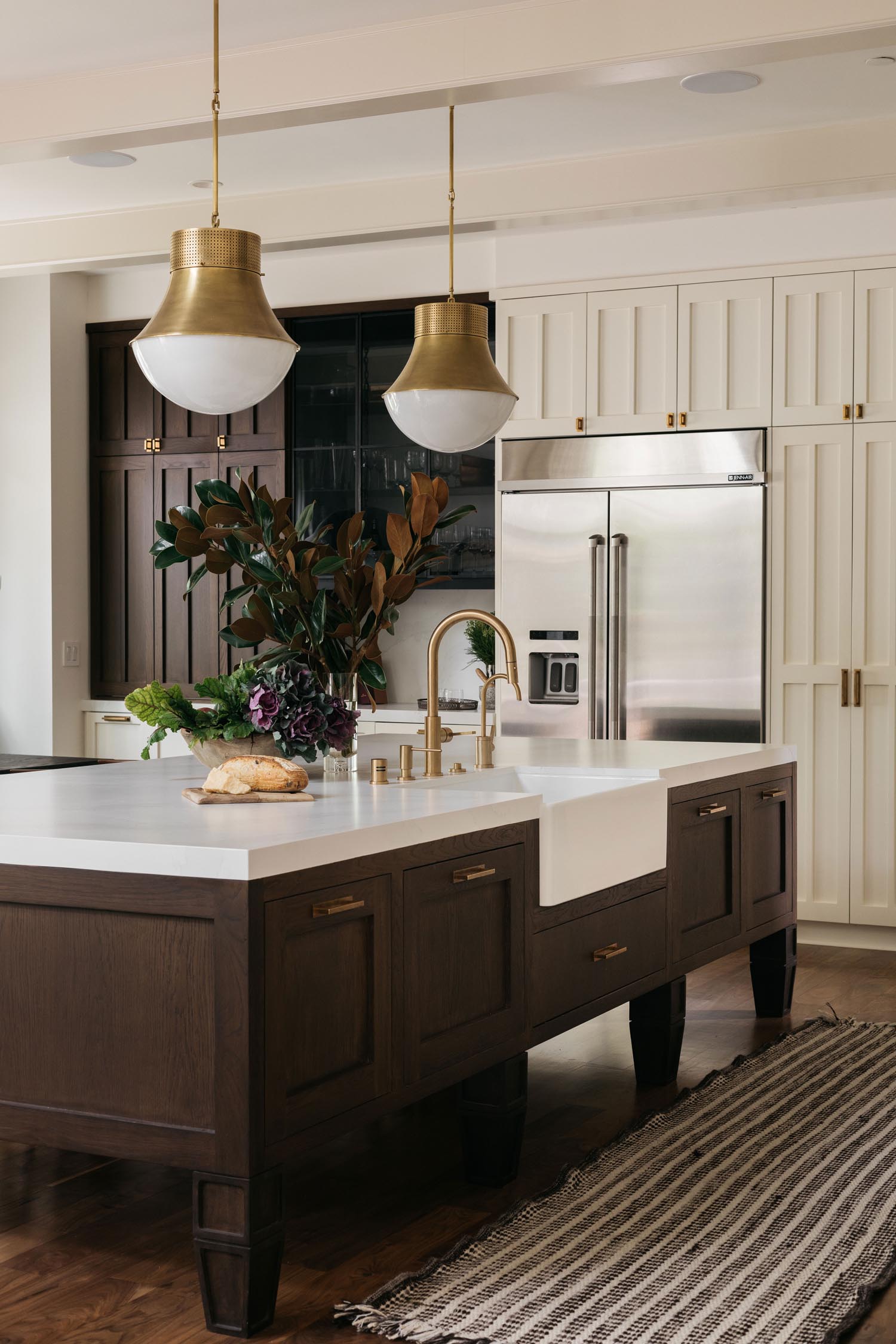
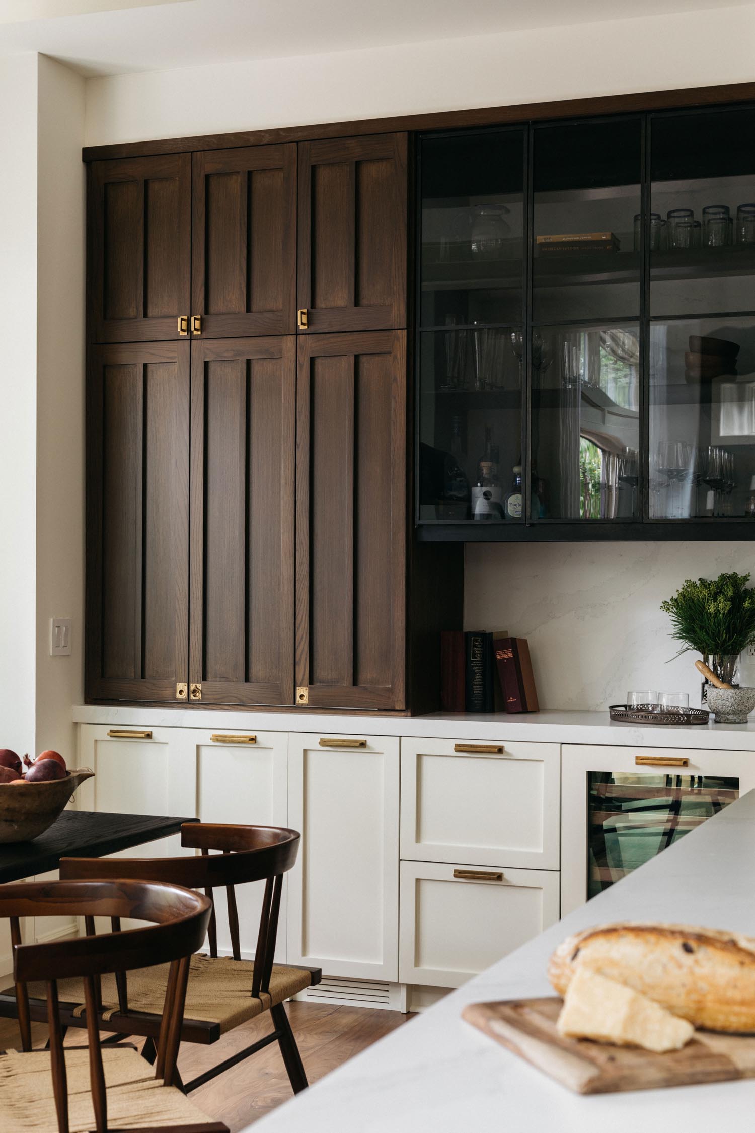
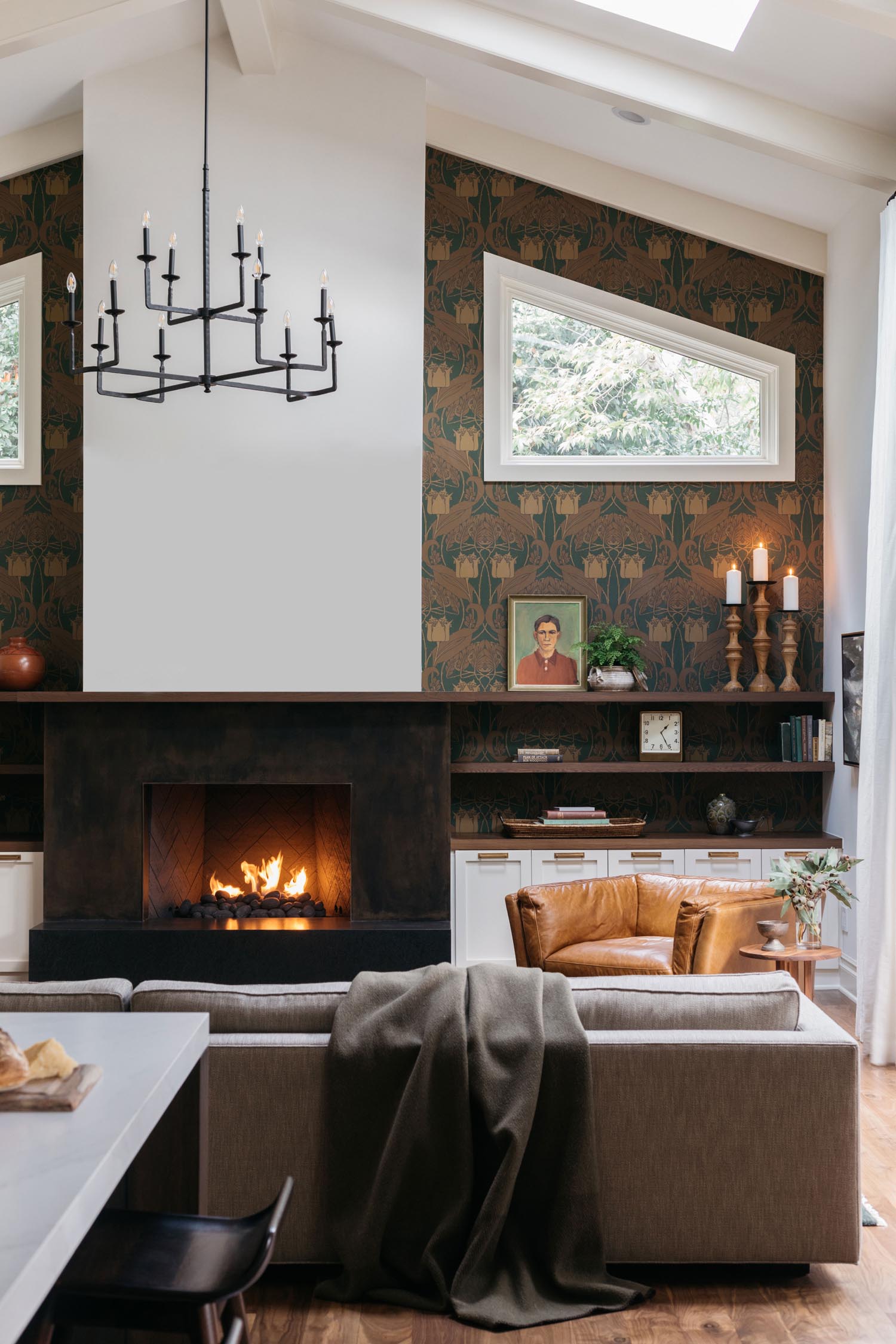
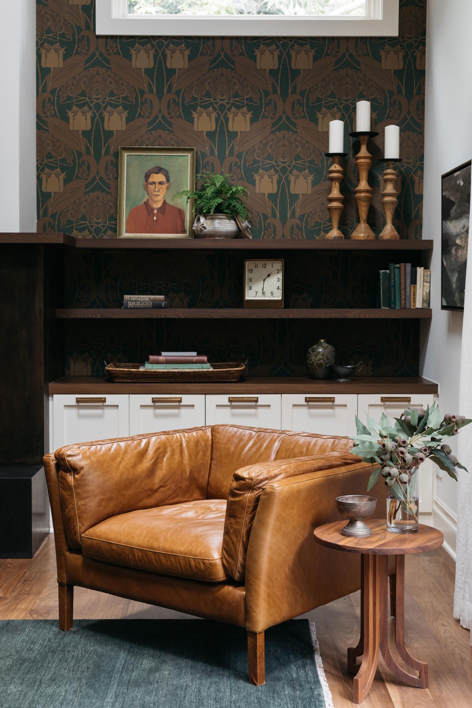
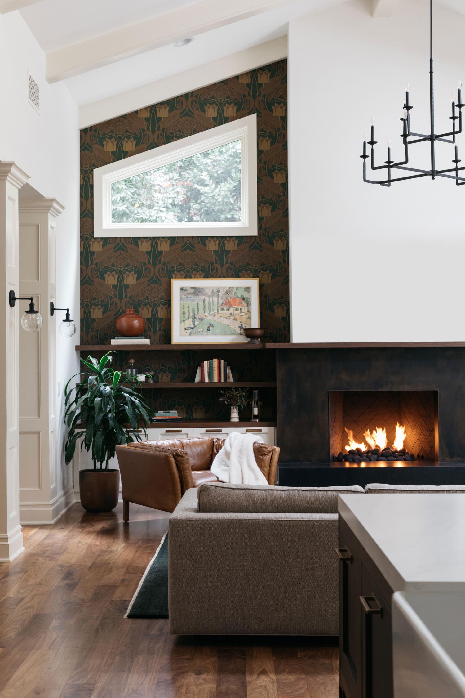
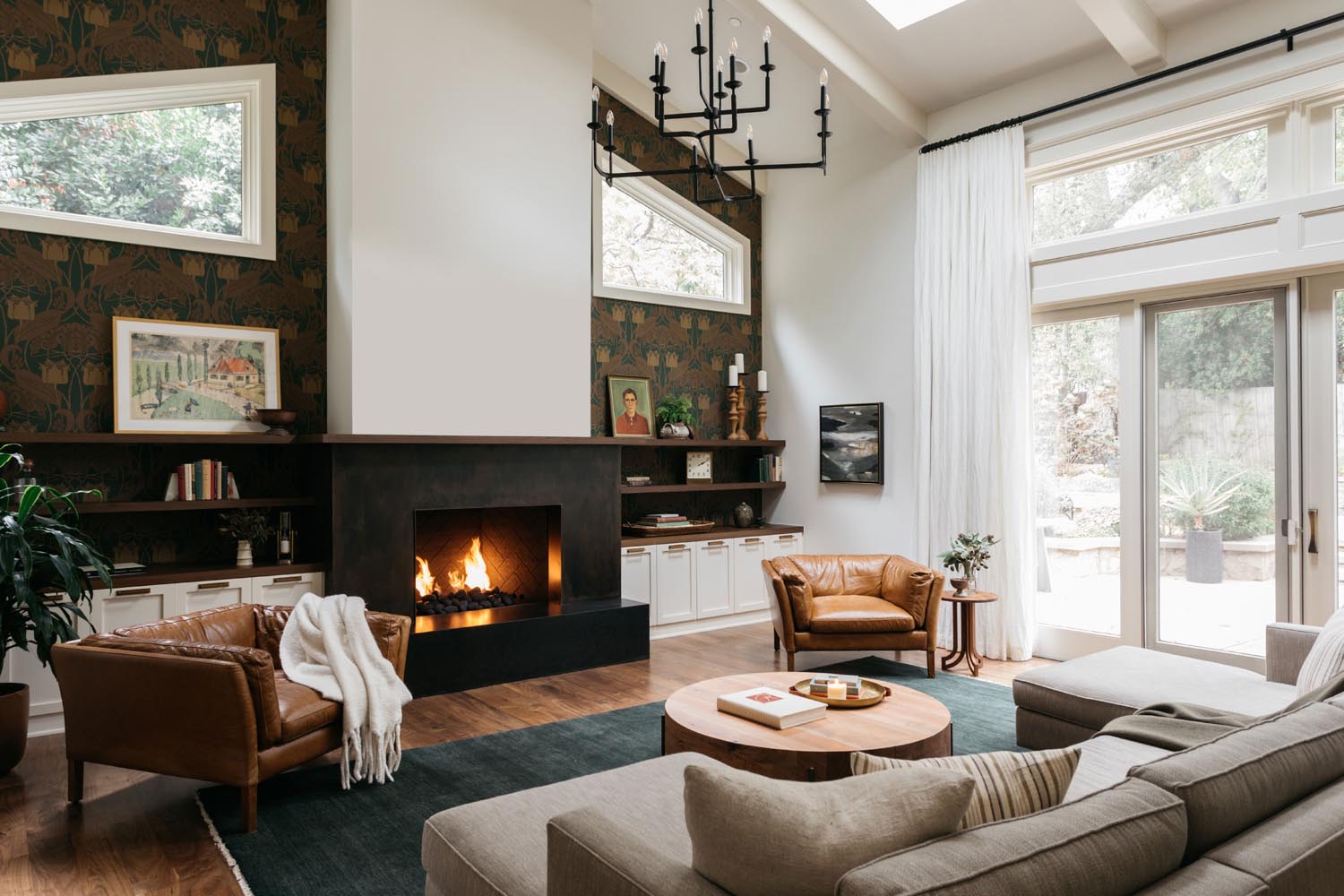
Even though the tone and aesthetic was established by the existing nature and essence of the home, there were two pieces of our “design puzzle” that really set the tone for the whole project: the family room wallpaper and the kitchen hardware. There was a bit of back and forth on the wallpaper, and it wasn’t until the paper was up on the wall that the clients understood it’s beauty completely. Thankfully, they allowed us to push the boundaries on a few aspects of this project, and this wallpaper was one of them. The kitchen hardware, on the other hand, was approved the moment the client saw it. It really the jewelry in both the kitchen and family room.
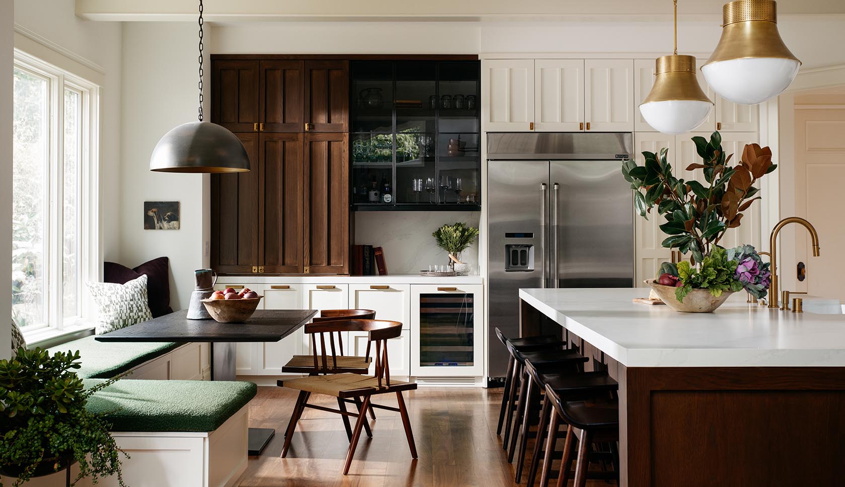
So, let’s talk details of the space. We’d love to know a few of your favorite features!
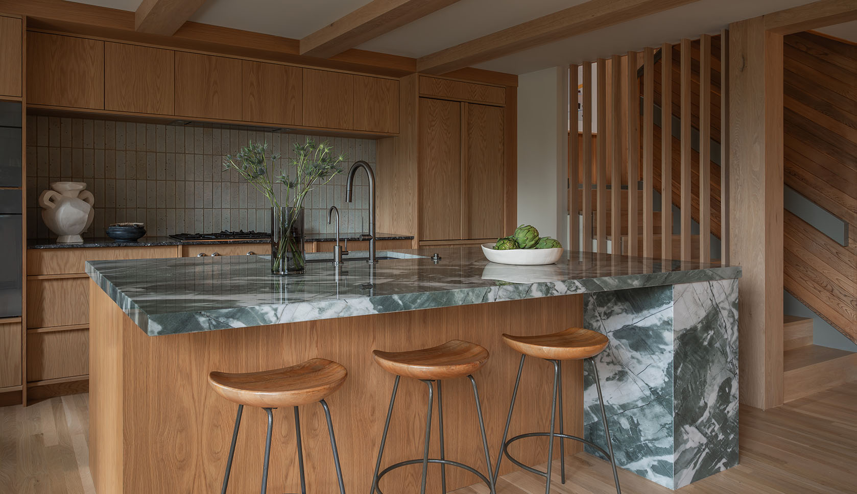
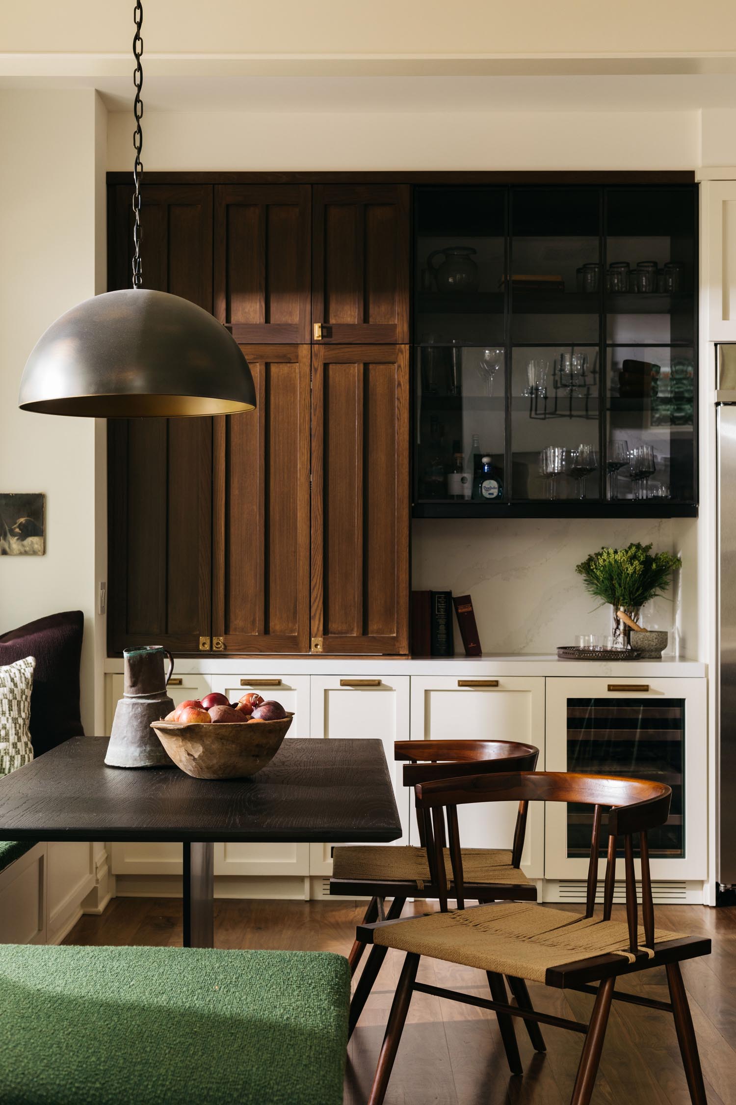
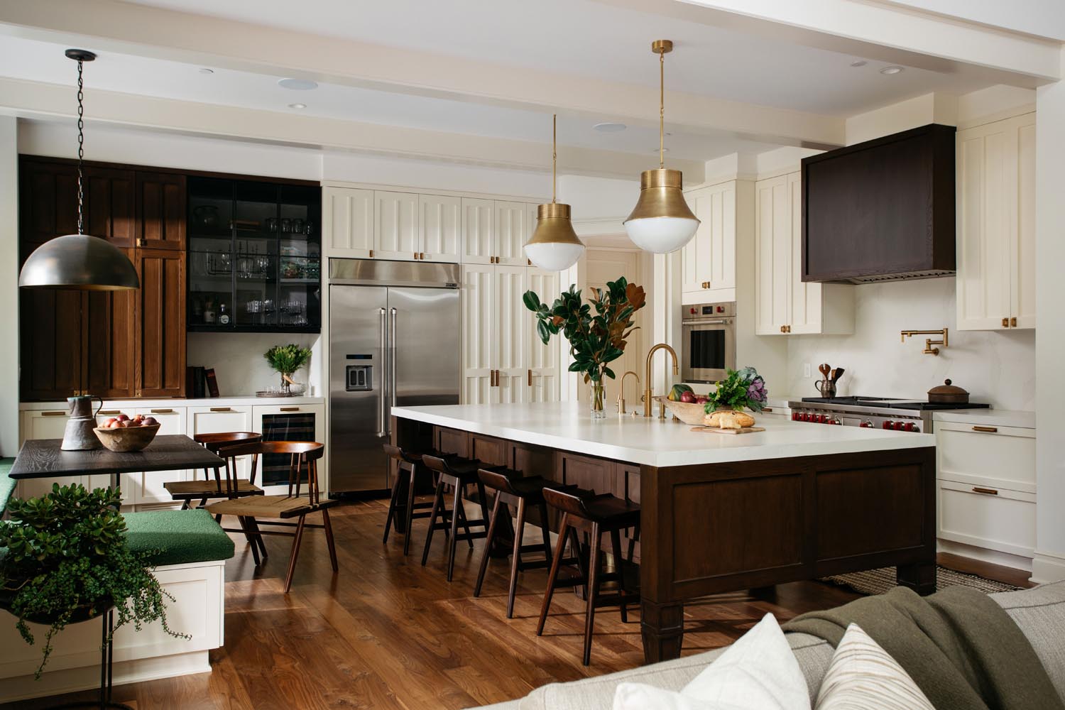
The large island is truly the show-stopper in the kitchen. Beneath its exquisite surfaces exists a ton of plumbing components, cleverly hidden behind brass and oak (including two large drawer dishwashers!) The combination of light and dark materials in the cabinetry finishes inspires rhythm and dimension in the space—unexpected contrast in certain corners, traditional details in others. The recesses on the cabinet faces were exaggerated, for example, to give it more depth and a truly custom feel. The banquette was also a surprise hit with both the clients and us; we went with a fairly bold shade and texture in the fabric, and, once installed, delighted the parents as a favorite hangout spot for their kids!
The obvious winner in the family room is the wallpaper. We love that it’s both contemporary and traditional in nature, and the color palette couldn’t be more on-point for the space. The refined media cabinetry is a great improvement on the existing, oppressive cabinetry that once overtook the space.
Since the space was in good condition, was it a long design process?
The project, from conception to installation, was about six months total. Aside from some mild indecision and a few last-minute finishing details, the project ran extremely smoothly. On top of this, the project began early enough during the pandemic that, luckily, we weren’t yet dealing with insane lags in product fulfillment.
See more in the slideshow.